On the eve of the publication of Patternalia: An Unconventional History of Polka Dots, Stripes, Plaid, Camouflage & Other Graphic Patterns, author Jude Stewart elaborates on some of her favorite topics from the book.
++++
O heraldry! How I love thee with an unruly, slightly embarrassing passion. Let us now count the ways.
But first, to explain my abashment. Heraldry, you see, suffers from a major image problem. Originating in medieval Europe as a means of differentiating jousters at crowded tournaments, heraldry is the study of those detail-laden shields that have bedecked establishmentarian surfaces for nearly a millennium: from university stationery to old-style brewery labels to castles galore. A heraldic device stamps a family identity upon its possessions, and how that device alters over time reveals a lot about the family history: from marital and military alliances, occupations, and other noteworthy events.
 This German Hyghalman Roll dates to the late fifteenth century and displays multiple family devices
The visual language of heraldry has become so familiar, so hackneyed in fact, that it’s a victim of its own success. Nothing screams We Have Arrived!!! like commissioning a curlicued shield held by mascara-heavy unicorns and embossing it onto all your valuables. And yet nothing is less “screamy” today than a heraldic device: it dials the volume of that scream down to a whisper, a discreet susurration to be absorbed, literally, into the woodwork. Heraldry’s modern-day fanbase is a further liability to its cool. Who digs heraldry? Doddering English codgers. Renaissance fair actors. Dungeons & Dragons players. Historians in unironic bowties. Brutal dictators, establishing quickie bona fides. Social climbers. Too keen of an interest in heraldry brands one in violation of modern democratic values: as snobby, stodgy, and lacking in humor.
I fell down this knight-infested rabbithole while researching Patternalia, which decodes the cultural histories of graphic patterns across the globe, revealing how many things a simple pattern can mean across cultures, disciplines, and contexts. The rules of heraldry—called “blazon”—live on in countless modern-day patterns and designs: flags, athletic team colors, military insignia, sportscar logos. Heraldic crests operated like personal branding to those who sported them proudly; they’re absolutely forerunners of the mega-logo. So decoding heraldry as a Rosetta Stone of Western patterning was spot-on fodder for my book.
But here’s the embarrassing bit: once you unlock this previously ignored visual grammar, you’re positively hooked. The chock-a-block, intentional meaningfulness of every plumed feather, every engrailed scallop, is delicious and forbidden. It’s a topic so deeply uncool that curious design-minded bulls can’t help but be tempted back into the deserted china shop.
Well, not entirely deserted. Illustrator Marian Bantjes
declared her love for heraldry to UnderConsideration back in 2006, doing a bang-up job of explaining the rules of blazon briefly, even inventing her own corporate-logo heraldry based on their principles. Earlier this year, Roman Mars of the podcast 99% Invisible gave a hugely popular
TED talk about his love of flag design, a first-cousin of heraldry. (I
blogged about flag design, or vexillology, for
Print a few years ago, emphasizing the unparalleled greatness of Chicago’s flag.)
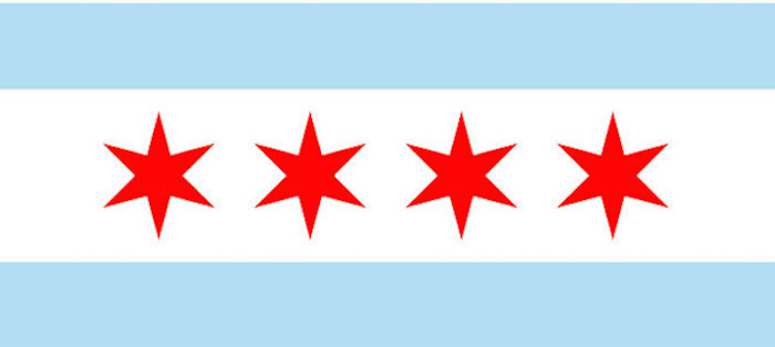
The unbeatable flag of my hometown Chicago
As medieval knights might exclaim: ‘Zounds! I’m deep into my wordcount for this post and still just frothing at the mouth with unguarded enthusiasm. Allow me to dab the drool with a lace-encrusted handkerchief and now deliver three reasons why medieval heraldry is well worth reconsideration.
1. It’s an invented world-within-a-world.
Patternalia gives a nice crash course in the rules of blazon, but I’ll further compress them here to give you an ultra-concentrated taste of how fascinating this world is.
Heraldic devices flourished from the mid-twelfth through the mid-seventeenth centuries, starting with feudalism. Encroaching foreign marauders threatened Western European kings, who hired freelance knights for defense. In thanks for territories protected, kings awarded knights with territories of their own. Newly landed knights settled down in one spot, transferred their lands to their offspring, and wanted to project a newly visible personal branding. The heraldic devices originally created to help tournament spectators recognize their favorite knights in the melee proved to be ideal fodder for this branding. Enter the heralds of arms: originally messengers to lords, these functionaries systematized the rules of blazon and enforced their use, ensuring a consistent visual grammar.
Heraldry invented its own rainbow divided into metals (“or,” gold or yellow and “argent,” silver or white), and colors (“gules” for red, “azure” for blue, “sable” for black, “vert” for green, and “purpure” for purple). Stylized patterns of furs—ermine and vair—completed the color (or “tincture”) alphabet. The biggest rule of blazon forbids placing a color on a color or a metal on a metal, which could hinder readability.
To describe a heraldic shield, you’d read the image like a medieval viewer would, in layers from the background up and using the exacting language that heraldry speaks. You start with the shield’s dominant color, then move on to any major division of the shield (known as “ordinaries” or “lines of partition”) or its overall pattern. Then you name each “charges” or pictorial element, moving left to right or top to bottom. You tack on color names after each element, the way French adjectives follow the noun. Thus might a heraldist describe Charlie Brown’s shirt: or (yellow) a fess dancetty (a horizontal stripe, zigzagged) sable (the stripe is black).
 The flag of South Africa. The language of heraldry lingers in vexillology. As in heraldry, this Y-shaped central partition is called a pall.
The delectable part is how incredibly codified heraldry is. No detail goes unaccounted for. A pall partition is a bold Y shape, a saltire an X. A central starburst is called a gyronny. Devices ran to symbolic beasts both actual and imaginary like the bonacon: an English invention, it’s a bull with blunted horns turned inward who defended itself by emitting burning shit that covered an enormous area. (Yes, really.) Those stylized lions so common on shields have each pose carefully named, like a dog’s obedience-training manual: “sejant” corresponds to sit, ”statant” to stand, “rampant guardant” to beg—and there are nine others. Tell me this is not ambrosia for the visually precise, a wordless yet fully understandable communiqué.
2. It’s surprisingly witty.
Heraldry’s current bad rap stems from its poker-faced adherents; many seem drawn to it out of pure snobbery. Yet punning or “canting” arms bust this impression wide open. In fact heraldry is rife with witty, self-knowing devices. Consider the Cornwall family of Trebarefoote, whose device pictures three golden bear feet against a black shield, traversed horizontally by a gold chevron stripe. Or the Portuguese family of Queixada, whose name translates to “jawbone” and whose shield shows exactly that: four azure jaws against a white background.
 The heraldic device of István Várallyay, Hungarian horse gelder
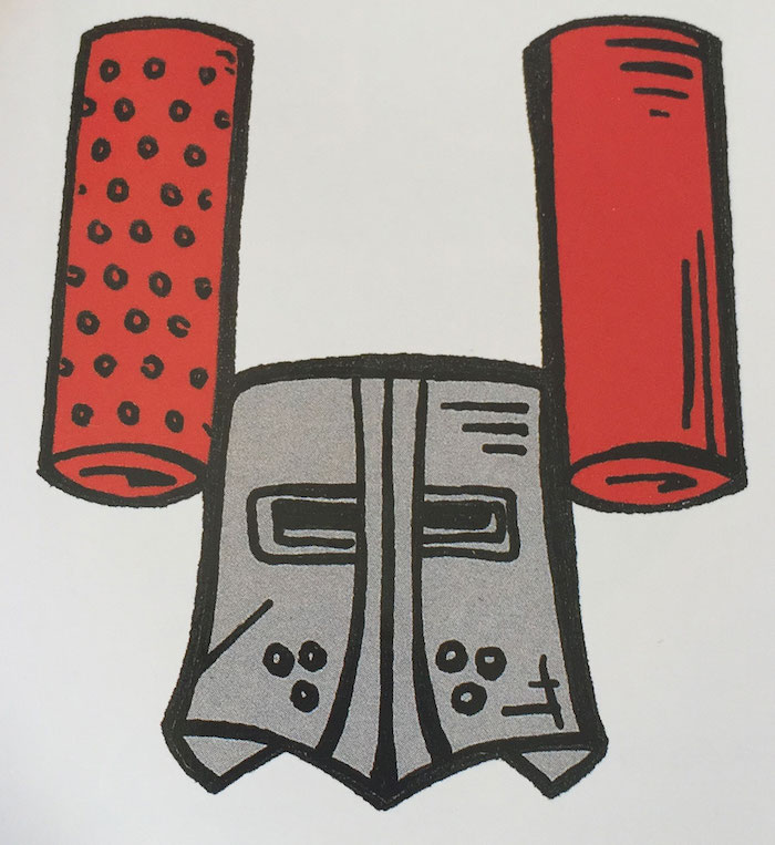
 The Master of the Kitchens to the Holy Roman Emperor had a peculiarly job-specific crest, featuring a cheese grater and noodle flattener
Heraldic devices could also reflect the family occupation. Consider the Hungarian gentleman István Várallyay’s arms, awarded in 1599 for his service to the Hungarian cavalry as a gelder of horses: azure a penis with balls, argent an arm, vert with mallet argent.
Another form of theoretical arms came in the form of “marks of abatement.” Should a knight dishonor himself, his master could redact that knight’s heraldic device to reflect the shame. (I call these “theoretical” because an abated device wasn’t usually displayed after the embarrassing episode, simply abandoned.) Flipping the shield upside-down is the most common abatement, denoting a traitor, but many others were meticulously worked out: for instance, an orange square (or “tenny,” a less frequently used tincture) within a shield marked “he who revoked his own challenge” in a duel. The erstwhile Earl of Carlisle got his arms revoked by King Edward II in fourteenth-century England in an elaborate, humiliating ritual: the sword he received upon knighthood was reclaimed and broken across his skull, and his gilt spurs were hacked from his heels.
3. It’s more global and far-reaching than you’d think.
I got most of my heraldry facts from two stupendously interesting books: The Complete Book of Heraldry by Stephen Slater and Heraldry: An Introduction to a Noble Tradition by Michel Pastoureau (who, coincidentally, also wrote The Devil’s Cloth: A History of Stripes, a kind of lodestar inspiration for Patternalia.) Slater’s book traces how heraldry spread beyond Europe’s borders, but also touches on parallel visual systems in non-Western cultures.
 Maruni Mitsu(ba) Aoi, the hollyhock crest of the Tokugawa clan via Wikipedia
In an interesting historical accident, Japan sprouted its own system of heraldry, mon, during roughly the same period as the medieval Europeans (eighth to seventeenth centuries). As in Europe, mon was an outgrowth of feudalism.
Originally embroidered badges for courtier costumes, the chrysanthemum was reserved for the mon of the imperial family, but allowed other courtly families to nab their own device. Flowers, insects, animals, fish, ideograms, and geometric designs burst from the round shields. Courtiers liked plums, sheaves of rice, ginger, cedar, and carnations; rabbits, rats, tortoises, and bats were also popular. Much simpler in design than European heraldic devices and less regulated in color, mon are bold and streamlined, uncannily evocative of present-day logos.
 Hana Wachigai, the mon of the Izumo Genji clans
Japanese military families sniffed at the effete imagery favored by courtiers and plotted their own. Bristling with swords and axe blades, sometimes interleaved between flower petals, military mon spread over hata (battle flags), tobari (curtains used to cordone off the commander’s camp quarters) and hitare (a silk garment worn under one’s armor, with only the sleeves and leg coverings visible). By the late seventeenth century mon filtered down to any social class, starting with those close to the inner circles of mon, like the kabuki actors and courtesans who entertained samurai and court officials.
And there you have it. Heraldry hopefully just went from snooze-worthy and invisible to sparkling and extraordinary in your estimation. I bow deeply (or curtsy dancingly?) and exeunt stage left, pursued by a bear rampant. The scrolling motto written in ribbons under this post should be: May you embrace your own visual-culture nerdiness and revel in it!







 Jude Stewart writes about design and culture for Slate, The Believer, Fast Company and Print among others. Her first book,