July 16, 2014
Parametric Posters from MuirMcNeil

Since the early 20th century, many designers have explored the construction of typefaces and lettering whose individual forms are conceived as variable components in systems of geometric difference regulated by underlying grid structures. These activities can be seen as either an exponent of — or a response to —communication practices predicated on a modernist worldview.
Founded in 2010 by Paul McNeil and Hamish Muir, MuirMcNeil’s first typographic collaboration began as a research project at the London College of Communication (where they both teach). What resulted was the award winning ThreeSix type system, published by FontFont in 2011.
Earlier this year, the studio published four new parametric type systems, each accompanied by a silkscreen poster. These posters are for sale at reduced rates until the end of August on their website.
The pair define parametric design as work that “explores the dynamics of space and hierarchy in systematic ways”. They explain further: “We establish rules or conditions to generate form that can be played out in a wide range of permutations or iterations: to make things which surprise and delight us and hopefully others – these are usually typographic – the pleasure is in seeing unexpected outcomes; things that can’t be imagined but can only be discovered.”
![]()
Panopticon
Named after a form of polygonal building devised in the Eighteenth century by Jeremy Bentham to facilitate controlled and concealed viewpoints, Panopticon is a system of three-dimensional display typefaces in four orthographic projections. Each of the projections is subdivided into four separate typeface layers which are designed to interact with one another, offering a wide range of visual possibilities for designers. The screen-printed poster explores one such interaction by overlaying / offsetting the word panopticon (split onto four lines), using overprinting to emphasize the abstract nature of the letterforms which are constructed from a set of core common elements. The poster is an attempt to locate the edge between reading and pure form; depending on lighting conditions and viewing distance, it reveals the word ‘panopticon’ or fragments to a pattern of abstract geometrical shapes.

Nine
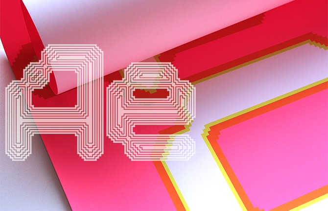
Nine is a geometric type system with both varispaced and monospaced versions – Nine Metric and Nine Mono, which are available in nine weights. Both have been designed for use in text or display. Nine operates within strict geometric constraints; all the glyphs are constructed from vertical, horizontal and forty-five degree oblique segments terminated by circular arcs. The strokes of each weight align on a central horizontal and vertical axis onto which weight is added incrementally. In this way, width, stroke, cap-height, x-height, ascent and descent are modulated vertically and horizontally on a fixed grid. The grid also determines consistent character and word spacing. As contour weights become bolder, the resulting decrease in side-bearing values tightens the overall fit of character sequences, visually emphasizing the increase in weight. The silkscreen poster celebrates the simplicity of the forms at large sizes which is further enhanced by the filling in of the counters in the os and the e.

Interact
Interact was originally designed by 8vo in 1994 as a system of grid-based bitmap typefaces for screen use in four fixed sizes. Taking as a starting point the optical characteristics of the stroke junctions in Wim Crouwel’s vormgevers lettering of 1968, Interact employs horizontal and vertical lines as well as forty-five degree pixel steps to modulate a set of stroke junctions which have the effect of optically rounding the letterforms. The silkscreened poster explores the potential for using the various weighted contours of one size of Interact to create a typographically based gradation of white interior space from bottom to top. The weight modulation is enhanced by the overprint of the neon green on neon pink to create an orange-brown. Colors have been adjusted in this poster to optimize this effect. It has two forms — one for day, one for night.

Intersect
Intersect is a geometric bitmap type system that subverts typographic weight. Traditional type designs can only provide a binary contrast of black and white, form and counterform. Intersect exceeds this limitation by emulating a successive range of linear screens to give the illusion of tint densities within the body of the type. The screen-printed poster is based on the same compositional idea as Interact (appropriate as the typefaces share a set of common core letterforms). The screen meshes of the light green and white lettering remain the same from top to bottom; the purple overprint increases in mesh density from top to bottom. The poster is designed to be abstract at close viewing distances, with the ‘gestalt’ of the letterforms only being revealed at greater distances.
Observed
View all
Observed
By The Editors
Recent Posts
Sam Furness got serious about investing in his curiosity. Now, he’s helping others do the same. Corporate crisis is design’s opportunity In a world that feels impossible to change, emerging designer Deborah Khodanovich is starting small Elixir Design founder Jennifer Jerde believes in the human touch
 Design Observer is edited by Ellen McGirt and Rachel Paese, along with Sheena Medina and Alexis Haut.

