September 8, 2011
Stealth Iconography: The Waveform
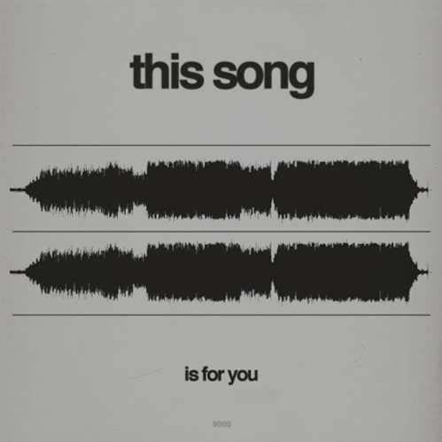
What visual sign says “music”? Notes remain the most typical answer – particularly, it seems, beamed eighth or quarter notes (see the iTunes icon); the solitary eighth note with its jaunty flag; and the clef. The disc shape has had a pretty good run, and you still see instances involving headphones (Napster’s logo, for instance). Maybe representations of speakers and guitars would make the list, too. But if you want to suggest music in the digital era, how about the waveform?
As iconography, the waveform’s rise has been even more stealthy than the Google Maps pin: It’s not really associated with any specific service or product— although I may contradict that slightly below — but rather with digital sound in general. But as with other distinctly visual forms encountered mostly via bits, its progress can be gauaged by the fact that it has inspired some to de-digitize it into the physical world.
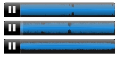
Steve Reich remix contest winners, via Disquiet
My friend Marc Weidenbaum, on his indispensible site Disquiet, has written about this manner of looking at music several times. Late last year, after Nonesuch announced the winners of a Steve Reich remix contest, he looked at the results and wondered: “How do the waveforms of winners compare and contrast with those of the losers?” His full consideration of that question is here, but in short he suggested that three winnings entries “show considerably less internal variety than do the ones that they bested, at least in the manner this waveform algorithm indicates.” He’s also written about “looking at” the sound of fireworks, and in a recent email exchanged observed: “If you look at a radio pop song’s waveform, it is, to me, absolutely disheartening how the chorus looks the same every time it pops up.”
Music-sharing site SoundCloud should get a lot of credit for advancing the waveform as a sonic-signifying symbol. Users of that service upload musical creations that are always represented by the resulting waveform, which the site asserts “not only makes sound look good, it makes it social.” (Other users can leave comments at specific spots along the waveform.) There are even SoundCloud groups that are explicitly waveform-centric, such as Pretty Waveforms (“tracks with unusual, pretty or downright gorgeous waveforms,” regardless of genre) and Waveform Art. Perhaps we’re still a ways from adopting the waveform labeling system suggested by Joshua Distler below (via Culturite) — but it’s easier to imagine a future for that scheme than for the compact disc.
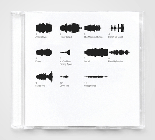
Waveform labeling system by Joshua Distler below, via Culturite
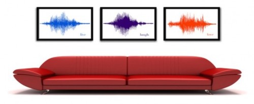
The waveform is also a symbol that suggests more than music. As Marc pointed out to me, field-recording database Freesound.org actually made the waveform central to its visual identity prior to SoundCloud. And more recently, David Bizer’s Waveform Necklace (via FashioningTech.com) can be based on “any kind of audio sample,” including a recording of your voice. (Earlier, geeksugar noted a Bizer-made bracelent, evidently part of his thesis project, that took the form of a bracelet physically manifesting the waveform resulting from “parents imparting advice to their teens about drug use; via The New Aesthetic.) Sakurako Shimizu’s “waveform series” (via Craft) has included jewelry based on the sounds of sneezes, giggles, and a church bell. Barreling up to, if not beyond, the kitsch border, BeSpoken Art (via PSFK) offers to convert recorded phrases, or a song, “pet sound,” or “company slogan,” into wall-displayable format.

Waveform Necklace by David Bizer, via FashioningTech.com
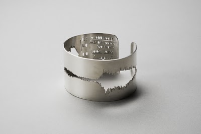
“Bell“ (silver cuff bracelet based on waveform of church bell), by Sakurako Shimizu. via Craft
BeSpoken Art, via PSFK
Anyway, drawing conclusions about sound by looking at a waveform has some resonance with “reading” musical notation, but it isn’t quite the same thing. Then again, given how many people first encountered waveforms via Pro Tools or other editing software, it’s a symbol that suggests something beyond listening (as a disc shape or headphones might). Precursors to today’s digital waveforms have been used to initiate music — lines drawn on film and fed into a Variaphone is one example; Oramics is another — but it seems more accurate to associate them with revising music (in addition to listening, of course).
At the same time, a waveform captures something precise. Consider the cover of composer Ken Ueno’s CD below. Yet again I have Marc to thank for bringing it to my attention: He tells me that in a Twitter exchange not long ago, Ueno said the cover “has a waveform painted-in with my blood.” And as you can see, that image is overlaid by handwritten musical notation. It’s a useful and clever juxtaposition: Notes on sheet music are meant to be interpreted, but a waveform is a visual record of a very specific interpretation. It’s an image that speaks of the human tradition of music and, thanks to the presence of that increasingly familiar waveform, a suggests something about where that tradition is headed, right now.

Observed
View all
Observed
By Rob Walker
Related Posts

Innovation
Ashleigh Axios|Essays
Innovation needs a darker imagination

Business
Kim Devall|Essays
The most disruptive thing a brand can do is be human
AI Observer
Lee Moreau|Critique
The Wizards of AI are sad and lonely men
Business
Louisa Eunice|Essays
The afterlife of souvenirs: what survives between culture and commerce?
Related Posts

Innovation
Ashleigh Axios|Essays
Innovation needs a darker imagination

Business
Kim Devall|Essays
The most disruptive thing a brand can do is be human

AI Observer
Lee Moreau|Critique
The Wizards of AI are sad and lonely men

Business
Louisa Eunice|Essays

 Rob Walker is a technology/culture columnist for