
March 19, 2004
The Book (Cover) That Changed My Life
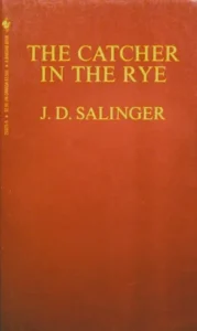
Tom Kluepfel, KleenEx Libris, 1987
It’s a strange, even ugly, color combination. Solid maroon with lemon yellow type: it looks like PMS 194 and PMS 116. One of the most generic typefaces in the world, Times Roman, set in all capitals, two slightly different sizes, with no particular finesse. The back looks just like the front. Nothing else.
Yet, using nothing more than these peculiar — dare I say crumby? — ingredients, the cover of the old Bantam paperback edition of The Catcher in the Rye has the power to move me like few other pieces of graphic design.
I can still remember the first time I saw it. It was in the “Young Adult” section of my local library, on a rotatable wire rack. I must have been in the seventh grade. The other books on the rack — It’s Like This, Cat; The Outsiders; Go Ask Alice; Irving and Me — all had illustrations on the front, usually peculiarly out-of-date, although perhaps only by months in the fast-moving time continuum of teenage fashion. Punks in leather jackets, preppies in checked button-down shirts and khakis. Handlettered titles for that “youthful” feel.
Catcher in the Rye was different. I think the only other book I knew at that point that had a type-only cover was the Bible. Was this book making the same claim to authority? And that title: what did it mean? I had heard, somehow, that Catcher in the Rye was transgressive and quirky, although I couldn’t have known then of all the local school boards that had sought to ban it (as they do to this day), or of the self-imposed isolation of its author, J.D. Salinger (which continues to this day.) I took it home, brought it to my room, began reading, and didn’t move a muscle until I was done.
Of course, I’m not alone in this. College admissions officers are resigned to the fact that, if asked to write an essay on The Book That Changed My Life, the majority of students will pick Catcher in the Rye. Or read the 2,260(!) customer reviews on Amazon if you doubt its enduring appeal.
The book does not have that cover now, and it did not have it when it was first published. The dustjacket on the original 1951 edition, designed by Michael Mitchell, had a Ben Shahn-style drawing of a carousel horse dwarfing the skyline of uptown Manhattan, an image clearly inspired by the book’s “so damn nice” final scene. Early in its paperback life, I recall it had an incarnation I hated: a drawing of protagonist Holden Caulfield wearing the Sherlock Holmes-style hat described in the book (but looking much dorkier, somehow, than I had pictured him in my mind).
Then somewhere along the way (Was it the mid-sixties? My attempts to find a chronology have been unavailing), Catcher acquired the cover it bore when I checked it out for the first time. I’ve heard rumors, but have not yet found any proof, that Salinger so hated the earlier illustrations that he insisted that the covers of all his books be type-only. Certainly this was borne out by the U.S. paperback editions of his other three books then in circulation. Nine Stories had its grid of colored squares (courtesy of Pushpin); the two Zen-themed books about the Glass family, Franny and Zooey and Raise High the Roofbeam, Carpenters both bore someone’s idea of Asian-flavored lettering.
But for me, the maroon cover of Catcher has a special place. Blank, enigmatic, vaguely dangerous, it was the perfect tabula rasa upon which I could project all my adolescent loneliness, insecurity, anger and sentimentality. It was as if possessing it provided a password into an exclusive club, even if that club existed only in your own mind. I wonder if a different cover, a more “designed” cover, could have been able to contain quite so much emotion and meaning.
Well, Catcher in the Rye has a different cover now. More than ten years ago, its publisher did what any intelligent marketer would do. They created a Unified Look and Feel for the Salinger Brand. Now all four of the paperbacks have identical white covers, identical black typography, and — here my heart sinks — a little sash of rainbow-colored stripes up in the corner. No horrible pictures of Holden and his hat, thank God, but those happy little lines just seem to be…what? I guess they’re trying a little too hard for my taste. As Holden Caulfield might say, the new covers just look phony. The old one was just so goddam nice, if you know what I mean.
Observed
View all
Observed
By Michael Bierut
Related Posts

Innovation
Ashleigh Axios|Essays
Innovation needs a darker imagination

Business
Kim Devall|Essays
The most disruptive thing a brand can do is be human

AI Observer
Lee Moreau|Critique
The Wizards of AI are sad and lonely men
Business
Louisa Eunice|Essays
The afterlife of souvenirs: what survives between culture and commerce?
Related Posts

Innovation
Ashleigh Axios|Essays
Innovation needs a darker imagination

Business
Kim Devall|Essays
The most disruptive thing a brand can do is be human

AI Observer
Lee Moreau|Critique
The Wizards of AI are sad and lonely men

Business
Louisa Eunice|Essays
