

January 27, 2016
The D Word: Vernacular Signage

That type should always be a “crystal goblet” is an ideal perpetuated by typeface expert Beatrice Warde in a 1955. “Type well used,” she said, “is invisible as type, just as the perfect talking voice is the unnoticed vehicle for the transmission of words, ideas.” But tell that to sign makers. They don’t know the meaning of invisible; their job is to make words scream—very loudly!


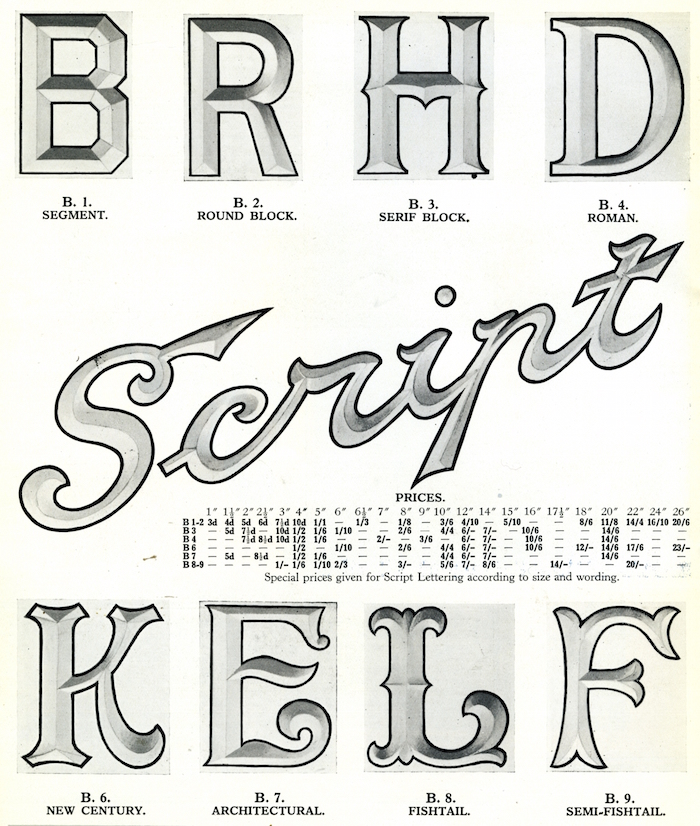

Back then, graphic or environmental designers rarely lifted a hand in the design of these quotidian signs. Although signmaking was a specialty, artists, carpenters, metallurgists and engineers were involved. This accounts for why the families of letters were referred to simply as “Lead Coated Sheet Steel” or “Recessed for Neon Lighting.” Letters were not part of a font nor were they exactly copies of the printed version. The only direction was to make them as eye-catching from a distance as possible—and customers were advised to keep them maintained lest they loose their brilliance.
Observed
View all
Observed
Share on Social
By Steven Heller
 Steven Heller is the co-chair (with Lita Talarico) of the School of Visual Arts MFA Design / Designer as Author + Entrepreneur program and the SVA Masters Workshop in Rome. He writes the Visuals column for the New York Times Book Review, a weekly column for The Atlantic online and The Daily Heller.
Related Posts

Innovation
Ashleigh Axios|Essays
Innovation needs a darker imagination

Business
Kim Devall|Essays
The most disruptive thing a brand can do is be human

AI Observer
Lee Moreau|Critique
The Wizards of AI are sad and lonely men

Business
Louisa Eunice|Essays
The afterlife of souvenirs: what survives between culture and commerce?
Recent Posts
Wayne Suiter Matamoros|Peru's Sacred Valley
Looking to Latin America for the future design innovation Pope Leo XIV weighed in on the AI conversationJessica Helfand|The Icarus Diaries
20: Deus ex Machina Nina Katz’s answer to growing anti-trans rhetoric: nine larger-than-life portraits of the people she wants you to meetRelated Posts
Innovation
Ashleigh Axios|Essays
Innovation needs a darker imagination
Business
Kim Devall|Essays
The most disruptive thing a brand can do is be human
AI Observer
Lee Moreau|Critique
The Wizards of AI are sad and lonely men
Business
Louisa Eunice|Essays