Business • Media • Typography
September 19, 2005
The Guardian’s New European Look

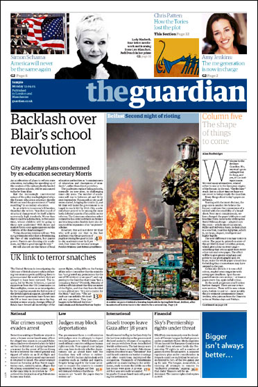
The Guardian, front page, 17 September 2005. Creative director: Mark Porter
There was an immediate flood of opinion when The Guardian‘s widely anticipated redesign appeared last Monday — much of it in the Editors’ Blog on the paper’s website. But it seemed best to consider at least a week’s worth of papers before commenting. Even now, any assessment can only be provisional. It can take months before the full potential and strengths of a newspaper redesign become apparent. A paper is an instrument and its editors and designers have to learn how to play it to perfection.
There can be no better illustration than The Guardian‘s previous design. David Hillman’s new look was a radical departure in 1988 and, at the time, many readers expressed dismay. Designers Simon Esterson and Mark Porter built on Hillman’s kit of parts to create a classic design that expressed The Guardian‘s editorial essence not only in the main paper, but in every scrap of print it produced. The Guardian exuded authority while looking fresh, contemporary and approachable. Hillman’s brilliant masthead, composed of “The” in Garamond italic and “Guardian” in Helvetica bold, was justly regarded as an icon. (Hillman has spoken out against the redesign.)
But the paper had no choice but to change. Its presses were old and would soon need replacing. In 2003, two broadsheet rivals, The Independent and The Times, changed to a tabloid format. Research has consistently shown that commuters prefer smaller papers which are easier to handle in confined spaces. The Independent has its admirers and has produced some memorable, campaigning front pages, but both papers look miscast in this attire, their traditional broadsheet typography ill at ease within a format better suited to fist-swinging tabloid journalism. Visually, they are shadows of themselves.
The Guardian‘s choice of the “Berliner” format, half-way between broadsheet and tabloid, is an inspired alternative. The paper is the first British title to adopt this European page size (315 x 470 mm), also used by Le Monde in France, the Neue Zürcher Zeitung in Switzerland and Repubblica in Italy. Elegant, well-proportioned pages make The Times and The Independent look like poor relations. These competitors must be seething at being trumped by a paper that has already succeeded in establishing itself as an international force. More than 10 million people a month around the world read The Guardian‘s digital edition, which is available free of charge until 26 September, allowing visitors to sample the new design. Since 9/11, The Guardian has joined the BBC as a major non-American news source for US readers and its letters pages often feature American correspondents.
The most controversial change is to the masthead. Guardian creative director Mark Porter commissioned British designer Paul Barnes and American designer Christian Schwartz to create a new typeface family, Guardian Egyptian. Any convincing redesign probably needs to go all the way, but the new lowercase masthead reversed out of a blue bar, though modern enough, is no match for Hillman’s classic and I doubt it will prove as durable. The headlines lack impact compared with Hillman’s Helvetica — a broadsheet innovation in its day — though they are certainly refined.
The main problem with the front page is the fold. This creates a visible surface smaller than a tabloid and, when turned sideways on a newsagent’s shelf, it does little to attract attention. The unnecessarily large teasers and the masthead monopolise more than half of the visible area. Unfolded, the front page is attractive, but it remains to be seen whether the new five-column grid, which replaces an eight-column grid, has enough flexibility. In the first week, the paper used two picture placements twice on the front page — a slightly worrying sign. The row of news summaries at the bottom further reduces the space available to create striking lead stories. So far, the front pages have lacked the old Guardian‘s news focus and drama. They are trying to squeeze too much in.
Inside the main paper, the pages are clearly structured, with sharp headlines and good use of white space, and the different weights of Guardian Egyptian give plenty of typographic variety. News reports are justified; commentary and opinion ranged left. The pages may be smaller but there appears to be no reduction in words: the broader columns seem to hoover them up. The “Comment & Debate” section now fills three pages. Obituaries have expanded from one page to two and there was even space for a full-page appreciation of Henryk Tomaszewski by British image-maker Andrzej Klimowski, illustrated in colour, an unprecedented amount of coverage for a graphic designer.
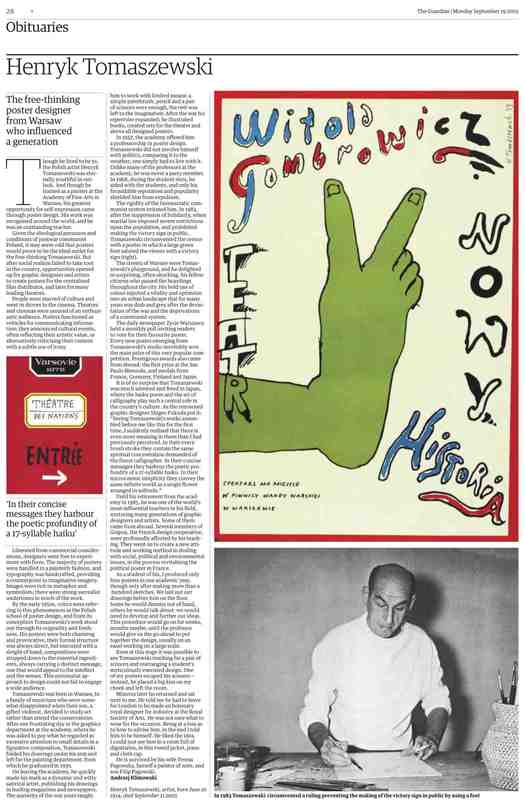
The Guardian, Obituaries, 19 September 2005. Creative director: Mark Porter
The Guardian is the first British paper able to print colour on every page. This is seen to most striking effect in the “Eyewitness” centrespread dominated by a single, huge, cinematic photograph — one showed artist Marc Quinn working on a sculpture of a disabled woman bound for Trafalgar Square in London, another plunged the viewer into a riot scene in Belfast. The quality of the colour was generally excellent, though there were sometimes registration problems. There was also a tendency to overuse the new resource. Do we really need to see colour pictures of so many Guardian writers? What does it add? Let’s hope the paper remembers the power and subtlety of black and white once in a while.
I was less convinced by the daily feature supplement G2’s new format. As a tabloid, it worked perfectly. Now stapled, it has shrunk to half the Berliner, making it more like a magazine, though it’s still printed on newsprint. The fold is off-centre giving it a scrappy, unfinished look at odds with the design’s refinement. One welcome piece of visual journalism is a weekly, two-page “G2 Graphic” by information designers Grundy & Northedge. Last week’s focused on the arms trade and the latest topic was oil prices. The Guardian has excelled at this kind of thing, particularly in its special supplements on subjects such as surveillance and food, and it’s to be hoped the paper does more. Another new G2 visual feature by art critic Jonathan Jones, analysing a photo in the news using superimposed captions, didn’t quite come off, but this is certainly an idea with potential.
Other sections — Sport, Media, Education, Technology, Film and Music — are printed in the Berliner format. They work well enough but ironically they are less easy to handle than the previous tabloid versions, and because they are the same size as the main paper, they look less distinctive, too. One disappointment was the reformatting of the formerly tabloid-sized Saturday Review. Beautifully judged, this was one of the high points of the old design, a mark of the paper’s creativity, confidence and panache, and a rousing blow against the dumbing down of contemporary cultural life. It gave dedicated literary papers such as The Times Literary Supplement and London Review of Books a run for their money and it was always a treat. The new Review is just ordinary, resembling any other weekend culture supplement, even if the writing remains as good as ever. Here again, the Berliner reveals its drawbacks, while the riot of sections — Family, Money, Work, Travel — announced by huge slab serif titles in supposedly enticing candy-wrapper colours makes you all the more appreciative of the main paper’s restraint.
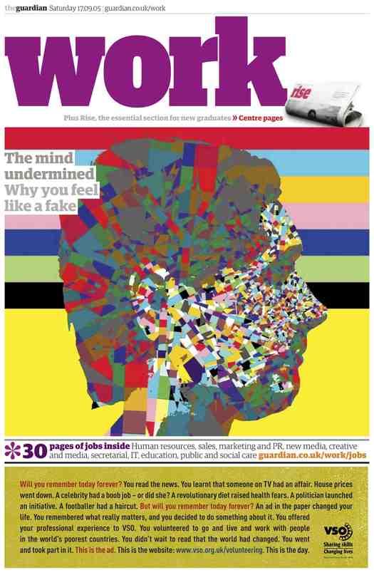
The Guardian, Work supplement, 17 September 2005. Creative director: Mark Porter
Despite some reservations, my reaction to the redesign is positive. The Guardian, owned by the Scott Trust, is one of the world’s great newspapers, a true independent and a vital alternative voice at a time when too many papers are run by a handful of proprietors pushing their own political agenda. I rarely miss it and I can’t wait to see if the paper can develop a presence that expresses its ethos as persuasively as the previous design. As the editors and designer point out, the Internet has changed printed newspapers for ever. Much of The Guardian‘s international success has come from the symbiotic link between paper and website. The next step will be to reflect the new identity online and Neville Brody, the site’s original designer, is reported to be working on it. The Guardian‘s bold new format sets it apart from its rivals and any paper that wants to follow its example will need to find £80 million to buy new presses and fund the exercise. It will also need an uncommonly imaginative belief in the possibilities of design and that could be a lot harder to acquire.
Observed
View all
Observed
By Rick Poynor
Related Posts
Innovation
Ashleigh Axios|Essays
Innovation needs a darker imagination
Business
Kim Devall|Essays
The most disruptive thing a brand can do is be human

AI Observer
Lee Moreau|Critique
The Wizards of AI are sad and lonely men
Business
Louisa Eunice|Essays
The afterlife of souvenirs: what survives between culture and commerce?
Related Posts

Innovation
Ashleigh Axios|Essays
Innovation needs a darker imagination

Business
Kim Devall|Essays
The most disruptive thing a brand can do is be human

AI Observer
Lee Moreau|Critique
The Wizards of AI are sad and lonely men

Business
Louisa Eunice|Essays

 Rick Poynor is a writer, critic, lecturer and curator, specialising in design, media, photography and visual culture. He founded Eye, co-founded Design Observer, and contributes columns to Eye and Print. His latest book is Uncanny: Surrealism and Graphic Design.