April 30, 2012
The Poster that Launched a Movement (Or Not)

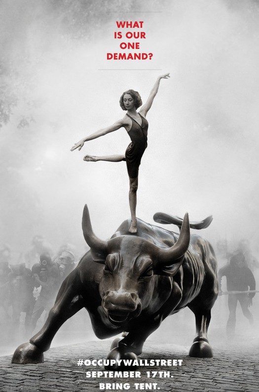
Poster, Adbusters, July 2011
Occupy Wall Street began with a poster. Adbusters co-founder Kalle Lasn described the moment in an oral history of the movement published earlier this year in Vanity Fair.
We put together a poster for the July issue of Adbusters. The poster was a ballerina — an absolutely still ballerina — poised in a Zen-ish kind of way on top of this dynamic bull. And below it had the [Twitter] hashtag #OccupyWallStreet. Above, it said, “What is our one demand?” I felt like this ballerina stood for this deep demand that would change the world. There was some magic about it.
The Vanity Fair article was illustrated with a half-page spread photo of protesters retaking lower Manhattan’s Zuccotti Park after being temporarily evicted on November 15. There were also portraits of many of the protagonists in the OWS movement. What wasn’t shown was the poster that started everything. Six months into the movement, I had never seen it. Chances are, neither have you. Because the poster — so elliptical, poetic and provocative in that characteristic Adbusters way — didn’t matter at all. The ballerina didn’t matter. The bull didn’t matter. The headline didn’t matter. Only one thing mattered: that hashtag at the bottom.
So, here the question. In the age of social media, does political graphic design matter?
It all seemed settled in 2008. Then, the answer was an emphatic yes. Shepard Fairey created a poster, later adopted by the Obama campaign, that will certainly rank as one of the most ubiquitous and effective pieces of political graphic design of the decade, if not the century. The Obama campaign itself seized the methods of contemporary consumer brand management and deployed logos, colors, and typography with a sophisticated precision that was revolutionary in the usually flat-footed world of campaign graphics. And the accessibility of communications tools made it possible for millions of people to download the campaign’s graphic assets and contribute their own designs.
Four years later, everything seems different. Make no mistake, OWS has not lacked for graphic support, both professional and grassroots, including a response from the reliable Shepherd Fairey. And over on the mainstream side of the political spectrum, the 2012 presidential contests predictably have generated a deluge of red-white-and-blue campaign graphics that in turn have been predictably been subjected to analysis. But am I wrong that this year conventional graphic design seems like an inefficient way to make a point, never mind to create or fuel a political movement?
Consider, on the other hand, the genius of that simple #occupywallstreet hashtag. Three little words, with a call to action built right in. And, also right there was the potential for an articulated brand architecture that any corporate identity expert could envy. “Occupy” sits in the master brand position. Fill in the blanks for a potentially infinite number of user-generated subbrands, from Occupy Amarillo to Occupy Zurich. Elsewhere in the OWS communications arsenal, we find other slogans (“We Are The 99%”) and some visual tropes (the Guy Fawkes mask popularized by Anonymous, now an emerging public “face” for the protest). But no typeface guidelines, no color standards, no official logos.
Of course, the goals of OWS have been elusive from the start, and clarity of message has almost always taken a backseat to the chaos of participatory democracy in action. I suspect that many of its supporters would insist that the last thing OWS needs is something as simple and reductive as a logo. Instead, many of the most effective contributions made by designers have taken the form of old fashioned information graphics like those from Jake Levitas and Occupy Design, which range from visualizations of income disparity to icons identifying recycling stations at protest sites.
Perhaps, however, the inability of OWS to develop a coherent graphic language is symptomatic of a larger challenge. Can a grassroots movement mature into a viable political force? An answer may come this week. Occupy Wall Street has called for a “general strike of the 99%” on May 1, the traditional workers solidarity day. What will the turnout be? Will spring weather bring, as some have predicted, a rededication to the cause? Or is the movement too diffuse to gain the traction it needs to move to the next stage?
One thing is certain. The graphic designer who has played the most dramatic role in the rise of Occupy Wall Street, isn’t Shepard Fairey or Jake Levitas. On September 24, 2011, a group of peaceful protesters in Manhattan were pepper sprayed by police officers. The incident was captured on video and posted to YouTube, where it has been viewed over 1.5 million times. “When the pepper-spray video came out, that was the hook,” said an activist in the Vanity Fair oral history. “That’s what made people focus on Occupy Wall Street.” The central figure in the video is a woman named Chelsea Elliott, who was subsequently identified as…a freelance graphic designer.
Sometimes, the key to political change isn’t designing a logo or poster. It’s simply having the courage to show up and make your voice heard, no matter what the cause —and no matter what the risk.
Observed
View all
Observed
By Michael Bierut
Related Posts

Innovation
Ashleigh Axios|Essays
Innovation needs a darker imagination
Business
Kim Devall|Essays
The most disruptive thing a brand can do is be human

AI Observer
Lee Moreau|Critique
The Wizards of AI are sad and lonely men
Business
Louisa Eunice|Essays
The afterlife of souvenirs: what survives between culture and commerce?
Related Posts

Innovation
Ashleigh Axios|Essays
Innovation needs a darker imagination

Business
Kim Devall|Essays
The most disruptive thing a brand can do is be human

AI Observer
Lee Moreau|Critique
The Wizards of AI are sad and lonely men

Business
Louisa Eunice|Essays
