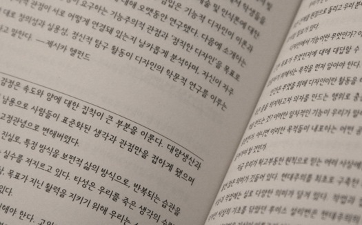
What’s “Crystal Goblet” in Korean?

What constitutes academic “research” in graphic design is an unresolved debate. While educators seem to agree (at last) that design theory and history are crucial for academic study and practice, such subjects still produce anxiety among those for whom English is a second language. Does it bother you that some of your academic associates struggle to understand English? Does it matter to your students? If you recognize the contributions made by designers from non-English-speaking countries to today’s professional discourse, then the answer should be yes.
English is a world language. Many would argue — and I would agree — that mastery of English is necessary for involvement in an international dialogue about design: I communicate in English daily with students and colleagues and have done so for years. A different problem arises, however, when I conduct academic research. Having spent my first 30 years in Korea, I required about five years simply to get up to speed with the required texts.
I struggled not only with sophisticated language but also with historical and contemporary concepts: “Crystal Goblet,” “First Things First,” “Modernism,” “Post-Modernism” — all of these were alien ideas until I entered the CalArts MFA program in 2004. I knew about psychedelic music but wasn’t familiar with its graphics. I encountered David Carson and Neville Brody’s work, but read no real descriptive or critical analysis of it. Neither Emigre nor the work of Cranbrook students or faculty crossed my path.
I became comfortable with some ideas. By the end of my undergraduate study, I had gained quite a good understanding of the New Typography, thanks to a Korean translation of Jan Tschichold’s Asymmetric Typography by the designer Ahn Sang Soo. But it was a rare example.
It is difficult for most native members of Western graphic design culture to comprehend how much discourse is based on that shared heritage and how disadvantaged are designers and students from outside. When I started my graduate study, I struggled, with the help of my teachers and fellow students, to catch up with my colleagues’ body of knowledge. If I had had a chance to read at least basic contemporary perspectives before I came to the U.S., my contribution to class research efforts would have be better. The graph below shows the rough number of Korean translations of design books published annually.
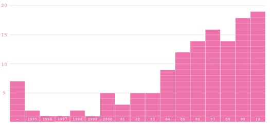
As you can see, the quantity falls far short of the number of English editions available. Design Observer’s “Books Received” section presented 159 titles about design and visual culture in 2010 alone. Hennessey + Ingalls sold 413 volumes published in 2010 in its graphic design category. Both lists far exceed the total number of Korean translations in all design disciplines.
One can hardly consider contemporary graphic design without the influence of designers from Korea, China, Japan, Russia, Holland, France and other countries. Of the 335 firms or individuals selected in the Art Directors Club’s 90th Annual Awards, more than 30 percent were from countries where English plays no crucial role. (Indian-born scholar Braj Kachru’s Three Circles of English model classifies countries of the world into three groups: The “Inner Circle” consists of countries where English is now used as a primary language. In the “Outer Circle,” English is used officially but not as a first language. And the “Expanding Circle” encompasses countries where English plays no official role but is widely employed as a medium of international communication.) The Phaidon Press book Area 2, which presented work by 100 international graphic designers, featured 61 selections from the non-English-speaking world. The influence of design students is even more widespread. Of 82 awards, Output 2010 presented 66 to students from non-English-speaking countries. Adobe Design Achievement listed 118 semi-finalists from non-English-speaking countries out of 303 total.
Apart from Output, the publishers and awards programs mentioned above are based in the United States, showing that graphic design’s scope is not limited to the English-speaking world—and never has been. The strong current of Asian graphic design is made obvious on American bookstore shelves, as well. Asian Graphics Now (Taschen), Tokyolife: Art and Design (Rizzoli), and 3030 New Graphic Design in China (3030 Press) are comprehensive collections of contemporary Asian design. No matter how glamorous the trophies or glossy the reproductions, however, it’s rare for celebrations of non-Western design to feature any statements by the designers. In all of these books, text is confined to captions or critics’ introductions. Western designers are encouraged to recognize Asian design as merely a superficial style without understanding its cultural context or designers’ philosophy. And Asian designers see Western design in the same way.
A language gap frustrates intellectual exchange between the two design cultures. The need for translation is unquestionable. But who is going to take on the burden?
There are two reasons why so few graphic design texts have been translated into Korean. First, it’s hard to find a qualified translator who’s knowledgeable about the field. Many of today’s design texts were written for trade journals and design conferences. The works are professionally oriented and regularly feature specialized terms. Attempting to rewrite them in a foreign language without being familiar with the particular nuances attached to such words as “modern,” “grotesque,” and “Swiss” is as dangerous as crossing Interstate 78 blindfolded.
Second, the professional rewards are few, and the rare individuals who are eligible to perform translation work receive little compensation for their efforts. The non-English-language book market is relatively small. Only Korean and Japanese designers purchase Korean and Japanese translations. Moreover, books dealing with such specialized subject matter are less likely to be profitable.
Graphic designers with full-time practices have little time to engage in extensive writing projects, even if they possess an aptitude for them. More hope lies with bilingual graphic design academics. Unfortunately, academia is no more supportive of translation than is commercial publishing. Tenure and promotion committees often question the contribution translation makes to the scholarly advancement of a field. My colleague Robert Wojtowicz, an art historian who is associate dean for research and graduate studies at Old Dominion University, noted in a recent e-mail that translation activities weigh little in the promotion and tenure process “unless there is significant material added to the original by the translator, such as an introduction or annotations.”
In other words, a few pages of introduction are accorded academic value, but the hundreds of pages of ensuing translation are not. Even faculty who recognize the importance of this effort rightly regard it as a distraction from their main tasks: publishing original writings and curating exhibitions. This privileging of original authorship further contributes to a body of graphic design research that is regarded as relevant only to the author’s culture — a view that obviously contributes little to design’s future as a scholarly discipline.
Although translation work isn’t accorded academic value, we might agree that it is a creative pursuit that involves significant research — perhaps as much as the production of the original writing. As mentioned above, translating a graphic design text requires knowledge about the field’s history and theory, as well as the cultural place and time in which the text is located. Without understanding the context, nuances of detail and precise connotations are lost. What may be worse than no translation is a mistranslation.
Not only does translation require research, it prompts additional inquiry. After translating Graphic Design Theory, edited by Helen Armstrong (Princeton Architectural Press, 2009), I embarked on a second project, Looking Closer 3 (Allworth Press, 1999), which guided me toward an investigation into 20th-century graphic design. Every essay demanded or inspired me to investigate beyond immediate references. Terms, names and dates and their implied meanings required clarification for readers lacking a Western cultural background. The most challenging of the 55 essays was Jon Savage’s “The Age of Plunder.” In the book’s introduction Rick Poynor described this article as “one of the most incisive commentaries on the graphic design of the early 1980s. The few years since punk had seen a groundswell of design activity in the music business, and graphic imagery created in the subcultural context of the musical “new wave” soon began to exert a powerful influence on the international mainstream of design, which by the end of the 1970s lacked energy and innovative thinking.” “The Age of Plunder” led me to conduct research into 84 British indiviudals involved in TV, film, editorial, style, music and album design.
The undervaluing of translation as an academic research subject means that there are no reliable methodologies or principles for undertaking it. The linguistic structure of Korean is totally different from English. Constructions such as the passive voice, infinitive, relative pronoun, and definite and indefinite article are not used. By the same token, elements of Korean grammar do not exist in English. Semantics offer a similar stumbling block. Even though a dictionary roughly defines word relationships between the two languages, nuances are lost. So translators need to establish a kind of formula for interpreting graphic design vocabulary. Min Choi documents this investigation in the introduction to his Korean translation of Robin Kinross’s Modern Typography: An Essay in Critical History (2009), when he explains the intricacy of choosing among three different Korean words for “modern”: “현대,” “모똔 and “근대.”
As Min Choi notes, Korean and English words are not related in a one-to-one correspondence — and it gets even more complicated with a specialized topic. We still lack conventions about notating punctuation marks in translation. Min Choi outlines his own principles for using parentheses, colons, semi-colons, ampersands, hyphens and quotation marks in translation. (Korean punctuation is used quite differently.) Establishing standardized methods for translating design-related texts, in terms of both form and content, will save future translators effort and reduce the risk of misinterpretation.
Nearly 15 years after its publication, Asymmetric Typography’s Korean-language edition has been joined by Korean translations of other important graphic design books. They are still not enough to connect practitioners and theorists in the East and West. The demand by bilingual designers for English-language design books is greater than ever, but translation shows no promise of flourishing as a research area that provides adequate rewards. I urge educators to recognize that making design texts accessible to a non-English-speaking audience benefits students, designers, theorists and historians on both sides of the language divide. If graphic design education is truly to be truly cross-cultural, spreading ideas to a wide range of people, and bringing in new perspectives, translation should be regarded as an important task.
For those of you who teach, encourage your international students to translate class readings into their native languages. It will require lots of their time, but it’s the only way for them to understand the books’ deeper meaning. And who knows? Some day, one might add another volume to the catalog of graphic design book translations. I would love to see that happen.
Author’s note: Thanks to Kenneth FitzGerald, professor of graphic design in Old Dominion University, for his assistance with this essay.
Observed
View all
Observed
By Jiwon Lee
Related Posts

Innovation
Ashleigh Axios|Essays
Innovation needs a darker imagination

Business
Kim Devall|Essays
The most disruptive thing a brand can do is be human

AI Observer
Lee Moreau|Critique
The Wizards of AI are sad and lonely men
Business
Louisa Eunice|Essays
The afterlife of souvenirs: what survives between culture and commerce?
Recent Posts
Martín Zabaleta|Peru's Sacred Valley
Designing with the Andean principle of Ayni: “What will we choose to give back?” “The world needs what you’re making,” and the deadline is May 29.Jessica Helfand|The Icarus Diaries
17: Solar Complex Sam Furness got serious about investing in his curiosity. Now, he’s helping others do the same.Related Posts

Innovation
Ashleigh Axios|Essays
Innovation needs a darker imagination

Business
Kim Devall|Essays
The most disruptive thing a brand can do is be human

AI Observer
Lee Moreau|Critique
The Wizards of AI are sad and lonely men

Business
Louisa Eunice|Essays

 Jiwon Lee, a graphic designer, type designer and educator, is an assistant professor of graphic design at Old Dominion University. In 2006, he joined Crispin Porter + Bogusky. He has been published in Eye, CA Korea, D-Plus and G Colon and has the translated two design books: Looking Closer 3 and Graphic Design Theory.