Marshall McLuhan, The Gutenberg Galaxy, The Making of Typographic Man, 1962
Typography is far more than type design and layout. It touches on key values of our society: the printed free word, and the democratic discourse. It is thanks to the power of typography that this discourse has assumed the form of a game of argument and counter-argument.
The new-media technology calls into question our accepted notion of typographic communication. Not since Gutenberg’s invention of moveable type in the fifteenth century has typographic communication undergone such a fundamental change as today. The typographic trade finds itself at a crossroads. Can typography still play a significant role when digitization and new media are shaking the foundations of the typographic craft? What direction will it take in its further development?
In The Triumph of Typography, twenty-one international experts in the fields of typography and communication share their expertise with fascinating analyses and examples. This book not only dwells on what moves and inspires today’s typographer, but also elaborates on new developments in the field of typography.
This and next week we offer some excerpts from this new publication.
Ellen Lupton’s text comes from the book's overview of history: “The Birth and Evolution of Typography,” and is an edited version of an essay that appeared in Graphic Design: Now in Production
exhibition catalogue, Andrew Blauvelt and Ellen Lupton (eds),
Walker Art Center, Minneapolis, 2011.
++++
Marshall McLuhan published The Gutenberg Galaxy: The Making of Typographic Man in 1962. No easy read, this rather technical book overflows with opaque excerpts from seventeenth-century poetry and bulk quotes from pioneering scholarship about print’s impact on the modern mind—readers today are advised to approach this book with a double shot of espresso. Despite its density, The Gutenberg Galaxy helped trigger McLuhan’s own remaking from a Canadian English professor into a global intellectual celebrity. The book uses typography in a remarkably aggressive way, breaking up its soporific pages of academic prose with slogan-esque “glosses” set in 18-point Bodoni Bold Italic. Bam! McLuhan was using type to invent the McLuhanism. Five years later, he produced the radical mass paperback The Medium Is the Massage with graphic designer Quentin Fiore, amplifying his early visual experiments to new levels of bombast.
Who is McLuhan’s Typographic Man? The concept of the human individual (an isolated self walled off from the collective urges of society) was born in the Renaissance and became the defining subject of modern systems of government, law, economics, religion, and more. This individual was, McLuhan argued, both product and producer of the most influential technology in the history of the modern West: typography. The use of uniform, repeatable texts transformed the way people think, write, and talk and triggered the rise of a money-based economy and the Industrial Revolution. The vast enterprise of modernity all came down to letters printed on sheets of paper. Movable type engendered the system of mass production. This new way of making things broke down a continuous process into a series of separate operations. The printed book became the world’s first commodity. [1]
What happened to Typographic Man, and what is he doing today? The eyeball was this creature’s supreme sense organ, supplanting shared auditory experiences of preliterate society. McLuhan predicted that in the rising electronic age, the individualism of Typographic Man would succumb to the tribal chorus of the “global village,” whose collective existence was defined by radio and television (dominated by sound) rather than by private acts of reading (dominated by sight). [2]
It hasn’t really worked out that way. Today, our lives contain more typography than ever, served up via text messaging, e-mail, and internet. Letters swarm across the surface of TV commercials and cable news shows, while global villagers in the developing world have discovered SMS as an indispensable business tool. Meanwhile, the collective experiences forged by Twitter and Facebook rely largely on the transmission of text. The most famous McLuhanism of all, “The medium is the message,” fared no better. In today’s world, the medium is often just the medium, as content seeks to migrate freely across platforms rather than embody the qualities of a specific medium. “Device independence” has become a goal more urgent than the task of crafting unique page layouts.
It hasn’t really worked out that way. Today, our lives contain more typography than ever, served up via text messaging, e-mail, and internet. Letters swarm across the surface of TV commercials and cable news shows, while global villagers in the developing world have discovered SMS as an indispensable business tool. Meanwhile, the collective experiences forged by Twitter and Facebook rely largely on the transmission of text. The most famous McLuhanism of all, “The medium is the message,” fared no better. In today’s world, the medium is often just the medium, as content seeks to migrate freely across platforms rather than embody the qualities of a specific medium. “Device independence” has become a goal more urgent than the task of crafting unique page layouts.
Strictly speaking, typography involves the use of repeatable, standardized letterforms (known as fonts), while lettering consists of custom alphabets, usually employed for headlines, logotypes, and posters rather than for running text. During the first hundred years of printing, calligraphy and type fluidly interacted, not yet seen as opposing enterprises. While it is well-known that Gutenberg and other early printers used manuscripts as models for typefaces, it is more surprising to learn that the scribes who were employed in the “scriptoriums” or writing factories of the day often produced handmade copies of printed books for their luxury clientele, using calligraphy to replicate print. [3] Today, a vital collision between idioms of handwriting and mechanical and post-mechanical processes is shaping our typographic vocabulary.
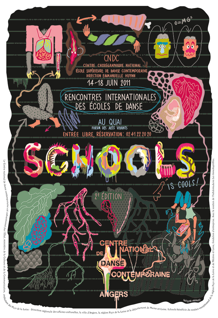
Antoine et Manuel, festival poster for the Centre National de Danse Contemporaine, Angers, 2011
With the introduction of desktop computing in the 1980s, the design and delivery of typefaces changed from a sequence of discrete processes requiring expensive equipment (mass production) into a fluid stream managed by a few producers at low costs (cottage industry). Using desktop software, a graphic designer could now manufacture digital fonts and ship them out on floppy disks. Emigre fonts, founded in Berkeley, California, by Rudy VanderLans and Zuzana Licko, began producing bitmapped typefaces in 1984 that exploited the constraints of early desktop printers. An intoxicating discourse about experimental design sprang up around these fonts, documented in Emigre, its eponymous magazine. By the mid-1990s, the jubilant fascination with high-concept display alphabets (distressed, narrative, hybridized, futuristic) was joined by a demand for full-range, full-bodied type families suitable for detailed editorial design (crafted by highly focused typographers in a field that was becoming, again, more specialised).
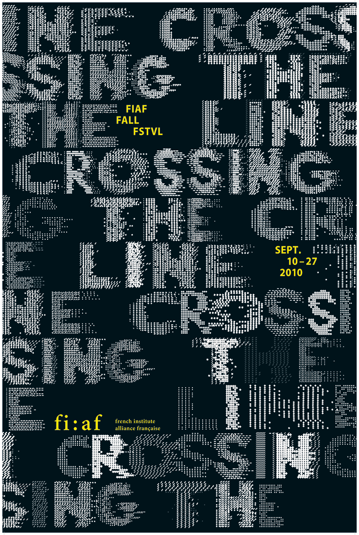
Philippe Apeloig, poster for Crossing the Line, FIAF Fall Festival, 2010
The same technologies that changed the way designers produce typefaces also changed the way we use them. Graphic designers could now manipulate fonts directly, instantly seeing them in their own layouts and testing them in different sizes and combinations. As the procedures of typesetting and layout merged, designers became direct consumers of fonts, no longer separated by layers of mediation from the essential raw material of their craft. In this intoxicating new era of instant alphabetic gratification, designers could not only buy, borrow, and steal digital fonts but could crack them open, violating the original designs to create alternate characters and even whole new typefaces. Designers stirred up the historic confusion between lettering and type in new ways by altering the outlines of existing characters.
Custom lettering is a powerful current in contemporary design. Today, designers like Antoine et Manuel or Philippe Apeloig, combine physical and digital processes to create letterforms that grow, copulate, and fall apart. Handmade letters provide the model for many contemporary typefaces, from Hubert Jocham’s Mommie (2007) to Laura Meseguer’s Rumba (2006) and Underware’s Liza Pro (2009). Many recent script fonts recall the funky headlines that floated the typographic scene in the 1950s and 1960s, when designers such as Ed Benguiat used ink, pen, and brush to create more than 600 original alphabets. The idea of seeking originality in letterforms is a product of nineteenth-century advertising culture. Before then, books were print’s primary medium, and book typography sought to define norms rather than seduce the eye with novelty. The neoclassical typefaces of Bodoni and Didot, with their hairline serifs and severe contrast between thick and thin strokes, opened the way to commercial typography by envisioning letters as a set of structural features subject to endless manipulation (proportion, weight, stress, stroke, serif, and so on). Many of the digital era’s most influential typefaces reference to work of Didot and Bodoni, including Jonathan Hoefler’s HTF Didot (1991), Zuzana Licko’s Filosofia (1996), and Peter Mohr’s Fayon (2010).
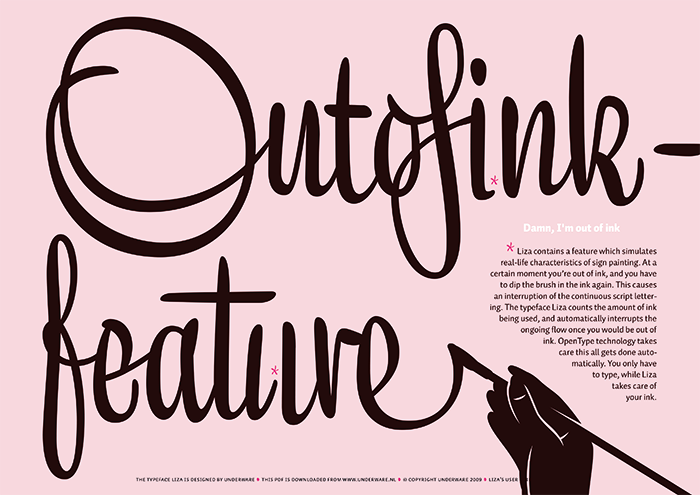
Underware, Liza type specimen, 2009
Type design has arrived surprisingly late to written communication’s biggest event since the Renaissance. The Typographic Man was born in 1450 and fattened up in the candy shops of commercial printing. Alas, during the opening decades of the World Wide Web, his diet was drastically reduced to the half-dozen fonts typically installed on end users’ own computer systems. This situation has finally begun to change, as members of the type design and web communities have agreed on ways to deploy diverse typefaces online without exposing them to shameless piracy. Services such as Type Kit, which legally host fonts and serve them to specific sites, have become big players in the omnivorous expansion of web typography.
The evolution of modern typography is not, of course, all about novelty and spectacle. Countering the restless appetite for sugarcoated change is a parallel hunger for anonymous, recessive purity. Gill Sans, Futura, and Helvetica—standards from the twentieth-century playlist—once laid claim to a cool neutrality suited to international communication in the machine age and beyond. While these classic faces have endured the shifting storms of taste and fashion, designers have sought out ever more subtle shades of basic black. Laurenz Brunner’s Akkurat (2004) has been heralded as "the new Helvetica," while Aurèle Sack’s LL Brown (2011) recalls Edward Johnston’s lettering for the London Underground. Paying soft-deal homage to Futura, Radim Pesko’s Fugue (2010) flaunts a tentative bravado, like a teenager on a motorcycle. Fugue, writes Pesko, “was conceived as an appreciation of and going-back-to-the-future-and-back-again with Paul Renner.” [4]
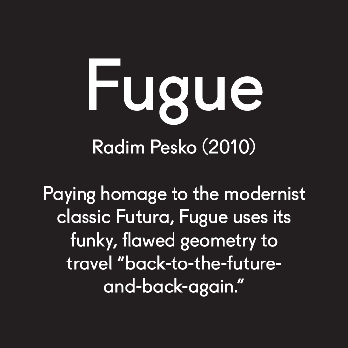
Radim Pesko’s Fugue (2008–10) pays soft-deal homage to Paul Renner’s Futura
Rounded end-strokes are another common craving among contemporary designers. Soft terminals restore a dash of humanity to the hard-edged realism of sans-serif typography. Eric Olson has led the way with his widely used Bryant (2002) and his more recent Anchor (2010), a condensed gothic whose plump, sausage-like forms fit comfortably in narrow spaces. The rounded terminals of Jeremy Mickel’s Router (2008) flare out slightly, recalling the mechanical process employed to manufacture routed plastic signs.
Rounded end-strokes are another common craving among contemporary designers. Soft terminals restore a dash of humanity to the hard-edged realism of sans-serif typography. Eric Olson has led the way with his widely used Bryant (2002) and his more recent Anchor (2010), a condensed gothic whose plump, sausage-like forms fit comfortably in narrow spaces. The rounded terminals of Jeremy Mickel’s Router (2008) flare out slightly, recalling the mechanical process employed to manufacture routed plastic signs.
Exploring the freshly cleared frontier of web typography, Christopher Clark is inventing surprising uses for SVG (vector graphics for the Web), HTML5 Canvas, and other emerging tools and protocols. Clark’s site not only showcases these startling prototypes but also provides instructive commentary and free code. At once generous and estranged, Clarke’s "lonely guy" persona speaks to the Typographic Man of our time, whose open-hearted desire to share and connect undercuts his self-mocking alienation.
Christopher Clark’s Web Typography for the Lonely: Triangulate, poster, 2011
Where is Typographic Man headed as he rides off with his serifs and spurs into the digitally remastered sunset? He may always keep slipping partly backwards, looking for glimmers of black gold in the post-industrial ghost towns and open mine shafts of history. Like the modern individual McLuhan so poignantly described, today’s Typographic Man is an inward-looking loner, wrapped inside a personal cocoon of digital feeds. Yet Typographic Man has spun that protective, narcissistic cocoon from the flux of public life. Today’s individual is the product of his own voracious immersion in the common watering hole of image/music/text; he is equipped as never before to bend typography with his own means to his own ends.
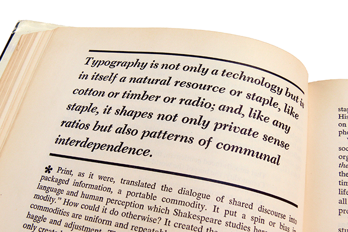
This self-involved creature is connecting to the social world in new ways. McLuhan described typography as an essential medium of exchange in the modern age: "Typography is not only a technology but is itself a natural resource or staple, like cotton or timber or radio; and, like any staple, it shapes not only private sense ratio but also patterns of communal interdependence." [5] As the first industrial commodity, printed book was portable, repeatable, and uniform. Unfurling today across the networked horizon, text is now mutable, interactive, and iterative, no longer melded to a solid medium. Yet as a means of exchange that ebbs and flows through communities, text remains more than ever an essential "natural resource" that offers access to participation in a world economy and a shared public life.
[1] “Global Village” is one of McLuhan’s most famous phrases, coined in The Gutenberg Galaxy. See pages 21 and 31.
[2] McLuhan coined the phrase "the medium is the message" in Understanding Media (Cambridge, MA, 1964).
[3] McLuhan credits this stunning insight to the scholar Curt Bühler, quoting at length from his 1960 work The Fifteenth Century Book. The Scribes; the Printers; the Decorators (Philadelphia 1960), pp. 153–154.
[4] Radim Pesko, http://www.radimpesko.com/fonts/fugue, accessed July 10, 2011.[5] McLuhan, The Gutenberg Galaxy, p. 164.
++++
The Triumph of Typography is edited by publisher Henk Hoeks and design critic Ewan Lentjes, and includes contributions from: Peter Bil'ak, Petr van Blokland, Hans Rudolf Bosshard, Paul van Capelleveen, Roger Chartier, Paul Dijstelberge, Yuri Engelhardt, Willem Frijhoff, Christof Gassner, Michael Giesecke, Britt Grootes, Gerard Hadders, Henk Hoeks, Ralf de Jong, Ewan Lentjes, Ellen Lupton, Lev Manovich, Jack Post, Rick Poynor, José Teunissen, Wouter Weijers. The book is designed by Patrick Coppens, and published by TERRA with ArtEZ Press. It can be purchased here.