
March 26, 2007
Annals of Ephemera: Town & Country Cookbook
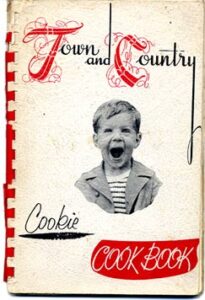
Cover, Town and Country Cookbook, 1953
Books are, by their very nature, often judged by their covers. Like miniature posters or single-frame film trailers, the book cover is the visual prologue to what lies beneath. Book cover designers are visual choreographers who frame miniature narratives in order to tease prospective readers into wanting more. Which often means showing less.
Or not.
It’s unclear what, exactly, inspired the anonymous designer of this 1953 cookbook. A cursory glance at the stark red-and-white palette suggests shades of a Russian Constructivist influence, but a closer look reveals nothing of the kind. There is no apparent formal strategy at work here (save for the ascender of the lowercase “d” in “and”, which shoots skyward and bifurcates the entire cover) and no structural rationale, but for a book that was spiral bound and typewriter-typed, the cover represents someone’s formidable effort to make something striking.
And striking it is. The typography seems to combine a kind of Currier and Ives illuminated capital (a weak riff on the splendors of Imre Reiner, popular in post-war greeting card design) with a series of hand-drawn letterforms that are generously spaced apart so as to minimize their sameness. “Cookbook” is reversed out of a ribbon-like field of red, while “Cookie” is underscored with a smudge of black ink that appears to have been lifted from a Ronald Searle caricature. And what is there to say about the attenuated descender of the lowercase “y” in “country” — with its loop at the end, like a grace note lifted from a Bach gavotte? It’s so bad it’s good.
Finally, there’s the decapitated head and shoulders of a little boy, his mouth wide open in what appears to be a look of genuine sugar-induced insanity. Is this a look of anticipatory glee, or a child breaking out in hives? Did those Filbert Butter Balls on page 22 freak him out completely, or did his mother just walk into the kitchen naked? It’s an unsettling image — one part Hitler youth, one part Dennis the Menace — that echoes its surrounding tableau of typographic uncertainty. In a comparatively early exposition of mash-up, the Town and Country Cookbook leaves nothing if not a curious aftertaste.
Observed
View all
Observed
By Jessica Helfand
Related Posts

Innovation
Ashleigh Axios|Essays
Innovation needs a darker imagination

Business
Kim Devall|Essays
The most disruptive thing a brand can do is be human

AI Observer
Lee Moreau|Critique
The Wizards of AI are sad and lonely men
Business
Louisa Eunice|Essays
The afterlife of souvenirs: what survives between culture and commerce?
Related Posts

Innovation
Ashleigh Axios|Essays
Innovation needs a darker imagination

Business
Kim Devall|Essays
The most disruptive thing a brand can do is be human

AI Observer
Lee Moreau|Critique
The Wizards of AI are sad and lonely men

Business
Louisa Eunice|Essays

 Jessica Helfand is an artist and writer based in New England. A former critic at Yale School of Art and one of the founding editors of Design Observer, she is the author of several books on visual culture including Self Reliance, Design: The Invention of Desire, and Face: A Visual Odyssey.