
July 8, 2004
Ask Not What Your Typeface Can Do For You: Ask What You Can Do For Your Typeface
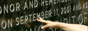
Photo: James Estrin / The New York Times
An article in today’s New York Times celebrates the suitably-named Gotham for its presence, etched into a 20-ton slab of Adirondack granite, in the Freedom Tower cornerstone. The choice of a typeface inscribed in stone offers the closest brush with immortality that any of us might dream of: it is a tribute to Jonathan Hoefler and Tobias Frere-Jones that their millenial font (initially designed for GQ) was thus selected.
But before we chalk one up for the idea that good design has been publicly recognized, let us acknowledge that over the river in New Jersey. Manhattan-based architect Frederic Schwarz’s memorial “Empty Sky” will use Times New Roman as the font of choice for its inscriptions.
Should we care? Or more importantly: should we worry?
Readers eager to understand the difference between Times Roman and Times New Roman would be well-advised to read Charles Bigelow’s detailed essay, which clarifies the differences between the font(s) as well as their respective postwar licensing agreements. (The fact that Schwartz chose Monotype’s Times New Roman over Linotype’s Times Old Roman is a subtle reminder of the ever-ubiquitous reach of Microsoft, one of its licensees.) In his defense, the architect’s explanation reinforces familiarity and readability above all: “Individuals’ names are within easy reach and engraved deep enough for hand rubbing,” notes a spokesperson for Schwartz’s office. “The lettering size is three and three-quarter inches high, in Times New Roman, a familiar and easy-to-read typeface.”
Today’s New York Times article on the virtues of Gotham waxes poetic on the romance of the metropolis and delves into typographic arcana, citing the provenance of the typeface (neon signs, blocky signage) as well as the progenitors of the letterforms themselves. DO’s own Michael Bierut is quoted, along with the other Pentagram Michael (Gericke, that is) as are Hoefler and Frere-Jones. Sadly for the New Jersey-bound Mr. Schwarz, Stanley Morison wasn’t available for comment. The British designer and former co-editor of The Fleuron died in 1967.
Morison’s robust family of newspaper fonts designed in the 1930’s for the Times of London reflects the era in which they were produced. Elegant and utilitarian, they were and are particularly suited for reading great quantities of text. That the spirit of Morison’s Times would become, over time, dulled by its over-exposure by desktop publishers the world over is unfortunate, its revival across the ocean in a New Jersey-based memorial perhaps even more so. Wasn’t there something more appropriate, more distinctive, more — dare I say — American?
In the end, of course, the choice of a typeface — like so many design choices connected to the emotional complexity of a memorial — is a near-impossible task. On this score, both Gotham and New Times Roman will suitably render the names of the victims of 9/11, and will do so with clarity and consistency. Like Maya Lin’s Vietnam memorial with which any memorialized list of names is likely to be compared, these metropolitan-area memorials must resolve their approach not only to form but also to typographic identity. And to the degree that design is capable of evocation as much as communication, my vote goes to Gotham.
Observed
View all
Observed
By Jessica Helfand
Related Posts
Innovation
Ashleigh Axios|Essays
Innovation needs a darker imagination

Business
Kim Devall|Essays
The most disruptive thing a brand can do is be human

AI Observer
Lee Moreau|Critique
The Wizards of AI are sad and lonely men
Business
Louisa Eunice|Essays
The afterlife of souvenirs: what survives between culture and commerce?
Related Posts

Innovation
Ashleigh Axios|Essays
Innovation needs a darker imagination

Business
Kim Devall|Essays
The most disruptive thing a brand can do is be human

AI Observer
Lee Moreau|Critique
The Wizards of AI are sad and lonely men

Business
Louisa Eunice|Essays

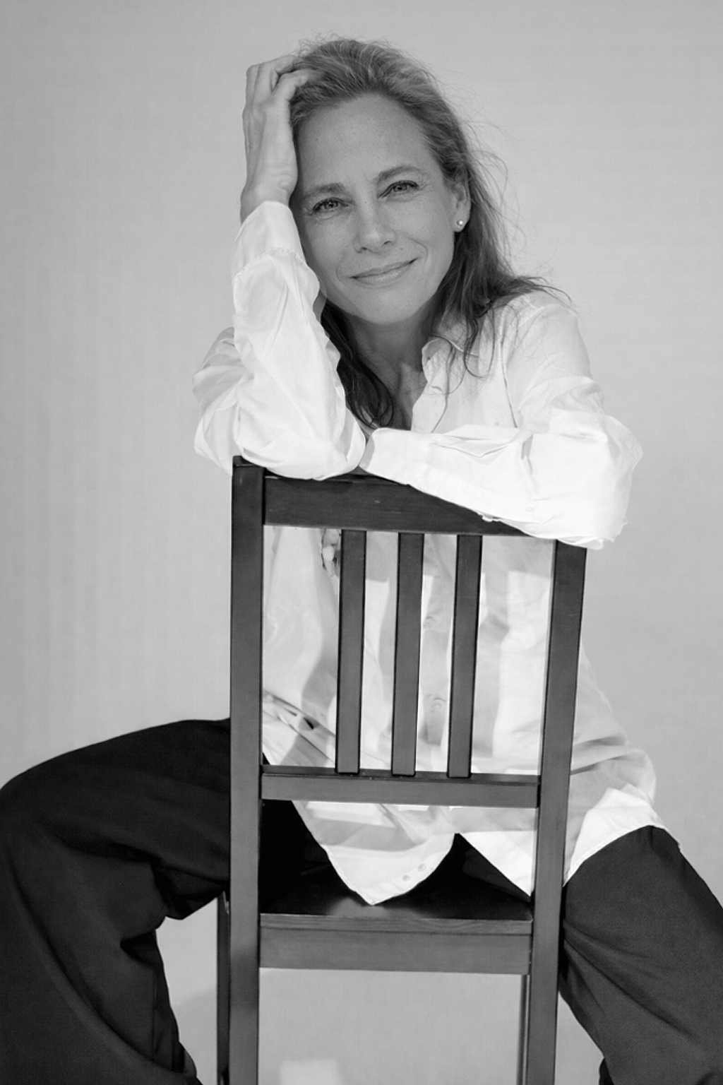 Jessica Helfand is an artist and writer based in New England. A former critic at Yale School of Art and one of the founding editors of Design Observer, she is the author of several books on visual culture including Self Reliance, Design: The Invention of Desire, and Face: A Visual Odyssey.