February 13, 2013
Chromatophobia

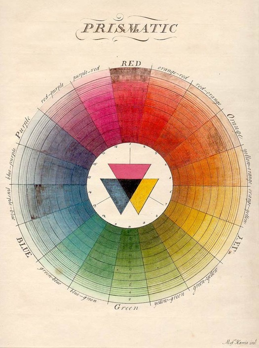
Moses Harris, Illustration from The Natural Systems of Colours, London, 1766. (Source: Sarah Lowengard, The Creation of Color in Eighteenth Century Europe)
The first step, they say, is admitting you have a problem.
A long time ago, when I used to do a lot of freelancing, I got a call from a friend of mine who had just gotten a job at a well-known cosmetics company. She had an assignment for me. Her company was famous for using a color wheel — a specially printed diagram with dozens of colors arranged in concentric circles — at their department store counters. The time had come, as it did periodically, to update the colors. Various experts had been consulted, all the requested changes had been tabulated, and all that remained was for someone to designate specifications for the colors that were changing. This task was seen as more or less clerical, and kind of a pain in the ass. “We know exactly what we want,” my friend told me, “but no one here has time to do it.” She asked if I would do it, and said they would pay me $2,500.
Now, this sort of thing didn’t exactly seem like graphic design to me — there was no typography involved, for one thing — but $2,500 was a stupendous amount of money for me at the time, probably the most I had ever been offered for a single project. I said yes. I was told I could buy whatever supplies I needed, so I bought every color specification guide I could find, even splurging on exotic imports from Germany and Japan. Finally, one day after work, I sat down at our kitchen table, with my pages of notes on the revisions on one side, my multiple specification guides on the other, and the color wheel in the middle. We even happened to own a matte-black Richard Sapper-designed Artemide Tizio lamp, which coincidentally was the exact model that was used at the cosmetic counters where the color wheel would be displayed. I trained it on the task at hand and got down to work.
Or, at least I tried to work. Instead, I found myself staring helplessly at mess before me, clueless as to how to begin. There were just so many chips, so many samples, so many ambiguous notes from the client: this color was supposed to “pop” more, this one was supposed to be “warmer but more neutral,” and so forth. It was overwhelming. And, in the middle of it all sat the color wheel. For the first time I wondered, what was it really for? How did it help women choose and apply their makeup? Why were so many colors necessary? How could anyone tell that colors looked out of date? Did these colors really look the same to other people as they did to me? And how did they look to me, anyway?
I sat for hours, disconsolately shuffling color chips around, getting more and more confused and despondent. Finally, my wife Dorothy, who had been trying to ignore my heaving sighs, came over. “Can you tell me again what this is all about?” she asked. Dorothy is not a designer and has never taken a single class in art or design, so I explained carefully. To my surprise, she responded with enthusiasm: yes, of course she knew this particular color wheel, all of her friends did, in fact she herself thought that it was out of date, and had thought so for some time. I was amazed. Really? She nodded. “Now, what exactly are you supposed to be doing?” I showed her the particulars of my assignment, and by way of example indicated a particularly vexing instruction from the client: “They say they want this one to be more like a soft…” (I had to refer to my notes at this point) “…celadon.”
I had looked up celadon in the dictionary (“a pale yellow-greyish green”) but it wasn’t much help. Yellow, and grey, and green: really? That’s three colors, godammit! I showed Dorothy the chips I was considering and she snorted in derision. “You think those are celadon? Let me see what else you have.” She leaned over my shoulder and picked out a few options. “These look nice,” she said. She was right. They did look nice. She asked if she could sit down and pick out some more. And some more after that. It was fun for her, and she was good at it. Eventually she designed the whole wheel, and for the next five years or so, women at cosmetic counters across America chose their makeup based on colors that my wife Dorothy picked out at our kitchen table.
That is when I began to realize that I had a case of chromatophobia, fear of color. From my earliest days as a designer I loved black and white. Such authority, such decisiveness. To this day, any collection of my favorite personal projects — posters, book covers, packaging — marks me as a follower of Henry Ford, another enthusiast for wheels who famously told buyers of his Model T that they could have whatever color they wanted as long as it was black. Every now and then, I dip my toe in the vast rainbow-hued sea. It usually comes up with no more than a little bit of red and an even littler bit of yellow. I admire people who can use color with authority. To me, they seem to be able to swim like fishes.
They say any fear can be surmounted, and I hope one day to begin to conquer mine. Until then, it’s back to the comfort of my nice dry towel, well away from the water’s edge — suitably striped, of course, in my two favorite colors: black and white.
This piece was written as an introduction to Color Works: An Essential Guide to Understanding and Applying Color Design Principles by Eddie Opara, to be published next year by Rockport.
Observed
View all
Observed
By Michael Bierut
Related Posts

Innovation
Ashleigh Axios|Essays
Innovation needs a darker imagination

Business
Kim Devall|Essays
The most disruptive thing a brand can do is be human

AI Observer
Lee Moreau|Critique
The Wizards of AI are sad and lonely men

Business
Louisa Eunice|Essays
The afterlife of souvenirs: what survives between culture and commerce?
Recent Posts
Sam Furness got serious about investing in his curiosity. Now, he’s helping others do the same. Corporate crisis is design’s opportunity In a world that feels impossible to change, emerging designer Deborah Khodanovich is starting small Elixir Design founder Jennifer Jerde believes in the human touchRelated Posts

Innovation
Ashleigh Axios|Essays
Innovation needs a darker imagination

Business
Kim Devall|Essays
The most disruptive thing a brand can do is be human

AI Observer
Lee Moreau|Critique
The Wizards of AI are sad and lonely men

Business
Louisa Eunice|Essays
