Skip to content
Home Interviews Dream Job: Interview with Film Graphics Designer Eric Rosenberg

Alex Knowlton|Interviews

January 8, 2010

Dream Job: Interview with Film Graphics Designer Eric Rosenberg

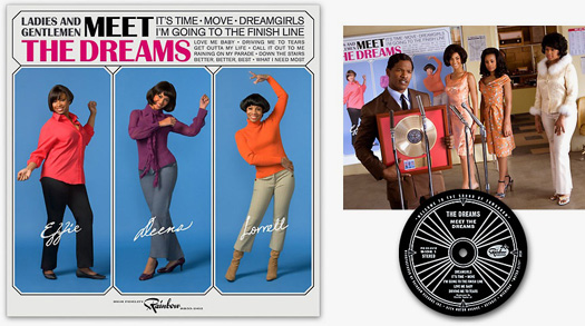
Meet The Dreams album cover, 1961, from Dreamgirls

Like the storied naïf who gets off the bus in Hollywood to make it big in pictures, Eric Rosenberg abandoned his career in editorial design at Business Week back in 1991 — with only a single movie-related project in hand — and headed West. He went on to design the company logo in The Hudsucker Proxy, the odd flight-safety cards and Ikea-esque catalogue in Fight Club, the Bubba Gump logo and several period magazine covers in Forrest Gump, the album covers and posters seen throughout Dreamgirls, and the kill-order forms in Wanted. Upcoming movies featuring Eric’s works include the Joan Jett bio-pic, The Runaways, and a Jay Roach comedy, Dinner for Schmucks.

Flight safety card from Fight Club

Alex Knowlton

Just to clarify, you don’t do titles but you seem to design everything between, correct?
Eric Rosenberg: On most projects I’ll be hired to design all the prominent scripted items requiring graphic design. “Scripted” being very important, because when the staffing for a film’s Art Dept. is budgeted, it’s not a given that there will be a graphic designer hired. Graphics may often be overlooked or misunderstood by the producers when budgeting. The workload needs to be presented to them clearly in list form so that funding for a determined number of weeks or months will be allocated. Most of the time the film’s art director will have done this before I’m hired, but it’s happened that my own breakdown of a project’s graphic needs has secured me the job, most recently on The Runaways which was a low budget production.
Usually I’m hired to design logos, signs, props and set decoration items, as well as the occasional piece for the costume designer. There are also many non-scripted items which crop up during filming, such as wallpaper and carpet designs or faux finishes like the marble flooring I’ve just done this week. Very often I’ll do photo composites of the film’s actors with notable public figures or put them in a particular setting called for by the script for set decoration or prop use. On occasion I do pre-visualization work in Photoshop, which I really enjoy, but illustrators generally get most of that work. The area of graphics I’m least likely to work in are those done for video playback purposes. Things like web page designs, TV news graphics or other custom computer screen interfaces are farmed out more often than not.
AK: Who do you answer to? The production designer? The director? For Almost Famous, you art directed much of the photography of fictitious band Stillwater to mimic period photos of The Allman Brothers Band and Neil Young. Was that something Cameron Crowe wanted, since it was a semi-autobiographical movie of his?
ER: First and foremost, the Production Designer is the head of the Art Department and nothing will be presented to a film’s director that the Production Designer doesn’t approve of. Sometimes the Art Director, working second to the Production Designer may be quite involved in the graphic design, but not in every case. I also work closely with the Set Decorator and Property Master as so many of my projects are done for them.

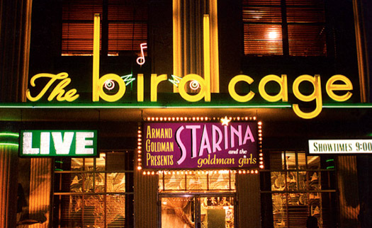
South Beach signage for The Birdcage

Whether or not I interact with the film’s director in planning and presenting the work is up to the Production Designer. Some wish to show all Art Department projects themselves, others like to bring along the designer to hear the director’s reaction first hand and participate in the discussion of whether it works for them or not. In the case of Almost Famous, after my comp designs were approved by Production Designer Clay Griffith, I would usually meet with Cameron Crowe on my own. I’d already worked with Clay on Jerry Maguire, for which he’d been the set decorator, and during that project had developed a good working relationship with Cameron.

Almost Famous was Cameron’s own story, and he cared deeply about the graphic design work. When we met to discuss the Stillwater record covers, he pointed to the first album by the Allman Brothers Band as the place to begin. I designed comps and prepared a detailed visual memo of all the Stillwater graphics before we commenced a three day stills shoot of the film’s actors with photographer Neal Preston who had been on those big rock tours with Cameron back in the seventies. It was quite an endeavor, involving all the creative departments, , in particular Costume, Hair and Makeup. I also had one of the film’s location scouts find us a terrific house in Venice Beach for use as the setting for the first Stillwater album cover where they’re standing on the porch, and the park in which the Stillwater’s big Rolling Stone cover photo was shot. It was a thrill to see it all come together and yield such great results.
AK: With period pieces, are you the final authority with regard to the design’s historical accuracy? You defended those who put anachronistic type in period films and have been called out, yourself. Is it because you care more about the overall impression of a period design than its typeface’s birth date?

The corporate logo on Tim Robbin’s apron in The Hudsucker Proxy is set in Bodega Sans Inline, a typeface released in 1991 but designed to look older

ER: Every aspect of the sets and decor is thoroughly researched by the various departments and all strive for authenticity. I’ll always try to match the typography and design sense of period pieces as closely as possible, but whether or not a font is the absolute exact version that existed in the period is not something I’ll worry about too much. The digital fonts available today are not all going to match the photo lettering or punch card driven typesetting of the period. That said, if the lettering is prominent and there are noticeable differences in particular characters, I’ll always take care to modify them to match the research. When I started working on films in the early nineties there were far fewer period fonts available, and I relied heavily on my library of typography from Dover Publications. I’d scan the font, auto trace the lettering and then go in and fix the vector art for just the character’s I needed.

AK: I know you lament that a lot of kids getting into the business are clueless with regard to design history, and you recommend they start with Steven Heller and Loise Fili’s Stylepedia to bone up. But you have over a thousand books and a life-long affinity for graphic design…
ER: Although there are now more graphic designers working on films and TV series than ever, not all of them have had graphics education, training or good practical experience. It’s perhaps a bit too easy to jump in the game. For some it’s simply a matter of having the computer, software and desire to do the work, and that doesn’t yield acceptable results. TV in particular is an area where producers who don’t understand the craft and don’t wish to spend much money on it, seem to ensure the hiring of the least qualified designers. Sadly, in those cases you wind up getting what you paid for, and the poor results show up on screen. There are also a lot of jobs, largely props that are done by outside vendors of varying quality.
AK: Tell me about product placement. M&M/Mars famously refused to let E.T. eat M&Ms on screen and Reese’s Pieces enjoyed the huge jump in sales instead. You’ve had to design around the fact that Ikea, Starbucks, and Kellog’s probably won’t allow their products to be used in a negative light. I loved that, for the grocery store scene in Wanted, you created a cereal box with a father and son pictured to subtly reference the father/son themes of the story. Was that a case of turning an obstacle into an opportunity?

The pictured father on this cereal box in Wanted was shot through the head during a supermarket shoot-out

ER: Although set largely in Chicago, most of Wanted was filmed in and around Prague in the Czech Republic. It was Russian director Timur Bekmamatov’s idea to reinforce the father/son dynamic within the film on the cereal box prop. I put together research boards of all current commercially available cereal boxes so that the Production Designer John Myhre could go over those with Timur and figure out the look they desired. Since these boxes were to be featured in a wild shooting melee, there was never any consideration that an actual product would be used.

In order to arrive at the name “Tuckerman Mills — Crispy Clusters” many product names were submitted to Universal Studios’ legal clearances department. Once I had approved name,s I designed the logo and lettering. I also had to do a great deal of stock photo research to find just the right father, son and cereal from which I could composite and re-touch the final image. As we were going to need large quantities of the boxes for filming multiple takes since they get shot up, I had the box traditionally printed and fabricated.
AK: When you “pre-vis” detailed storefront signs for an entire street, like in Forrest Gump, is it ever used for a matte or just for the set direction? I would expect someone like Robert Zemeckis would go digital.
ER: In Forrest Gump, which was made in 1993, all of the period storefronts of “Greenbow, Alabama” were created in a real town on location in South Carolina using existing buildings. Everything you saw was practical — that is — ready for filming with the camera. An instance of the kind of digital creations you’re referring to would be for a recent film, Clint Eastwood’s Changeling. In that movie sign designs were created specifically to become part of elaborate digital mattes. I’d certainly expect more of that process to come up in the future.
Besides being fabricated for filming, just about all of the signs in Forrest Gump were also hand painted from my designs. We were fortunate to have a master sign painter on staff to do this work back then. Sadly, these days there aren’t too many left out there who could pull off the job so well. For authenticity it’s certainly desirable to have past period signs done by hand just as they really would have been, but if Forrest Gump were being made today, we would probably do all the deep background and many mid-ground signs with vinyl and printed graphics and save the hand craft for those close to the camera. It’s quite likely the viewer wouldn’t be able to tell the difference in the end.
AK: I was surprised that it was necessary to do a “pre-vis” of the Senator’s snow-covered house for The Birdcage until I saw the amount of work that went into creating the snow-covered farm in the live-action version of Charlotte’s Web, in the DVD extras. Was that snowy exterior shot in The Birdcage done on-set or digitally? 

Original photo of California location used for a Ohio home in The Birdcage

Eric’s pre-visualization work is referenced by set decorators and post-production staff

ER: As I recall, the scene was filmed during the spring at the Pasadena location I used for my pre-visualization, dressed and decorated with fake snow for the winter setting. In post-production they added some winter mattes and other snow effects. That was the first piece of pre-vis I ever did. It was rare to do that sort of thing then, nowadays it’s a standard part of how film sets are planned.

AK: As with Wanted, many movies are now made far from L.A. Do you always have to be on location to deal with script changes and location challenges?
ER: I don’t have to be there, and have even done some local L.A. projects such as Dreamgirls entirely from my home studio. That said, it helps the process immensely if I am, we’ll all communicate faster and more effectively when I work in-house. This is especially true for designing signs for a non-studio filming location. It helps tremendously to be in the space and get a real sense of place. On a film production the graphic designer’s job is mainly back in the production office, not on set. All my projects are done in advance of shooting, so it’s rare that I’ll spend time on stage during filming.
AK: In Jerry Maguire, you had to design an awful-looking billboard for the career low of Cuba Gooding Jr.’s character. Is that intentionally bad work more fun or just another challenge for authenticity?
ER: It’s great fun to design the kitschy stuff, and can be very challenging because it goes against the natural instinct to try and design something well. I remember being very happy when I showed Director Cameron Crowe the finished design and he burst out laughing — that’s just what his script called for.
AK: You’ve worked for most of the best filmmakers in the business. Who’s on your wish list? Whose work do you admire?
ER: It’s been a thrill to have worked with and met so many fine filmmakers and actors over the years. What’s a particularly fun part of the process are the unexpected encounters, such as meeting with Carl Sagan to discuss my designs for an alien message to earth taken from his novel Contact, or 1970s rock icon Peter Frampton who schooled the actors playing the band Stillwater in Almost Famous.
After 17 years working in the film world I’m fairly relaxed about what types of projects I get to work on, I don’t seek out a particular genre, with the exception of the music films which I have a special affection for. Earlier on I was gung ho for getting on the big superhero or sci-fi films, and I certainly welcome those when they come along, but I’ve learned that it’s often the smaller, more off-beat projects that turn out to be the most enjoyable experiences. Very often those films offer up an assortment of surprises and challenges I hadn’t anticipated. The larger projects with their huge budgets, are by nature very complicated endeavors, so the design and decision making process is usually more difficult to wade through; I’ve learned to go with the flow and look forward to whatever comes my way. Like everyone else, I take note of who’s doing good work and seek out opportunities with those people.
AK: Since leaving editorial design, do you ever miss that work or wish you had branched into a different area of design? Because I’m volunteering, right now, to switch places.
ER: I consider myself fortunate to have found my way into designing graphics for film. It affords me the chance to design all sorts of projects from just about any time period and help in telling the story. This is not something you’re likely to find in other avenues of graphic design. I’m glad I had those years in magazine design, it was good training for the work I do now, particularly working on the tight deadlines of a weekly issue. Smoothly handling sudden changes proved highly valuable once I jumped into the world of movies, where you need to be ready for just about anything.

Eric’s work may be viewed at www.ericrosenbergdesign.com