May 9, 2012
Hamilton Wood Type and Printing Museum

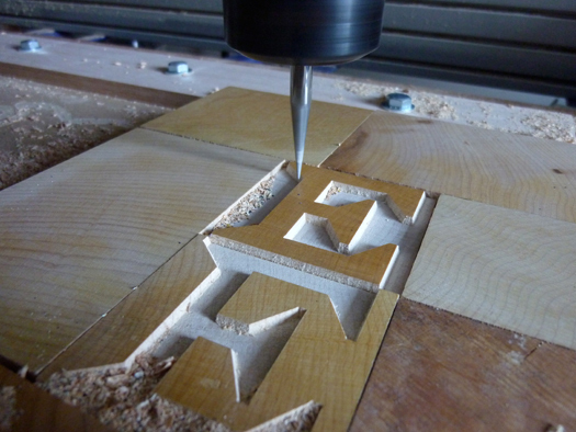
A vector-driven router puts the finishing touches on Matthew Carter’s Van Lanen font. When cutting fine interior angles the router bit lifts to create sharp corners
When you arrive in the city of Two Rivers, Wisconsin you discover a smokestack of epic proportions. Measuring fourteen stories with 6-foot-tall brick letters that spell Hamilton — a 200-foot-tall sign for the Hamilton Wood Type foundry built in 1880 on the western shore of Lake Michigan. The center of the city is still dominated by warehouses and manufacturing plants that date back to the 1890s. Because the craft of making wood type and wood cabinetry generated so much sawdust, the company still uses it to heat its entire six block complex.
Hamilton Wood Type, along with its Two Rivers neighbor, Mirro Aluminum Company, prospered in small-town America for the better part of the twentieth century. Like many small towns that were cropping up in the 1880s Two Rivers had a grocery store, a livery stable, and a print shop, which printed small jobs and weekly newspapers. Such a printer’s type collection would have been incomplete without wood headline type.
A burgeoning business already existed in the field of wood type in 1880 but it was “Ed” Hamilton’s ready access to the required materials and a knack for refining machinery that lead him to dominate the industry. By 1906 he bought out five out of his six competitors and went on to become the largest manufacturer of wood type and printing related equipment in the world. Beyond producing wood type, Hamilton also manufactured cabinets for printer’s type that quickly expanded to include doctor and dentist cabinets, which required fine woodworking skills and an ample supply of virgin hardwood. Adding metal cabinetry to Hamilton’s production made for explosive growth of skilled labor and productivity, with the company employing over 2000 people at its peak.
Wood type was a mainstay of the company through the 1950s until the widespread use of offset printing and phototypesetting equipment made wood type nearly obsolete. Hamilton made their last wood type in 1985, just as Apple was introducing of the Macintosh personal computer. In 1999 the facility was converted into a “living” museum of printing history, honoring the many skilled craftsmen and the contribution that Hamilton made to the graphic arts industry.
When you walk through the front door of the museum you discover a building that is home to 1.5 million pieces of wood type. It’s housed in a Hamilton building that dates from 1926. The original pantograph equipment remains, though now incorporating a pneumatic router carving end-grain maple at 50,000 revolutions per minute. Sawdust is still a by-product of manufacturing, but now it’s part of the permanent exhibition.
The 40,000 square foot space is full of wood type, ranging from 2 picas to 6 feet tall. A 4000 square foot printing studio offers 12 presses and a working collection of twenty cabinets of type from a 60-year span of type designs. Berhard Gothic is nestled along side Civil War-era Grecian Condensed and this mix of typographic material is part of what makes this working museum unique in the world.
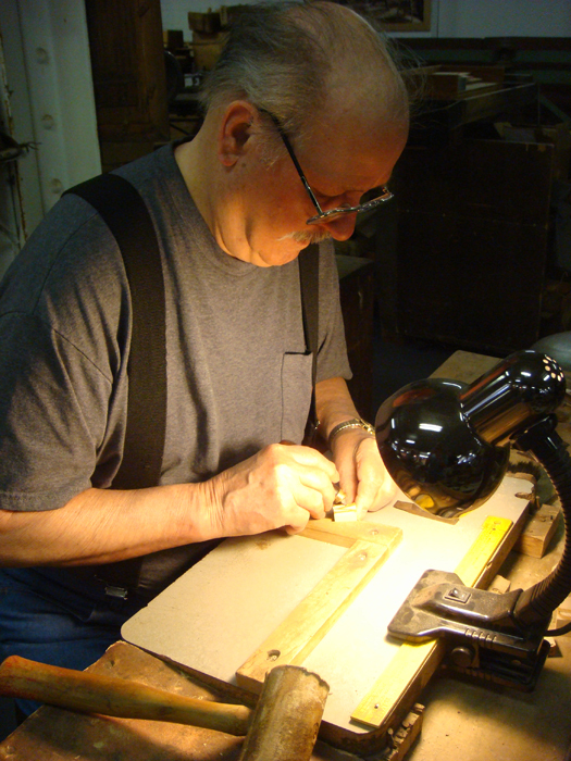
87-year-old Norbert Brylski demonstrates the trimming and finishing that was required of each piece of type. Brylski spent 20 years as a Hamilton employee preparing slabs of Wisconsin maple for wood type. Photo: Nick Sherman
But the equipment and type are only part of the story. Since the museum opened it has been run chiefly by volunteers, many of them former Hamilton employees who are now in their 80s. The men and women who worked at the company’s pantographs, sanding, and finishing equipment still regularly come to the museum to help fill orders, give demonstrations for visitors, and share stories of working for an industrial giant in small-town Wisconsin.
Darleen Guelstorf began at Hamilton in 1952, at first as a spot welder then an upholsterer. She currently volunteers at the museum doing finishing work on type used as nameplates. She marvels at the international attention that Hamilton Wood Type receives as a typographic destination. When introduced to Sandro Berra, curator of the venerable Tipoteca Italiana printing museum near Venice, Italy, she turns to museum director Jim Moran and asks “Is he just here for the wood type?”
Indeed, the city of 12,000 people is a little surprised by the level of attention the museum is receiving, bolstered largely by the 2008 release of Typeface, a documentary film about Hamilton produced and directed by Justin Nagan (Kartemquin Films). Printers, typographers, college students, and their professors visit from all parts of the country for daylong workshops, weekend seminars, and for some just the chance to marvel at the world’s largest working printing museum.
When you hold a piece of wood type in your hands this deceptively simple piece of mass communication rewards you with its grace but also surprises with its weight. End grain maple is cut from the cross section of a tree yielding a harder and heavier piece of wood. Using the end grain of the wood improves durability with most wood type that was made in the nineteenth century still fully functional a century after its date of manufacture.
First larger then smaller router bits are used to remove the wood surrounding each letterform with hand finishing required for serifs and corners that a router bit can’t reach. Fortunately, there are still many Hamilton retirees who possess the skill to do this work. Documentation of these techniques is being taken up museum director Jim Moran and volunteers eager to preserve the working knowledge of a group of craftspeople whose skills are increasingly unique in the world.

Students hold up their printed proofs, which spell the word “Listen” in the Lushootseed language
Attention to detail has been a hallmark of Hamilton Wood Type with that tradition continuing into the twenty-first century. With the establishment of the Hamilton Wood Type and Printing Museum, The Two Rivers Historical Society set out to preserve the ability to make and use wood type. The revival of commercial manufacturing of wood type began in the museum in 2003 with a commission from Nashville’s own Hatch Show Print, which needed replacement letters cut for their first font originally purchased from Hamilton by Will T. Hatch in 1879. With help from museum volunteer Norb Brylski and using templates created from a computer driven laser cutter, the Civil War-era type design was revived, redrawn, and cut at the museum using wood that was originally harvested in the 1920s. Other collaborations include the Gutenberg Museum, Tipoteca Italiana, and an unlikely partner, the Tulalip Tribes of Washington State.
Lushootseed is a severely endangered language of the Salish dialect that has been spoken on the Olympic Peninsula for more than a half century but was only committed to a phonetic alphabet in the last fifty years. Type designer Juliet Shen was enlisted by the Tulalip Tribes to create Lushootseed, a digital font in 2008. Inspired by Salish art forms, Lushootseed was intended to echo the rounded motifs found on shields, vessels, and masks. At Juliet’s suggestion the tribe hired Hamilton Wood Type to cut a full wood type font to be used by children in the tribe as part of their Summer Language Camp. It’s hoped that language acquisition will be aided by the ability to combine art, literacy, and literature into a single activity.
The delicately curved terminals of Shen’s typeface allowed the museum an opportunity to advance their capabilities by incorporating a computer-controlled router into the actual cutting of the type. “As much as we’d like to rely on Hamilton retirees to cut new type for us” says museum board member Jim VanLanen, “we have to continue to explore the best tools to make type in the same way that Ed Hamilton would have insisted on using the best tools available to him and his employees.”
Matthew Carter, an internationally recognized type designer and recipient of a 2010 MacArthur “genius” Grant, created the typeface Carter Latin (2002) for Hamilton. This typeface, with its wedge-shaped serifs and bold weight is reminiscent of late-nineteenth-century advertising typefaces and a perfect compliment to the existing Hamilton collection. Production of the wood type began following the completion of Carter’s drawings, but numerous technical difficulties were encountered while applying the traditional pattern making and routing production method to the face. This problem was also overcome through the use of a computer-driven router to achieve the optical effects Carter was seeking. The font exists as both a digital font and as wood type.
Arriving at the printing studio on a typical weekend you would likely encounter a room full of design students who are pulling proofs of vintage advertising plates, archiving drawers of type that have been quietly sitting in storage for sixty years and a general buzz of giddiness that accompanies a younger generation of computer users who are having their first exposure to analog type.
“This place is amazing,” says graduate student Stephanie Fenstermaker of Indiana University. “We drove nine hours to get here for a weekend workshop and this is the fifth time I’ve come in the past two years.” The museum seems to have a magnetic pull on designers and printers from all over the United States who have participated in fifteen different workshops in 2010. Efforts are underway to expand program offerings to kids of all ages, and as Museum Director Jim Moran quips: “We’re just getting started.”
Unusual Suspects is edited by Andrew Blauvelt and William Drenttel and supported by Winterhouse Institute and AIGA. The project seeks to uncover important contributors to local design scenes across the United States in the hopes of enriching and expanding the canon of graphic design history. Design Observer is open to editorial submissions for this series. Please write to designobserver@winterhouse.com and clearly identify your project as for Unusual Suspects.
Observed
View all
Observed
By Bill Moran

