Timothy Young|Movie Poster of the Day
December 31, 2009
Holiday Movies in Print: Meet Me in St. Louis
For the uninitiated, this poster may not register as an advertisement for a Christmas film, but Meet Me in St. Louis is a perennial favorite this time of year. The movie traces a year in the life of a St. Louis, Missouri, family, leading up to the opening of the World’s Fair there in 1904. Over twelve months, the Smith family celebrates many holidays and events—including Halloween in a spookily beautiful color-saturated sequence. But it is the Christmas section that pins this movie to the season. The dramatic climax of the film takes place on Christmas Eve, with Judy Garland singing “Have Yourself a Merry Little Christmas”—making all but the most impassive of viewers tear up—and, in the film, prompting Margaret O’Brien to assault an innocent snowman.
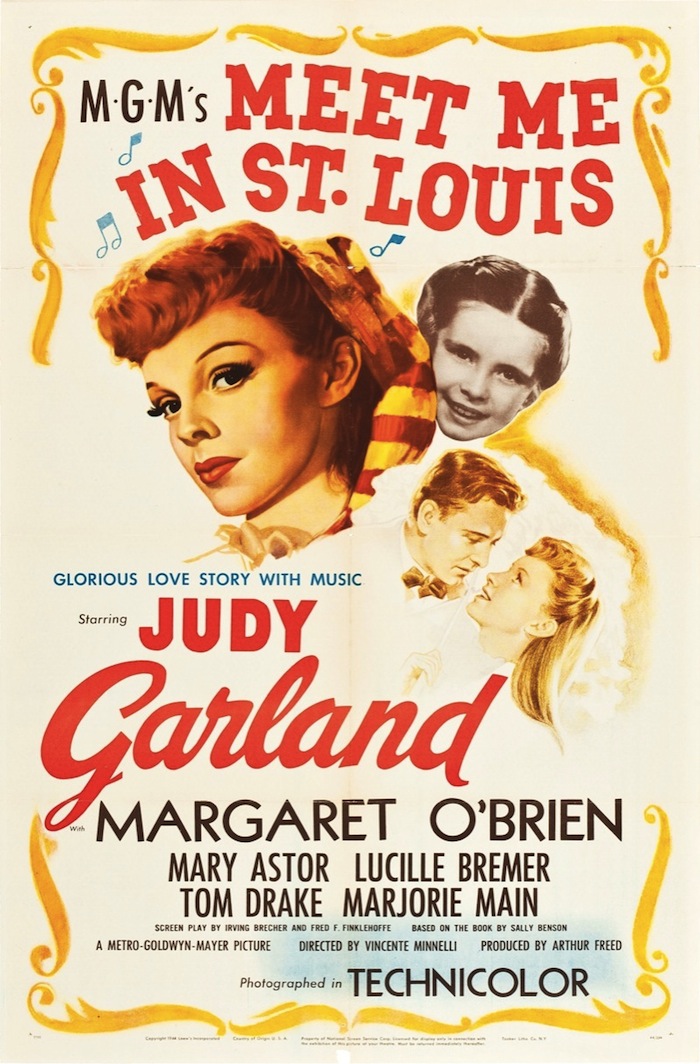
The movie is a knockout, in terms of set design, the solid script, and able performances—a real gem from Arthur Freed’s MGM team. It gave Vincente Minnelli his first shot at Technicolor and he was a perfect match for it, exploiting the technology with brilliant costumes and extravagant interior and exterior sets. It’s a puzzle, then, why the primary single sheet poster for the film is such a jumble. Granted, it follows the format of so many 1940s films of the “floating head” genre. There’s Judy painted in a three-quarter pose—but poor Margaret O’Brien, though she gets her photo on the poster, appears in black and white. And couldn’t the lovey-gazey vignette of Judy and Tom Drake have been painted in something more romantic than sepia? And the text? There appear to be at least eight fonts in use. Maybe this is meant to give a sense of the high energy of the film? The bracketing devices that make up (most) of the perimeter seem like they’re afterthoughts. And what’s with the odd wash of light blue over the bottom right corner? Is it meant to highlight that the film is in Technicolor? A tepid gesture, if so.
But these criticisms don’t matter much, MMISL was not a film that needed to be sold. It generated interest on the popularity of its stars and the inherent strength of musicals in its era. The poster served mainly to announce the arrival of the movie at the local cinema, so its appearance as an object that has more in common with a scrapbook page than thoughtful design makes sense. It only hints at the rainbow of music, costumes, dancing, and humor that make the film one of the best American musicals ever—and a must-see for Christmas.
Observed
View all
Observed
Share on Social
By Timothy Young