September 1, 2010
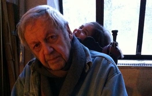
James Victore: Straight Up
There are some things you remember clearly almost twenty years later. It was the early nineties. I was dropping something off at the receptionist’s desk in our office. And there, popping out amidst the clutter on her desk, was a business card for a theater group. I picked it up. “This is nice!” I said to our receptionist, Elizabeth. She was an aspiring actress making ends meet by answering our phones.
Elizabeth was startled. “Really?”
“Yeah,” I said. “I wonder who designed it.”
The next day she had the answer. “Here, I wrote it down, but I don’t know how to pronounce it.” And there on the card she offered was written a name completely unfamiliar to me.
“Wow, I’ve never heard of him,” I said. I looked again at the card. “He’s really good.”
“He is?” asked Elizabeth, genuinely puzzled. “How can you tell?”
The name, of course, was James Victore. And the question remains: how can you tell?
It sometimes seems there are two kinds of graphic designers in the world. One kind sees each project as an opportunity for self-expression, producing a body of work that bears an unmistakable mark, that is more alike than different, that is more about the maker than the message. At its best, the output of this kind of designer is personal and passionate; at worst, it’s repetitive and self-indulgent, the mark of the attention-seeking diva.
James Victore is good because, amazingly, he combines the very best of both ways. His work is unmistakably his. Every one of his pieces bears his handwriting. More often than not, this is literally true: few designers have done more to render typography foundries irrelevant than Victore. The human hand, his hand, is always in evidence. Yet this signature approach takes so many different tones. His handlettering can evoke Spencerian script or the scrawl of a stickup man, a puff of cigar smoke or a mushroom cloud. All of it, though, has one thing in common. It conveys the sense that the words don’t want to wait around to be put into type, justified, and kerned. Instead, the ideas are rushing to get out.
And there lies the paradox that makes Victore so hard to classify. His work, so personal, conveys ideas with the directness of a speeding freight train. If his intention is to shock, as sometimes it is, it is because the subject matter — racism, the death penalty, unsafe sex — is shocking. The results can be shockingly funny as well: just ask the subscribers to a leading design magazine who were given a quick and viciously literal lesson on the difference between Shinola and its customary opposite. And don’t expect an apology if you’re offended. You won’t get one. Nor will you ever, ever miss the point.
If one were envious, one might shrug off Victore for taking the easy way out. After all, he works with art schools, cultural groups, worthy causes, the kind of clients one might think would offer ideal opportunities for memorable design solutions. However, people who talk dismissively about shooting fish in a barrel have probably never taken aim at one of those slippery devils: it’s harder, and messier, than you think. Victore has the powder burns to show for it. And in the midst of those celebrated big bold ideas, all delivered with fierce and accurate punches, one is always surprised to find an example of beautifully structured information design. For example, turn over what is perhaps Victore’s most celebrated poster, featuring a game of hangman that’s completed to devastating effect in the viewer’s head. There on the back is a sober typographic treatment of the poster’s subject, Racism and the Death Penalty, laid out with the straightforward clarity of a brochure for Swiss pharmaceuticals. The two sides of one talented designer were never so perfectly illustrated.
Beatrice Warde once described the two kinds of designers with an extended metaphor in her celebrated 1955 essay “The Crystal Goblet, or Printing Should Be Invisible.” Some designers, she wrote, create solutions that are like elaborate wine goblets, “solid gold, wrought in the most exquisite patterns.” These are the expressive designers who let their personalities get in the way. Others prefer to pour wine into a “crystal-clear glass, thin as a bubble, and as transparent.” These are the neutral designers, desperate to stay in the background.
So let’s make this simple. Here’s how you can tell this designer is good. James Victore does away with the goblets altogether. He simply wrenches the cork off the bottle and pours the stuff right down your throat. Are you thirsty? I know I am. Cheers.
Observed
View all
Observed
By Michael Bierut
Recent Posts
Sam Furness got serious about investing in his curiosity. Now, he’s helping others do the same. Corporate crisis is design’s opportunity In a world that feels impossible to change, emerging designer Deborah Khodanovich is starting small Elixir Design founder Jennifer Jerde believes in the human touch


