May 16, 2011
Kirsten Hively’s Collection of Coffee Cup Lids and Registration Marks

There is so much beautiful design in throw-away packaging — a lot of crap too, but some inventive and appealing boxes, bottles and bags. Objects designed to be collectible have never really attracted me; I’ve always been drawn to prosaic things — artful uses of everyday materials, gems of design hidden in plain sight, elegantly useful things and places — partly out of a sense that these things need me to curate, frame, and organize them in order to make their allure more apparent, while a Hummel figurine, say, can just sit on a shelf by itself, not needing my help to reveal its collectibility. Ephemeral packaging, neither antique nor rare, is one of my favorite kinds of run-of-the-mill relic, so here are two small packaging collections I’ve gathered:
To-Go Coffee Cup Lids
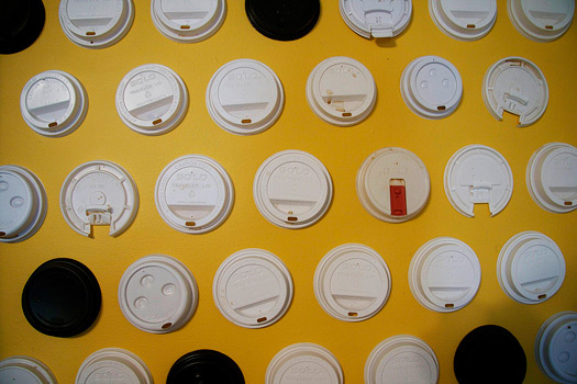
The coffee cup lids I started compulsively keeping when I worked long hours in a stressful office with no coffee pot. I’d buy a coffee to-go most every afternoon, one café in particular used elaborate lids I’d never seen before with bright red covers over the spout that slid open or closed, keeping the scalding coffee safely inside when necessary with a simple, satisfying glide and click — so much design in such a small, single-use device. I couldn’t throw it away, so I kept it despite its coffee stains and soon started keeping all the others I used too, finding something compelling in their roundness, their functional similarities and their subtle differences. Though all the lids provide the same basic service — carefully mediating the interaction of coffee and coffee drinker — their phenotype varies widely within those constraints. Some are black, some white, various brand names, patents and stock numbers are embossed on their surfaces, each sports a slightly different locking lip to grasp the top of the cup, some feature squashable buttons to indicate decaf or tea, some have lids that lift and lock into place, some have permanent openings in various ovoid shapes (small enough to avoid much splashing). Other people have collected pristine examples of the varieties available around the world, but I like my slightly scruffy used set because it tells a small, intimate story about me and my interaction with design. I don’t buy as much coffee these days (I tend to make my own), but when I do, you might spot me finish, toss the cup, carefully dry the lid and tuck it in my bag.
Printer Registrations
The other set are printer’s marks I’ve kept from packages, mostly (though not entirely) for food. I love these for the obscure hieroglyphics, the bright colors, and the subtle misalignments. I love that they reveal something about the process of design and printing to anyone who cares to look closely at the corn bread mix, cereal, or six-pack they buy. I continue to be surprised every time I encounter one — every inch of packaging is so carefully designed, they seem like some kind of leaked internal memo, revealing secret goings-on not meant for outside eyes. They reveal the colors that comprise the design, whether CMYK or spot, often in beautiful shapes and patterns, including crosses, bursts and tracks meant to reveal misalignments as well as color shifts. Sometimes they give printing instructions (“Pre-Press targets with curve”) or mysterious numbers, letters and abbreviations. They often show up on bottom box flaps where, if the glue isn’t too strong, it’s easy to slice them off and carry them away to marvel at these strange, intricate artworks.
Observed
View all
Observed
By Kirsten Hively

 Kirsten Hively is currently in the midst of a project to document New York City’s neon signs, and you can follow along at