
September 21, 2007
May I Show You My Portfolio?
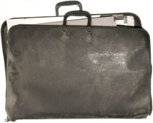
Actual portfolio, cardboard and fake leather, 34 by 42 inches, circa 1978.
In the fall of 1979, prior to my last year of design school, on a trip to New York City, I went job hunting. I visited about six design firms. One of them, Vignelli Associates, eventually made me a job offer, and that’s where I started my career one week after graduating from the University of Cincinnati’s College of Design, Architecture and Art in June 1980. I didn’t know it then, but that would be the last time I would look for a job.
On each of those visits, I carried my work in a black portfolio, 34 by 42 inches, acetate sleeves, pockets in the front and back. That portfolio sat in a box, largely untouched, with some other junk in the closets and basements of the three places I’ve lived in the last 27 years, sort of like a slowly decaying design time capsule. A few weeks ago, I opened it up for the first time in a long time.
I realize you’re not hiring, but may I show you my portfolio?
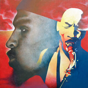
We’ll start with this portrait of jazz saxophonist Sam Rivers, copied from photographs on his album The Complete Blue Note Sessions. This is the kind of thing upon which I had built my reputation by the time I graduated from high school: painstaking realism in the style of Bernie Fuchs, Bob Heindel and especially Mark English. There wasn’t any instruction in this kind of thing available at UC. I did it after hours, as a private exercise in self indulgence. One never heard names like Fuchs, Heindel and English invoked in our classes.
Instead, we heard a lot of names like Hoffman, Muller-Brockmann, and Weingart. And, of course, Paul Rand. I didn’t realize it as a 17-year-old from suburban Cleveland, but in applying to study graphic design at the University of Cincinnati in 1975, I was enlisting in a particular midwestern strain of a nascent global design ideology. Most of my instructors had studied at Yale University under Rand, Bradbury Thompson and Alvin Eisenman, or at the Allgemeine Kunstgewerbeschule in Basel, Switzerland with Hoffman and Weingart.

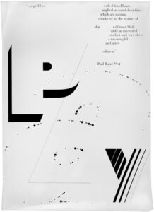
So out went the crosshatching, and in came the grid systems. I became a designer with a split personality. Without ever putting aside my passion for lush, literal illustration and blunt commercial art, I became an enthusiastic student of the “new Swiss” movement that was sweeping across American design education in the wake of Weingart’s 1972-73 U.S. lecture tour. Two leading Basel-trained practitioners, Ken Hiebert and Hans-U. Allemann, visited us from the Philadelphia College of Art and led a week-long workshop, resulting in this interpretation of a Rand quote from “Design and the Play Instinct.” Like so many such interpretations, it is neither playful, nor fun, nor surprising, but rather a fairly succinct compendium of then-trendy European design gestures: dots, lines, diagonals, and simulated light-to-dark gradations.
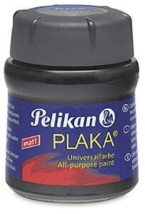
That’s not to say that we didn’t learn practical things too, like how to render letterforms in a brand of black and white poster paint called Plaka that was specially imported from Switzerland and stocked in the UC bookstore expressly for us graphic design students.
We were asked to choose the name of an artist and interpret it typographically. (We didn’t know we were fortunate to get a choice; year after year, Rand assigned all his students the same name, Leger.) I managed to combine what now seem like over-obvious visual puns with the expected typographic moves of the day, painstakingly executed by hand. For Ansel Adams, that meant an allusion to the photographer’s trademark Zone System.
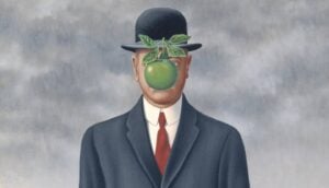
Or the enigmatic absences of Magritte’s surrealism…
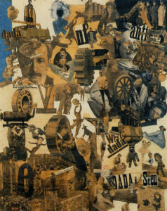
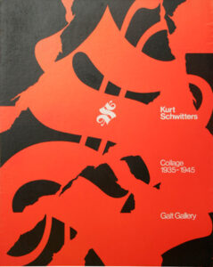
…or the collages of the Dada movement. With Schwitters, I got to indulge a seemingly insatiable infatuation I had for what Bill Drenttel calls Silk Road Typography, also beloved by kidnappers, sampled mildly in the Rand poster above, and with real gusto here. Hand painting letterforms is one of those ostensibly obsolete skills that I now concede was truly character building. Those hours improved my eye not just for typography but for symbol design and formmaking in general.
In an inversion of actual practice, formal exercises were often developed into preemptive responses to imaginary assignments for nonexistent clients. In this case, the Schwitters exercise became a poster for a notional exhibit at a gallery I invented that got its name either from the hero of Ayn Rand’s epic novel Atlas Shrugged (which I read six times in my five years of college, sorry) or from the fact that I had only capital Gs left in my collection of presstype. This may account as well for the date range, oddly late in Schwitters’s career for such a show. I am relieved that at least the artist was still alive in 1945; content was a pretty malleable thing for me in those days and I wouldn’t have checked.
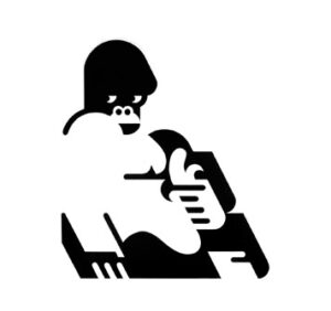
This was a classic assignment given by Cincinnati professor Joe Bottoni that I believe is still given to this day: pick an animal and render it in simplified forms. I have fond memories of sketching gorillas at the Cincinnati Zoo. Oddly enough, I don’t remember seeing the work of local boy Charley Harper until much later. Thank God, because he had taken almost all the available animals for himself. Painted by hand, again, in black and white Plaka.
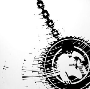
My selection of this subject turned into a problem when the second part of the assignment was revealed: to show the animal in motion. Gorillas are basically immobile. My way around this was a rare instance where I came up with a mildly funny solution to a class assignment. Note that the lettering on the tire is pretty much the same as the word “Kurt” in the Schwitters exercise. I really knew how to paint those kind of letters.
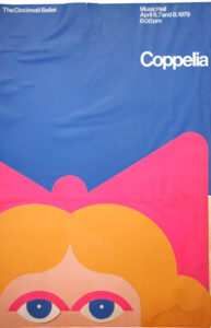
This was my response to a competition held by the Cincinnati Ballet to design a poster to promote their holiday show. This is clearly my attempt to steal from another one of my secret idols, Gilbert Lesser, the New York-based designer perhaps best known for the Studio 54 logo, and a non-doctrinaire master of geometric minimalism and Helvetica. Handcut Pantone paper and presstype. I lost the competition to someone — a non-designer, it looked like — who did a drawing of a ballerina and stuck some cursive typography next to it: an early reminder that high design didn’t always play well with the regular folks.
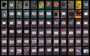
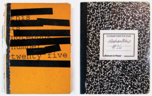
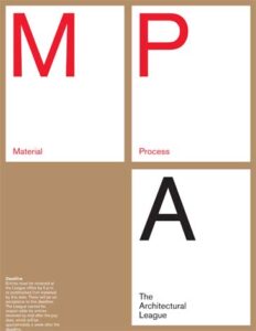
On my own time, I dreamed of merging my interest in illustration, my love of commercial art, and my growing facility with classic form resolution. Freelance assignments gave the chance to try. I designed (and wrote) posters to promote the school magazine, Clifton, where my then-girlfriend (now wife) was business manager. The obvious model for this eclecticism was Pushpin, of course. But so tragically futile! How easy it seemed to imitate anyone who used flat colors, geometric shapes and sans serif type on a grid, and how hard it was to knock off Milton Glaser and Seymour Chwast. I began to realize around then that maybe I didn’t have what it took to make it as a designing illustrator. (Note the Times Bold, one of my favorites back then. Take that, Coudal!)
I believe it was this piece that got me the job at Vignelli Associates. The assignment was to design a brochure for commercial label papers. Each page a square, a simple 2×2 grid, one size of Helvetica in two weights: quintessential International Style modernism straight out of the tube. More surprising to me, and dismaying as well, is how eerily the cropped label artwork anticipates the packaging I was to do for Saks Fifth Avenue nearly 30 years later. It’s sobering to realize how trapped I am by my own handwriting.

This piece, one of several I did for Print‘s annual student cover design competition, was just about the last time I undertook an ambitious illustration, this one a self-portrait based on a old black-and-white picture my mom commissioned when I was five. I still like it, although it isn’t very good. I lost the competition, of course, and retreated into the comfort of typography for, well, the rest of my life.
It’s easy to assume that one grows in self-confidence over the course of a life in design, and in many ways I have. But looking back to 1979, I’m struck by how much nerve I had back then. Part of maturing as a designer is discovering what you’re good at. Inevitably, you become biased towards what you know will work. In unknown territory lurks the risk of failure. Back then, I was too naive to know what risk was, and too enthusiastic to dream I’d be slowed by any obstacle. I’m older and wiser now, and, maybe, sounder and safer. Is it too late to take up crosshatching again?
Observed
View all
Observed
By Michael Bierut
Related Posts

Innovation
Ashleigh Axios|Essays
Innovation needs a darker imagination

Business
Kim Devall|Essays
The most disruptive thing a brand can do is be human

AI Observer
Lee Moreau|Critique
The Wizards of AI are sad and lonely men
Business
Louisa Eunice|Essays
The afterlife of souvenirs: what survives between culture and commerce?
Related Posts

Innovation
Ashleigh Axios|Essays
Innovation needs a darker imagination

Business
Kim Devall|Essays
The most disruptive thing a brand can do is be human

AI Observer
Lee Moreau|Critique
The Wizards of AI are sad and lonely men

Business
Louisa Eunice|Essays
