
July 11, 2012
Obama’s New Fonts

Image by Chip Somodevilla / Getty Images (via BuzzFeed)
Over the weekend, Zeke Miller posted an item at BuzzFeed about the new Obama typeface. Rolled out during the president’s recent Midwest bus tour, the fonts were chosen to present the Obama 2012 campaign’s new slogan, “Betting On America.” This only counted as political news because “America” was set in what looks like Revolution Gothic Extra Bold, from MyFonts, described as follows:
The original font is inspired by retro propaganda posters and wallpainting in Cuba from the 60s to 80s. And the original PAG Revolucion is the most popular font from Prop-A-Ganda.
In other words: a Communist typeface conspiracy theory in the making.
More striking to me than the name of the font, and even its tenuous Cuban connections, was how ugly this poster is. I know ugly is not a term of criticism, so let’s unpack. Obama’s current campaign strategy seems to be to paint himself as a champion of the working and middles classes, and Mitt Romney as an out of touch rich guy. The Camp David vacation, the bus, the diners of early July all send that message. Who is betting on America? He is, by not cutting jobs and offshoring industries. And we are, by rallying around the largest word on the poster, America. Uncontroversial when spelled correctly.
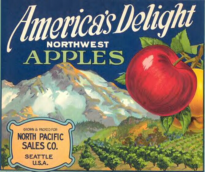
The curved square corners, the low-riding bar, the slanted ends of the arms all suggest a pre-digital, possibly hand-drawn typeface, not 1980s but 1940s [or maybe 1920s]. When paired with the script [identified in the comments as MVB Mascot, designed by Mark van Bronckhorst in 2012], the combination suggests to me early advertising, printed but “personalized” with a script message. My first thought was fruit crate labels, which often combine block letters, script, and images of fruit orchards and fields. What could be a better association for a trip to the heartland in summer, when strawberries, if not apples, might be consumed?
And yet, something is missing here. I see the possible references, but the result is mechanical, cold. The color palette, white on midnight, doesn’t help. The American flag field, so effective when combined with Obama 2008’s large Gotham O, is shrunk to the size of a button at the top. Gotham appears in both its 2008 (sans serif) and 2012 (slab serif) versions, but also shrunken. Compare the mixed messages and mixed fonts of “Betting On America” to the simpler, bolder “Change.” Change, in word and font, was forward-looking and sophisticated. The script and the block letters are both awkward, angular versions of their kind. Without the landscape, without the energy of a softer, realer script, it looks like an ersatz version of American nostalgia.

The result lends itself to a critique of Obama’s campaign poster similar to the current critique of Obama’s campaign style: the words are all appropriate, but some feeling is lacking.
What do you think? Do you see different references? More curb appeal?
Observed
View all
Observed
By Alexandra Lange
Related Posts

Innovation
Ashleigh Axios|Essays
Innovation needs a darker imagination

Business
Kim Devall|Essays
The most disruptive thing a brand can do is be human

AI Observer
Lee Moreau|Critique
The Wizards of AI are sad and lonely men

Business
Louisa Eunice|Essays
The afterlife of souvenirs: what survives between culture and commerce?
Related Posts

Innovation
Ashleigh Axios|Essays
Innovation needs a darker imagination

Business
Kim Devall|Essays
The most disruptive thing a brand can do is be human

AI Observer
Lee Moreau|Critique
The Wizards of AI are sad and lonely men

Business
Louisa Eunice|Essays

 Alexandra Lange is an architecture critic and author, and the 2025 Pulitzer Prize winner for Criticism, awarded for her work as a contributing writer for Bloomberg CityLab. She is currently the architecture critic for Curbed and has written extensively for Design Observer, Architect, New York Magazine, and The New York Times. Lange holds a PhD in 20th-century architecture history from New York University. Her writing often explores the intersection of architecture, urban planning, and design, with a focus on how the built environment shapes everyday life. She is also a recipient of the Steven Heller Prize for Cultural Commentary from AIGA, an honor she shares with Design Observer’s Editor-in-Chief,