April 27, 2013
On the Trail of The Eater of Darkness

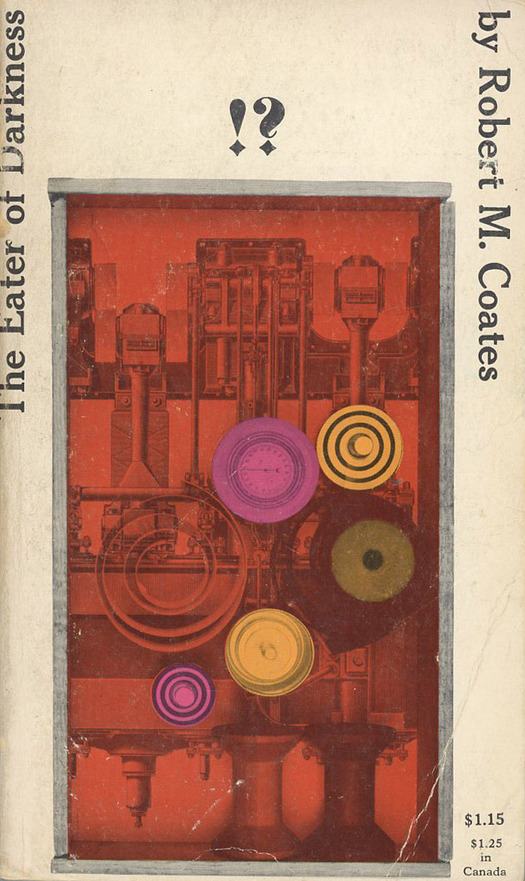
Published by Putnam Capricorn, 1959. Cover design by Milton Glaser
I stumbled upon The Eater of Darkness by Robert M. Coates while undertaking research into visual prose, sometimes also called visual writing, for a recent lecture. I had never heard of the novel, first published in Paris in 1926 by Contact Editions with the help of modernist matriarch Gertrude Stein, and the title alone would have been enough to compel my attention. From descriptions, the book appeared to be a genre-busting collision of science fiction, murder mystery, and Dada and/or Surrealism. A spread reproduced online — the same spread I show below — seemed to indicate that it featured artful typographic arrangements, with texts wrapping around each other and fragmented syntax. Even more promisingly, the website where I found it proposed that its interlocking passages anticipated the multi-voiced patchwork layout of Jacques Derrida’s Glas, meticulously designed by the late typographer Richard Eckersley.
Unfortunately, the American paperback edition in question, published by Putnam in 1959, was not immediately accessible to me in London, and it was also expensive. But it seemed there was an alternative. Out of print for decades, the book was republished in 2012 by the latest incarnation of Olympia Press, notorious Parisian purveyor of narrative pornography and literary landmarks such as Lolita and The Naked Lunch. This cheap edition I could obtain at once. Alas, this screen dump of a book makes a complete hash of the typography and treats the spread that had interested me as though it were a linear text. No way around it: I found the cheapest copy of the 1959 edition available and waited for it to turn up.
In the meantime, I contacted Milton Glaser because the other thing that made The Eater of Darkness a book I wanted to see was Glaser’s cover design. The website with the spread also reproduces the back cover where he has a credit. It doesn’t look like Glaser as we came to know him as designer-illustrator — he was then around 30 — but it is still an enticing design. The uncanny atmosphere and disorientating compositional style of the book, described on the back as “the first surrealist novel in English,” are signaled by the vertically positioned title and author’s name (surely unusual on a novel at the time) and by the curious device of the reader-beckoning, centrally placed exclamation/question motif with the gothically styled points — a graphic “what the heck.”
The illustration, a black-and-white photo of a Joseph Cornell-like surrealistic box, to which vibrant color has been applied at the printing stage, is not at all Glaserish. The mechanical elements and optical discs reminiscent of Duchamp’s Rotoreliefs represent the machine that the inventor and self-styled “Eater of Darkness” in the novel devises to kill people at a distance by means of a deadly, invisible “X-ray bullet.” “I very rarely ever use any art other than my own, so it may in fact be mine,” says Glaser, “but I have absolutely no recollection of having made it. I do, however, recall designing the cover.” I couldn’t find any occurrences online of the box as a freestanding work of art, suggesting that the piece was indeed made for the cover, and most probably by Glaser since there is no other credit.

The Eater of Darkness, 1959 edition
The properly typeset 1959 edition of The Eater of Darkness turned out to contain fewer departures in visual prose than I had hoped. (My lecture was prepared for a one-day event at the Royal College of Art about the British experimental writer Christine Brooke-Rose, and I included examples such as Glas, Avital Ronell’s The Telephone Book, Raymond Federman’s Double or Nothing, and Mark Z. Danielewsi’s House of Leaves, alongside Brooke-Rose’s Thru.) From a layout point of view, the spread shown here, where the central character, Charles Dograr, learns from a newspaper report that the first victim has been found mysteriously dead, is the most adventurous in typographic terms. Still, this is a book saturated with the anti-conventional artistic ambitions of 1920s Paris where much of it was written. Just before the killing, the narrative devolves into a three-page list of objects that the X-ray bullet passes through before destroying its target’s brain, which reads like a gleefully sustained exercise in Surrealist chance encounter:
. . . a pack of cards
a glass eye
two felt slippers
the C in a Chop Suey sign
a cigarette holder
an umbrella
Reginald Marsh
a bottle of gin
[etc.]
Other devices include a chapter broken into sections labeled (a) to (i) like a textbook; footnotes (years before Nicholson Baker); an annotated diagram of the “engine of death”; conjunctions that lead on to empty spaces followed by other conjunctions; and a lengthy passage rendered as if describing a movie, with interpolated captions summarizing the scene in the manner of intertitles. It is worth adding that Coates felt it necessary to update some of the more obscure references for the 1959 edition. These changes can be spotted easily because the lines of type are lighter; the unsatisfactory Olympia Press edition has the original text.
The Eater of Darkness is shot through with bizarre incident, antic humor and unexpected swerves, and comparisons have been made with Flann O’Brien’s The Third Policeman. The novel seems like perfect material for Exact Change, Dalkey Archive, or Atlas Press, and it deserves a proper reissue. Robert Myron Coates (1897-1973) had a long relationship with The New Yorker, where he was a contributor and art critic from 1937 to 1967, and he wrote other novels and short stories, but he has tended to be regarded as a “minor” writer and most of his fiction is out of print. His most committed advocate, Dutch academic Mathilde Roza, published the first biography about him in 2011 so a revival of interest may already be mounting.
Observed
View all
Observed
By Rick Poynor
Related Posts

Innovation
Ashleigh Axios|Essays
Innovation needs a darker imagination

Business
Kim Devall|Essays
The most disruptive thing a brand can do is be human

AI Observer
Lee Moreau|Critique
The Wizards of AI are sad and lonely men

Business
Louisa Eunice|Essays
The afterlife of souvenirs: what survives between culture and commerce?
Recent Posts
Sam Furness got serious about investing in his curiosity. Now, he’s helping others do the same. Corporate crisis is design’s opportunity In a world that feels impossible to change, emerging designer Deborah Khodanovich is starting small Elixir Design founder Jennifer Jerde believes in the human touchRelated Posts

Innovation
Ashleigh Axios|Essays
Innovation needs a darker imagination

Business
Kim Devall|Essays
The most disruptive thing a brand can do is be human

AI Observer
Lee Moreau|Critique
The Wizards of AI are sad and lonely men

Business
Louisa Eunice|Essays

 Rick Poynor is a writer, critic, lecturer and curator, specialising in design, media, photography and visual culture. He founded Eye, co-founded Design Observer, and contributes columns to Eye and Print. His latest book is Uncanny: Surrealism and Graphic Design.