
March 18, 2014
Open Source Politics/Open Source Design

When the Danish politician and Member of the Danish Parliament, Uffe Elbæk, decided to launch his radical new political party in 2013, the first person he called was Jonas Skafte, a young Danish graphic designer. The importance of graphic design and visual presentation in political propaganda of all kinds is not new. From woodblock electioneering posters in the pre-industrial era to the sophisticated digital stratagems of the Obama campaigns, graphic design has been fundamental to the way political parties and politicians present themselves to their electorate.
But with the launch of Elbæk’s party, Alternativet (The Alternative), graphic design appears to have assumed an even greater importance than normal. And since Alternativet is a party as yet without policies, we might even go as far as to say that graphic design is all they’ve got.
There’s a good reason why Alternativet has no polices. According to the party’s website, policies will be generated “together with citizens of all ages and in all parts of the country through events and workshops. We will focus on challenges, opportunities and good examples. Ideas will be gathered which can be developed into solid political proposals and serious sustainable scenarios for the future.”
Although Alternativet intends to make its policies collectively it nevertheless has a set of “core values”, a “political manifesto,” and “five political priorities”: it has been described as an “entrepreneurial green party.” But while we wait for Alternativet’s policies to be “crowd sourced”, rather than made by a political leader, the party’s visual identity must act in lieu of a figurehead. And although Uffe Elbæk is relatively well-known in Denmark (he was a former Minister of Culture), his face is nowhere to be seen on Alternativet’s website, nor are there any idealized Obama-esque portraits of him on campaign literature. Instead, Jonas Skafte’s acidic green diagonal stripe is used as a visual mnemonic and unifying symbol for all the party’s online and offline activities.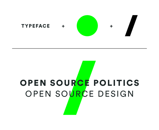
Elbæk has a track record for starting disruptive organizations. In 1991, he founded The Kaospilots, the alternative Danish business school. Jonas Skafte attended the school, but only met Elbæk subsequently at Bruce Mau Design in Toronto when Elbæk gave a lecture, and where Skafte was doing an internship. Currently a second year postgraduate student at the Royal College of Art in London, Skafte is a smart and progressive-minded graphic designer, and fully in sync with Elbæk’s ambitions for Alternativet: “I’m a supporter,” he says. “I think Uffe hoped I’d be a volunteer and do the work for free. But I told him I couldn’t work without payment. In the end, Uffe put a lot of trust in me. Thanks to our Kaospilot background, we speak the same language. At The Kaospilots there is strong culture of design.”
The initial brief Skafte received from Elbæk was vague. He was urged to be bold and daring, and to take inspiration from the brand identities of art galleries rather than other political parties. “I came up with four or five concepts.” Says Skafte. “There was one in particular that I really liked — a forward slash that formed part of the letter A. But it was too close to the logo of an existing Danish political party, and in the end we decided to merge two of the concepts.”
The project moved at high speed, in keeping with the new instant publishing culture of the Internet: “I would show them a draft,” recalls Skafte, “and rather than engaging in discussions, the ideas would be put to use straightaway. Suddenly we were live. Letterheads were designed the day they were needed. The website was launched a few hours before Alternativet went public.” Skafte likens the design process to “flying an airplane while building it.”
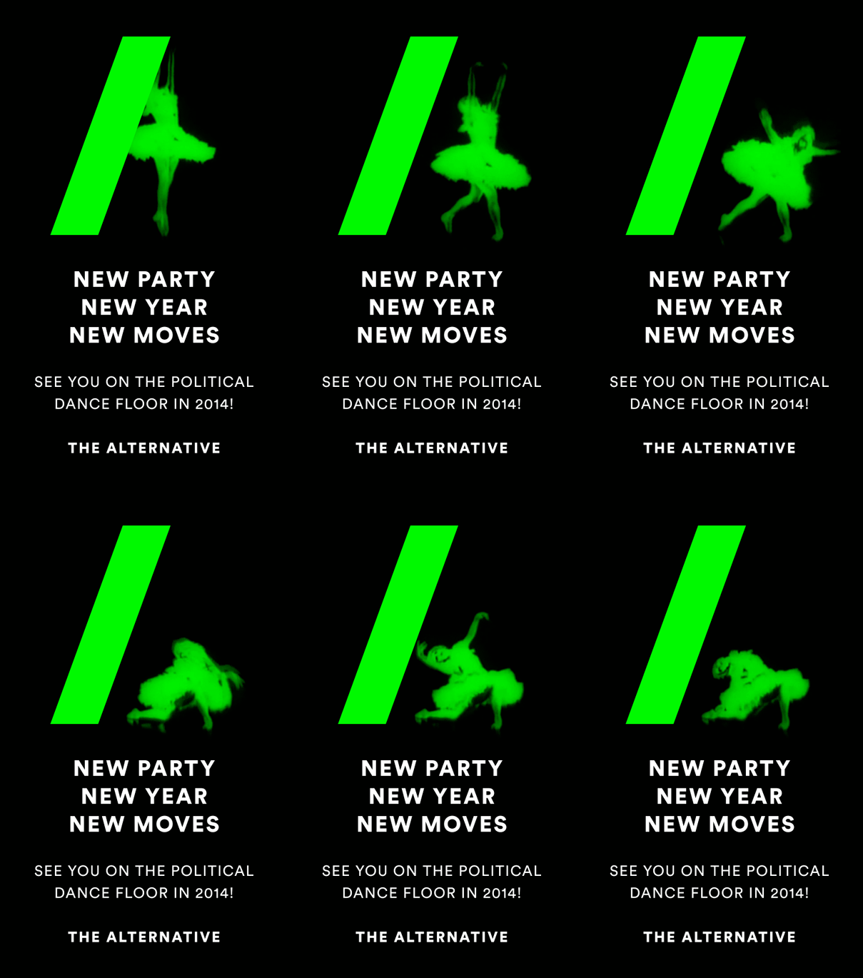
In keeping with Alternativet’s democratic ambition, Skafte’s visual identity aims to be a “open source” identity. It could hardly be simpler. It consists of only three elements: a single colour (RGB: 0/255/0; or Pantone 802C; or “just the greenest CMYK colour achievable”); a font (LL Circular); and the forward slash (always at 20°). “These three elements have no limits or restrictions on how they are used,” says Skafte, “and instead of giving Alternativet a design manual full of rules, I delivered an ‘inspirational PDF’ with examples of various ways in which these elements can work together. In fact, my intention was to not give them a logo at all, but a graphic system. However, for the launch of the party it was important to be as recognisable as possible, and so a temporary logo was used. The three design elements do not all necessarily have to be used, it is okay to just use one or two of them as the font might not be available or if it’s only possible to print black and white — that’s okay as long as it’s recognisable.”

While it’s easy to see how the notion of “open source” politics might have a strong appeal to the electorate of many Western democracies disenchanted with their political overlords, the role of the “crowd” in design sits uneasily with the idea of the designer’s omniscience in design matters. Can design be democratic? Can a visual identity be effectively implemented by amateurs? Can high design standards be maintained when usage is controlled by untrained users?
Skafte’s desire to create an identity suitable for “grass roots implementation” stands in blunt contrast to the need for graphic distinctiveness and visual sophistication — such as you might find in the identity for a stylish art gallery, for instance. I asked him if it is possible for the two aims to be accommodated within the same identity? “Finding that balance is difficult,” he admits. “I’ve designed something that is robust, well thought through, easy to adopt, and anyone can take the files and use them. But in reality I have created an identity that needs some design knowledge.”
Does correct implementation matter in the age of self-publishing and social media? Who cares if Facebook pages look a mess? Who cares if people use Skafte’s identity to make cookies or hand rendered roadside signs? “I really like these unconventional usages, and I encourage them,” he says. But in the absence of firm policies, the Alternativet identity has been the target for some rough handling on social media. “It got mocked and critiqued,” says Skafte, “mainly because the graphic design was having to represent a whole political movement.”
Although both Alternativet, the political party, and Skafte’s embryonic identity (it is growing all the time), are yet to be proved viable, it’s clear that both are indicative of a new trend in human affairs. The end of the all-knowing expert appears to be nigh. Politicians and designers who wish to hold onto their positions as authority figures had better watch out — the “crowd” is banging at the gate.
Observed
View all
Observed
By Adrian Shaughnessy
Related Posts

Innovation
Ashleigh Axios|Essays
Innovation needs a darker imagination
Business
Kim Devall|Essays
The most disruptive thing a brand can do is be human

AI Observer
Lee Moreau|Critique
The Wizards of AI are sad and lonely men
Business
Louisa Eunice|Essays
The afterlife of souvenirs: what survives between culture and commerce?
Recent Posts
Sam Furness got serious about investing in his curiosity. Now, he’s helping others do the same. Corporate crisis is design’s opportunity In a world that feels impossible to change, emerging designer Deborah Khodanovich is starting small Elixir Design founder Jennifer Jerde believes in the human touchRelated Posts

Innovation
Ashleigh Axios|Essays
Innovation needs a darker imagination

Business
Kim Devall|Essays
The most disruptive thing a brand can do is be human

AI Observer
Lee Moreau|Critique
The Wizards of AI are sad and lonely men

Business
Louisa Eunice|Essays
