Business • Media • Typography
April 3, 2004
Stanley Kubrick and the Future of Graphic Design
Imagining what the future will look like is never easy. Does anything go out of date faster than someone’s idea of what décor, fashion and hairstyles will look like ten, one hundred, or a thousand years from now? But there was one artist who got it perfectly right: Stanley Kubrick.
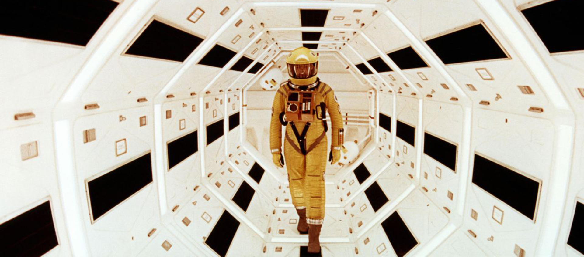
Inspired by Jessica Helfand’s recent post here on the peculiar graphics of the Apollo space program, and intrigued by an article on Kubrick’s archives in the Guardian, I went back and watched 2001: A Space Odyssey. From the moment the prehistoric bone-as-weapon turns into the floating spacecraft (the best jump cut in the history of cinema), you know immediately you’re in the hands of a master. And 35 years later (plus three years past due), it all looks better than ever.
As a graphic designer, I was interested to learn from the Guardian article that Kubrick was obsessed with typography, with a special affection for Futura Extra Bold. This font is so strongly associated with 2001 that I was surprised to realize that it appears only in the promotional material for the movie; the main titles are a kind of cross between Trajan and Optima, and I regret to say this is as horrible as it sounds.
In space, however, all is forgiven. In film after film, Kubrick proved himself to be a poet of the horrors and pleasures of boredom, and I mean that in a good way. The little boy going round and round on the Big Wheels in The Shining, the exquisitely slow zooms in the vast landscapes of Barry Lyndon: these are some of the most memorable images ever put on film.
In 2001, the everyday banality of space travel gets its own special treatment that will ring true with any Wallpaper-toting frequent flyer. Buck Rogers histrionics are rejected in favor of the simple pleasures of the low-cost flight to Fort Meyers; my eleven-year-old daughter, seeing the seat back video screens on the film’s space shuttle, exclaimed, “Just like Jet Blue!” Graphic design provides the grace notes. 2001‘s vast space station is fully colonized by corporate brands, some still with us (Hilton), some still with us but a little more unlikely (the glamorous-sounding Earthlight Room is operated by Howard Johnson’s) and some, alas, gone forever (Bell Telephone, Pan Am). Each logo is deployed with understated precision, contributing to the sense of place no less than the red Olivier Mourgue “Djinn” chairs and the Saarinen occasional tables.
Kubrick knew well the power of brand name as mot juste. My favorite line in Dr. Strangelove is delivered by Keenan Wynn as he grudgingly permits Peter Sellars to shoot off the lock of a soda dispenser to get enough spare change to make a phone call to the president to call off World War III. “If you don’t get the President of the United States on that line, you know what’s going to happen to you?” he growls as if he’s delivering the biggest threat of all. “You’re going to have to answer to the Coca-Cola Company.” There, in one sentence, you have the DNA from which was to spring both Davos and Adbusters.
Kubrick’s sense of humor in 2001 is more subdued, but no less evident. In The Making of Kubrick’s 2001, a great out-of-date paperback edited by Jerome Agel (of The Medium is the Message fame), the space shuttle’s daunting instructions for its Zero Gravity Toilet are identified as the film’s “only intentional joke,” and in Eurostile to boot. In an age where few of us can access the advanced features of our cell phones, it still gets laughs. Kubrick understood so well that the everyday hallmark of the 21st century would not be the wonder of technology, but our day-in, day-out struggle to master it.
More like this:
AI Observer
Dave Snyder
The compound interest of design: what not to build
Editor’s note: This is Dave Snyder’s first opinion piece for Design Observer. Be sure to read to the end. I’ve been designing digital products for 25 years. I remember when the big decision was going from 800×600 to 1024 pixels. I’ve lived through multiple cycles of VR hype, watched the web go from static pages … Continued
The Observatory Newsletter
Michael Bierut|Audio
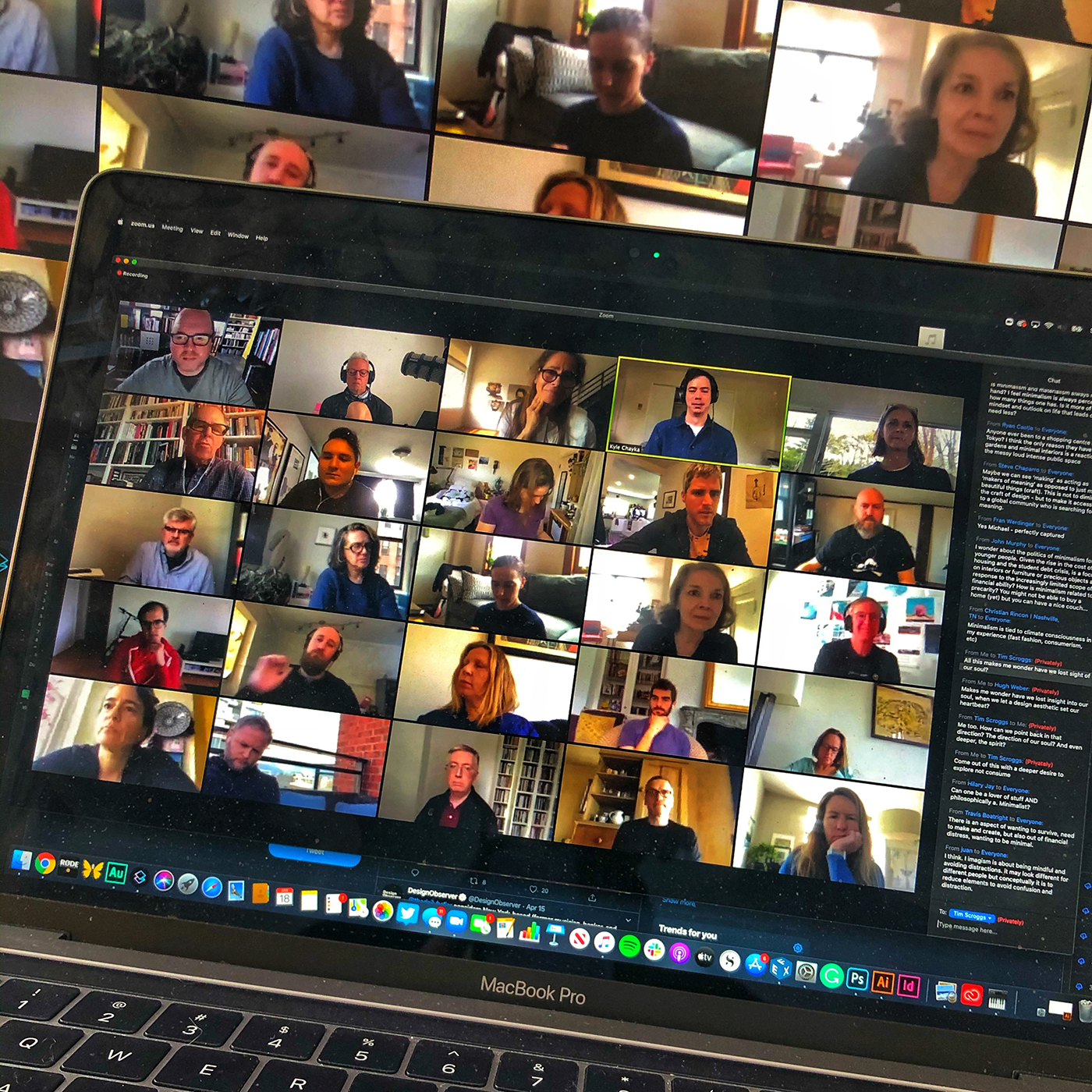
Episode 125: Zoom Aesthetics
Zoom aesthetics and COVID-19; Kyle Chayka on minimalism; Deborah Berke on shared spaces; Jessica Salfia’s poem “The First Lines of Emails I’ve Received While Quarantining”; Megan O’Grady on artistic recluses
The Observatory Newsletter
Ellen McGirt|Recommended Books
Booked and Blessed
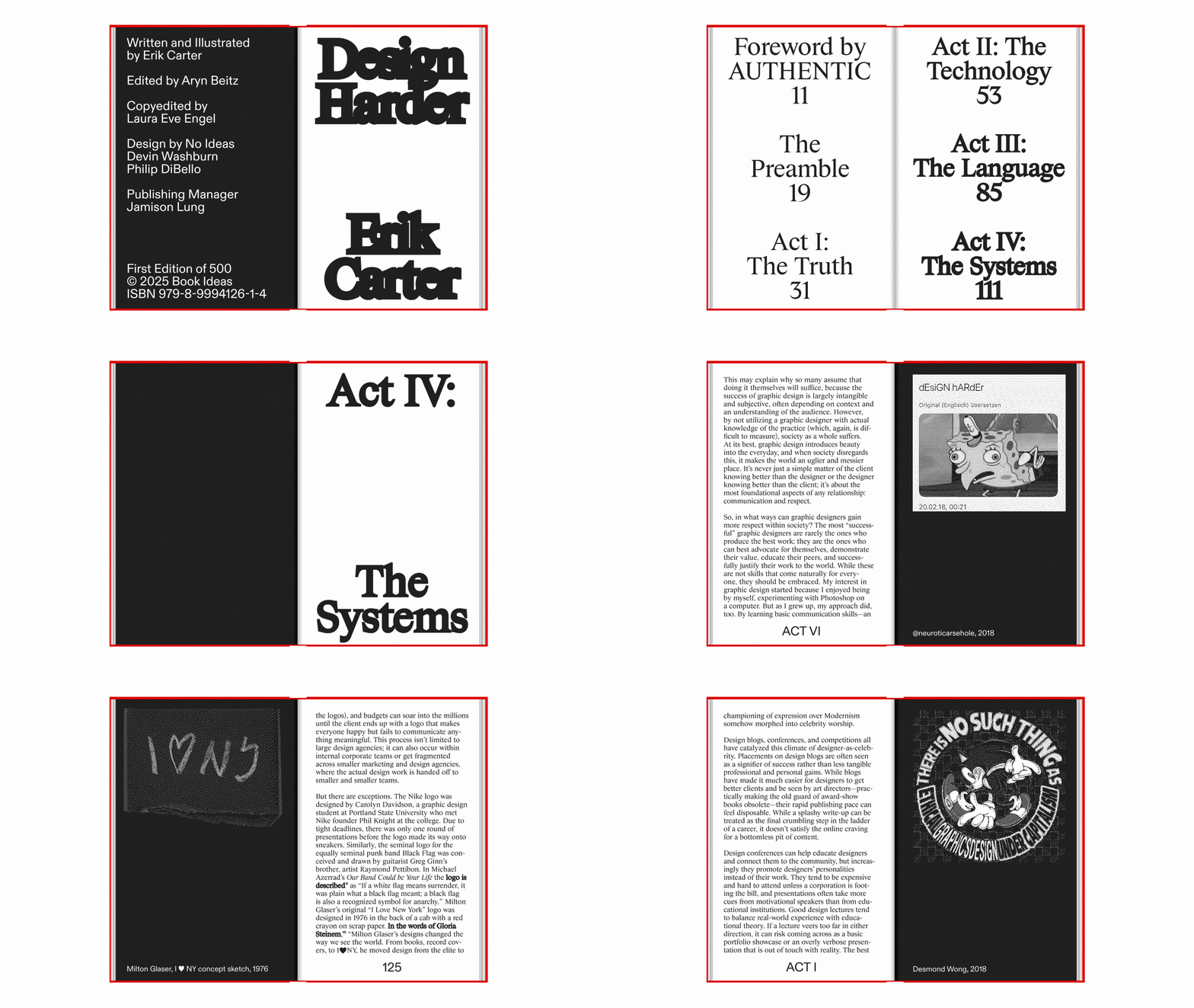
Erik Carter’s new book, Design Harder, takes aim at the state of graphic design, critiquing capitalism, sameness, and creative complacency with humor and heart.
Observed
View all
Observed
By Michael Bierut
Related Posts
Innovation
Ashleigh Axios|Essays
Innovation needs a darker imagination
Business
Kim Devall|Essays
The most disruptive thing a brand can do is be human

AI Observer
Lee Moreau|Critique
The Wizards of AI are sad and lonely men
Business
Louisa Eunice|Essays
The afterlife of souvenirs: what survives between culture and commerce?
Related Posts

Innovation
Ashleigh Axios|Essays
Innovation needs a darker imagination

Business
Kim Devall|Essays
The most disruptive thing a brand can do is be human

AI Observer
Lee Moreau|Critique
The Wizards of AI are sad and lonely men

Business
Louisa Eunice|Essays
