
April 13, 2016
The D Word: Stock Cuts
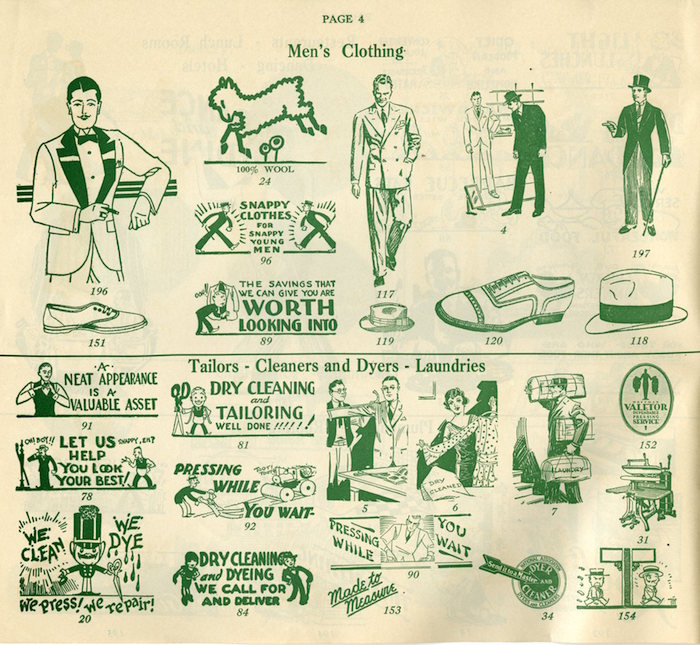
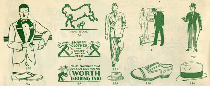
The printer’s “cut” (a.k.a “cliché”) is as common to graphic design practice as yodelling is to mountain climbing in the Alps. Yodelling is an oscillating, trill, and often polyphonic sound that fills the snowcaped peaks with vocal resonance; printer’s clichés are visual noise—signs, symbols, vignettes—that fill mountains of empty printable space.
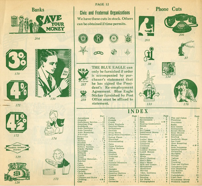
Pointing fingers were the most ubiquitous, watch faces, smiling and frowning heads, horses, fruits and vegetable baskets and funerary iconography have long been staples of the cut business—but thousands of others have been produced celebrating everyday events like birthdays, marriages, and Christmas. In addition to the garden variety of stand-alone symbols, there were comic cuts, symbolic cuts, and conceptual cuts—cuts that were impressionistic, expressionistic, and cubistic. Anything that looked good, gave relief to the eye, and helped tell a story. Most were anonymously done.Today’s pictographs and icons are direct descendents of the cliché. In fact some are direct copies too.
Observed
View all
Observed
Share on Social
By Steven Heller
 Steven Heller is the co-chair (with Lita Talarico) of the School of Visual Arts MFA Design / Designer as Author + Entrepreneur program and the SVA Masters Workshop in Rome. He writes the Visuals column for the New York Times Book Review, a weekly column for The Atlantic online and The Daily Heller.
Related Posts

Innovation
Ashleigh Axios|Essays
Innovation needs a darker imagination

Business
Kim Devall|Essays
The most disruptive thing a brand can do is be human

AI Observer
Lee Moreau|Critique
The Wizards of AI are sad and lonely men

Business
Louisa Eunice|Essays
The afterlife of souvenirs: what survives between culture and commerce?
Recent Posts
Wayne Suiter Matamoros|Peru's Sacred Valley
Looking to Latin America for the future design innovation Pope Leo XIV weighed in on the AI conversationJessica Helfand|The Icarus Diaries
20: Deus ex Machina Nina Katz’s answer to growing anti-trans rhetoric: nine larger-than-life portraits of the people she wants you to meetRelated Posts
Innovation
Ashleigh Axios|Essays
Innovation needs a darker imagination
Business
Kim Devall|Essays
The most disruptive thing a brand can do is be human
AI Observer
Lee Moreau|Critique
The Wizards of AI are sad and lonely men
Business
Louisa Eunice|Essays