December 31, 2009
The Plot Against America: Prop Story Redux

If you watch the six part HBO adaptation of Philip Roth’s novel The Plot Against America, which premiered on March 16, please keep your eye on the props. You’ll doubtless have to watch a second time for that, but they are important actors in the drama. In addition to graphic designer and prop-designer Eric Rosenberg (interviewed on Design Observer here), other graphic designers were required to produce the large quantity of material used throughout the mini-series. Veteran illustrator and prop-designer Ross Macdonald joined the team to lend his expertise to a number of quotidian props (some on camera for but a milli-second). Philip Roth’s original book was chilling in many ways and like actors who must deeply embody the characters’ lives, the prop designers are similarly impacted by the emotional weight of their work. I asked Macdonald to share his process and also his feelings about designing for Plot.
Steven Heller: You have been designing movie props for many years. Was there anything unique about making props for The Plot Against America than for other films? Was it too close to home, let’s say?
Ross Macdonald: This show had its own special terrors. I’m often asked to work on disturbing material — serial killer’s letters, detailed descriptions of the enhanced interrogation for The Report, victim’s statements for Paterno, the descriptions of birth defects caused by Dupont chemicals for Dark Waters, etc.
For Plot, I had to find dozens of papers from the early 40’s, and the articles needed to be retyped so we could use them in our prop papers. It was gripping reading the daily reports — the Nazi’s takeover of Europe, the bombings in London, Dunkirk, Uboats sinking ships, residents fleeing vast areas — all told by people who had survived the terror, and yet had no idea of the further horrors that were coming tomorrow, next week, and for years to come. Having worked on and done research for a lot of period films and shows, I was lulled into thinking that I had a pretty good grasp of history, but when you have an overview of what happened, it can be hard to understand just how terrifying it must have been living it day-to-day, and not knowing what was coming next. And yes, the parallels between the creep of fascism of that era and our own made it all that much more chilling.
SH: How did you come to work with Eric Rosenberg on this project?
RM: I had had the pleasure of working with Eric on a couple of previous projects, and we had discovered that we had some friends and colleagues in common. Peter Gelfman, the propmaster, asked me to work on some items for Plot. I had worked with Peter on The Knick. It quickly became apparent that the rapidly changing schedule, and the sheer massive volume of work was in danger of overwhelming the art department. I had worked on newspapers for other productions, so I offered to help with the many papers needed for Plot. It was great working with Eric, who not only has a real knowledge and appreciation of period design, but has a background in both film and print. Experience in both fields is really a bonus when making props. There are plenty of great print designers who don’t grasp the nuances of making good props, and lots of graphic designers for film who have little or no print experience, and don’t understand how to design a periodical that needs to be printed. You really need both skillsets.

SH: I read Roth’s book in galley before publication. It was a shocker, but unreal. My parents lived through those years; The nation survived, defeated the Nazis, etc. It was scary but fiction. How did you feel when you read the script or book?
RM: I started reading the book, but dropped it when I got the scripts, since they were what I needed to take my cues from. Reading the scripts, I felt a sense of creeping doom, which was intensified by the research I was doing into the early days of WWII. The feeling was further compounded by what we were hearing in our own news at the time — white supremacist marches, attacks on synagogues and mosques, travel bans. The story felt a little less like fiction, and a little more like prophecy.
SH: How did you apportion the work? You seem to have done a lot of the more quotidian materials, like stamps, school books, newspapers, etc.?
RM: Most of my marching orders for that stuff came from Peter Gelfman. He needed someone who could do the period research, design the stuff, but also fabricate it. Print hundreds of copies, perforate the stamps, print the newspapers, draw illustrations for the books, provide dozens of period Newark ads for the newspapers, bind books and booklets, bind and perforate checkbooks, etc. Some of those things can be performed by the in-house art department, but they usually don’t have the time or wherewithal to fabricate things.

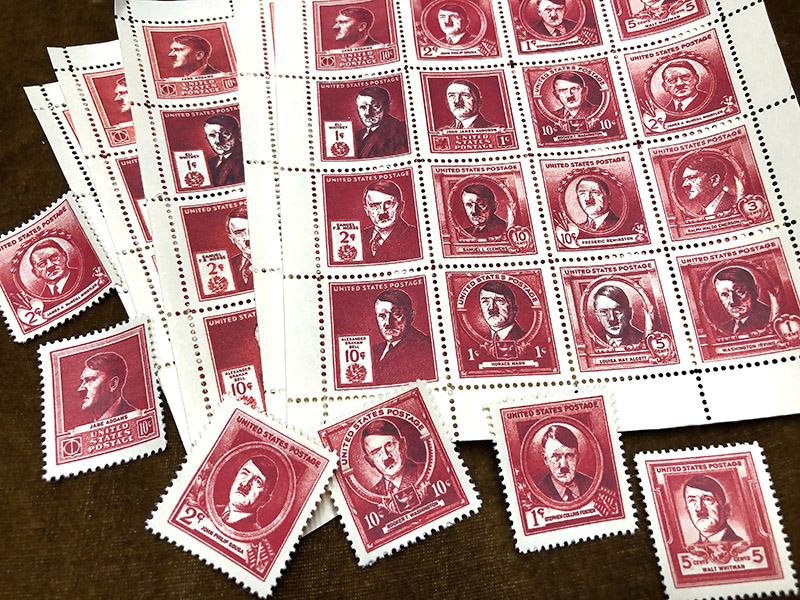
SH: Seeing the stamps with Hitler’s picture reminds me of when as a Kid I collected them. Did making these trigger any emotions?
RM: There are less than a handful of real stamps with Hitler’s face on them, and the engraved ones are all in profile. For this show, they had a dream sequence where all the faces on the 1940 Famous Americans series of stamps turn into Hitler’s face. Almost all of the 35 faces on those stamps are face forward. So, I had to search for images of Hitler’s face in a similar pose, and then draw them as faux engravings. You might think that after looking at and drawing a lot of images of Hitler, it would become quite clinical, but that never happened. I was never able to shake the disturbing feeling, especially since I was working on the newspapers at the same time so I was connecting the stories of the horror with the person who was the cause.
SH: Can you describe the usage of these items. The ledger, school book, portfolio? And what was your model for each?
RM: The ledger is used in a scene at the border crossing from Canada. Agents use the book to screen border crossers, to weed out any known agitators or undesirables. I modeled the pages on period FBI ‘wanted’ cards, using the same layout and fonts. As with most prop work, I’m almost more of an archeologist than a designer. You want to make things look right, and that doesn’t always mean beautiful. The binder is one of several vintage heavy-duty binders I have. I scavenge a lot of stuff like that — vintage paper, art supplies, check writers, typewriters, binders, folders, ledgers, clipboards, etc. They really come in handy for period work, whether as models, or for actual use. This piece seemed like the perfect use for this old binder, which is black, heavy, and foreboding, with quarter-inch thick black boards, metal hinges and lots of clanking metal parts.
For the school book, I looked to my collection of vintage school books for inspiration. Many of those are Dick and Jane books (and their imitators) from the 1920s through the late 60s. I used the early 1940s ones as the model. I had drawn the cover art and a few interior illustrations, and had designed the interior pages, which are all real, period arithmetic problems. They requested 30 copies for a classroom scene. Originally I had planned to do full hardcover bindings for these, but then the schedule changed and I had one day to produce 30 books. [For the school books] my friends at Rankin Textiles silkscreened the cover art onto bookbinding cloth, and then I raced back to my shop and mounted the cloth on board, printed the books, staple bound them, and put cloth tape over the spines. I barely got them done in time to ship them out that evening. Luckily that faster style of binding was used on a lot of grade school textbooks of that period, so I didn’t have to sacrifice period correctness for speed. And the “Homestead 42” portfolios are used in a scene where the characters are at a meeting discussing this [new government] program for the relocation of Jewish youth.

SH: Was there anything you did for the series that just didn’t work in the context of the script?
RM: Most of the time I was very careful to get things right, especially when it came to the newspapers. David Simon is the show runner for this, and he’s an ex-newspaperman — he worked 12 years on the crime desk at the Baltimore Sun. Not only that, but the papers feature in many closeups. However, one time we had to do 5 papers in a HUGE rush — I found out on a Sunday afternoon that they needed them in a few days. I had to get the copy and photos, design and print them. James Reyman (along with Jack Tom) helped out with the heavy lifting on the design for some of the papers for the show, and through superhuman effort, he was able to get print-ready designs for the 5 papers to me in time to print them. 5 complete newspapers in 3 days — I suspect he didn’t get much sleep. However, in the rush we missed a non-hero headline that didn’t fit with our timeline — it was about Bataan, which doesn’t happen in the alternate reality of our show. There was lots of hair-tearing over that, but it was for a scene where a character buys a different paper at a newsstand, so they could bury the Bataan paper in the background. It was a bad day, but hopefully I redeemed myself.
Observed
View all
Observed
By Steven Heller
Related Posts
Arts + Culture
Ellen McGirt|Interviews
The face, reconsidered
Design Impact
Alexis Haut|Education
‘Thoughts & Prayers’ & bulletproof desks: Jessica Dimmock and Zackary Canepari on filming the active shooter preparedness industry

Design Juice
Ellen McGirt|Design Juice
Making ‘change’ the product: Phil Gilbert on transforming IBM from the inside out

Arts + Culture
Alexis Haut|Interviews
How production designer Grace Yun turned domestic spaces into horror in ‘Hereditary’ and heartache in ‘Past Lives’
Recent Posts
Sam Furness got serious about investing in his curiosity. Now, he’s helping others do the same. Corporate crisis is design’s opportunity In a world that feels impossible to change, emerging designer Deborah Khodanovich is starting small Elixir Design founder Jennifer Jerde believes in the human touchRelated Posts

Arts + Culture
Ellen McGirt|Interviews
The face, reconsidered

Design Impact
Alexis Haut|Education
‘Thoughts & Prayers’ & bulletproof desks: Jessica Dimmock and Zackary Canepari on filming the active shooter preparedness industry

Design Juice
Ellen McGirt|Design Juice
Making ‘change’ the product: Phil Gilbert on transforming IBM from the inside out

Arts + Culture
Alexis Haut|Interviews

 Steven Heller is the co-chair (with Lita Talarico) of the School of Visual Arts MFA Design / Designer as Author + Entrepreneur program and the SVA Masters Workshop in Rome. He writes the Visuals column for the New York Times Book Review,