April 8, 2013
The Practical Virtue of Works That Work

The first issue of Works That Work magazine edited and published by Peter Bil’ak
Peter Bil’ak, a Slovakian designer based in the Netherlands, sent me a copy of his new magazine Works That Work a few weeks ago and I liked it immediately. But it’s only recently, while working on a talk about criticism for the AIGA’s “Blunt” conference later this week, that I had a chance to look at the magazine properly. So my apologies if the subject already seems ancient, though the next issue, if there is a next issue, won’t be out for a few months; the planned frequency is two a year. Still, with a venture this new, I’m guessing few will have seen an actual copy.
The magazine’s focus, signaled twice on its cover, is unexpected creativity of every kind. Now “creativity,” much as we depend on it, is perilously close to becoming one of those overused, tuneless, cheerleading terms like “vision” or “innovation” that sometimes make you wonder whether the very opposite is most likely to be the outcome. Bil’ak reclaims the word from the stultifying embrace of branding culture and design thinking (or is that passé now?) by being wonderfully low-key and “vernacular” about it. The curious image on the cover, shot by photographer Michael Wolf, is an improvised seat from his “Bastard Chairs” project undertaken mainly in mainland China and Hong Kong; there are several more of his pictures inside.
 Photographs of “Bastard Chairs” by Michael Wolf
The 84-page, saddle-stitched publication, set in Bil’ak’s Lava typeface, is small and bookish, like a journal, though it is also highly illustrated, and Atelier Carvalho Bernau’s design mixes different papers to good effect. The balance is just right. The worldly, outward-facing ethos seen here is very different from the often abstruse concerns and presentation style of Bil’ak’s previous editorial collaboration on issues 1-12 of Dot Dot Dot. A committed reader, he knows what makes a publication appealing and comfortable enough to relax into reading, rather than being something to browse as a primarily visual experience without ever becoming fully immersed. Thanks to perceptive commissioning, good copyediting and some fine writing, the articles repay the effort. Bil’ak now belongs to that select group of accomplished designers-turned-generalist editors that includes Tibor Kalman with Colors and Abbott Miller with 2wice.

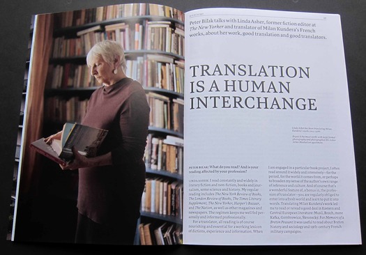
Interview with Linda Asher about her work and thinking as a translator
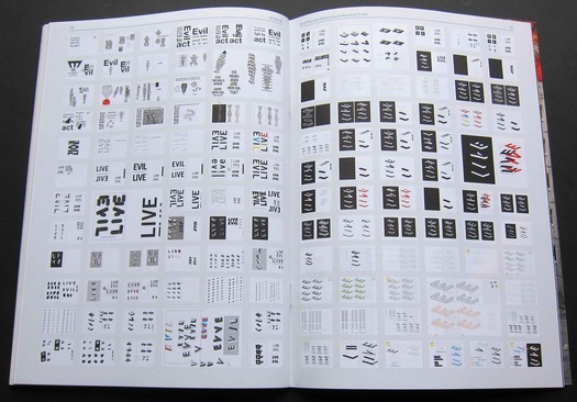
Leading from the front, Bil’ak conducts a penetrating interview about translation with Linda Asher, New York-based translator of Milan Kundera’s French books and former fiction editor of The New Yorker. D-Crit graduate Barbara Eldredge contributes an ably reported piece about the Kwikpoint pictorial guides used to aid communication between American troops and local people in Afghanistan and Iraq. A visual story documents the 300 or more stages in the development of a poster about evil by Swiss poster designer Ralph Schraivogel. Dutch designer Dingeman Kuilman, irked that the Rotterdam Design Prize excluded beauty as a criterion, challenges contemporary designers’ blinkered discomfort with the term, arguing that beauty’s “power is not conservative . . . but transformative.” Three cheers for that.
 An article about Mumbai’s 5,000 dabbawallas, who deliver over 350,000 lunches a day to office workers
 Development ideas for Ralph Schraivogel’s “Evil prevails when good men fail to act” poster
Initially funded by crowd-sourcing, Works That Work is equally unconventional in its approach to what it calls “social distribution.” The idea is that readers buy copies at a discount from one of the publisher’s “hubs” — seven is the minimum order — and sell them to bookstores. After the bookstore’s cut, the reader’s profit should be 10 to 25 percent of the cover price of each copy. One can understand Bil’ak’s desire to be free of the time-consuming pain of chasing money owed under traditional distribution arrangements, but who knows whether this new model is viable. The essential first step, if this refreshingly different magazine sounds intriguing, is to get yourself a copy of the launch issue.
Observed
View all
Observed
By Rick Poynor
Related Posts

Innovation
Ashleigh Axios|Essays
Innovation needs a darker imagination

Business
Kim Devall|Essays
The most disruptive thing a brand can do is be human

AI Observer
Lee Moreau|Critique
The Wizards of AI are sad and lonely men

Business
Louisa Eunice|Essays
The afterlife of souvenirs: what survives between culture and commerce?
Related Posts

Innovation
Ashleigh Axios|Essays
Innovation needs a darker imagination

Business
Kim Devall|Essays
The most disruptive thing a brand can do is be human

AI Observer
Lee Moreau|Critique
The Wizards of AI are sad and lonely men

Business
Louisa Eunice|Essays

 Rick Poynor is a writer, critic, lecturer and curator, specialising in design, media, photography and visual culture. He founded Eye, co-founded Design Observer, and contributes columns to Eye and Print. His latest book is Uncanny: Surrealism and Graphic Design.