February 11, 2008
The Smartest Logo in the Room

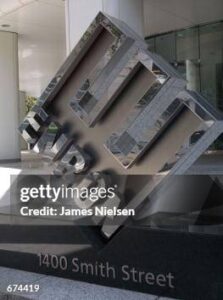
Paul Rand, logo for Enron Corportion in front of the company’s corporate headquarters in Houston, Texas. Photo by James Nielsen/Getty Images.
After the 2002 collapse of the company under the weight of its fraudulent business practices, [Paul] Rand’s “E” took on a whole new meaning. Rechristened the “crooked E,” it inadvertently became the most powerful anti-logo of its time. No parodist of corporate identity could have devised a more startling outcome.
The Enron debacle created much soul-searching among the graphic design community, as artists pondered the ethical dimensions of their power to shape people’s perceptions.
Of all the things I read in Stephen Eskilson’s Graphic Design: A New History, this passage startled me the most. Let the soul searching begin!
Paul Rand took logo design very seriously, and his work in the field serves as the centerpiece of many of his books. Detailed accounts of the genesis of symbols such as Morningstar, Next, and Ideo appear in A Designer’s Art, Design, Form and Chaos, and From Lascaux to Brooklyn; even rejected proposals, like those for The Limited and Ford, merit many pages of coverage. But Enron was designed too late in Rand’s career to make any of his books. In Steven Heller’s monograph, it’s simply identified as one of Rand’s last works, and it appears towards the very end, with no further comment, rounded up with a group of other, less notorious, logos.
Perhaps the only thorough account of the launch of the Enron logo appears in Conspiracy of Fools, Kurt Eichenwald’s 746-page history of the company’s rise and fall:
Despite the early hour — eight o’clock on the morning of January 14, 1997 — the mood in the room was jubilant. The big announcement was at hand. The planning had been very hush-hush, but now the employees were about to see the unveiling of Enron’s new image for the world.
On the far side of the room, [chairman Kenneth] Lay and [president Jeffrey] Skilling walked across the stage, stopping beside a large object covered by a massive cloth. Lay held up his hands, making barely audible shushing noises until he had everyone’s attention.
“Well,” Lay said. “We’ve come a long was since 1985, when we were just a pipeline company with a vision — a vision of becoming the premier natural-gas company.”
A smattering of applause.
“We have become much more,” he said. “We’re a force the world can be proud of, for everything we’ve been doing. Deregulating markets. Providing alternative services. Making markets more efficient.”
Applause again, louder this time.
“So we tried to develop a new logo that would reflect the dynamic company Enron has become,” he said. “It will be recognized as the logo of a company leading the energy industry into the next century, into the next millennium.”
The loudest applause yet.
“It’s a logo we can be very proud of.”
Lay gestured to the covered object. “And here it is!”
Recorded trumpets blared. Lights flashed. Smoke enveloped the stage. Someone pulled a rope, lifting the covering cloth. On the stage rested a giant sculpture — a single titled E. Multicolored lights surrounded each prong of the letter. The crowd loved it.
They celebrated the logo’s birth for an hour, then trickled back to the office where delightful surprises awaited. The logo was posted in hallways; new letterhead and business cards were at their desks. It was official: Enron had a cool new icon to show the world.
How sad the designer is mentioned nowhere. But maybe not! Because, well, wait for it:
Within hours, the world would laugh it off the stage. Houston faxed the logo to Enron’s offices in Europe. But in transmission the middle, yellow prong disappeared, leaving the new design meant to celebrate Enron’s triumphant ascension looking more like an electric plug. Worse, to the Italians it resembled an obscene hand gesture, one that meant about the same thing as shooting a middle finger at an American. The European executives roared with laughter: now they had a new way to win Italian customers.
Back in Houston, dismay grew: the yellow prong also vanished when run through the copying machine. Somehow, Enron had spent millions of dollars on a new business logo without bothering to check if it worked in business. Soon the hallway signs went down, the new cards and letterheads were shredded. With no fanfare, another logo was introduced, replacing the yellow prong with a green one.
The symbol meant to carry Enron into the next millennium hadn’t lasted a week.
Embarassing, but not to its designer. Not only would he know nothing of Enron’s ultimate collapse, Rand didn’t even live to see the unveiling, having died weeks before in November 1997. It has yet to be revealed who performed the last minute yellow-to-green substitution that briefly snatched the design from the jaws of defeat.
Nonetheless, faxability aside, the new symbol was rated a success. Identity consultant Tony Spaeth, for one, was enthusiastic about what he saw. “Enron would be Rand’s last logo (it is likely that he knew this), and he said it was his best ever. That is a tall order,” reported Spaeth his annual assessment of new logo programs for the February 1998 issue of the Conference Board’s magazine, Across the Board. “But it is a fine mark: bold, one big idea, but richer in layered ideas and associations than might appear at first glance. Like great names, great marks often have more than one layer of possible meaning; this one is of course a big E, but one can also see in Rand’s Enron ideas of household power as in a plug, industrial power as in stacks or towers, and connectivity (whether pipe or wire) between the E and N.”
There has since been some debate as to whether Enron was actually Rand’s last logo; certainly it was his last of real consequence. I personally never cared for the way the “pipeline” met the top of the first letter of Enron; it works fine for the N, but really needs a letter like U to work well at the top end. Unron, anyone? Also, I bet I would have preferred the doomed red-yellow-blue version.
But all of this is entirely missing Professor Eskilson’s point. The issue he raises is not the Enron logo’s aesthetics, or metaphoric incisiveness, or suitability to xerographic technology. Instead, it’s the “soul searching” that consumed the design community after the scale of the Enron debacle became known. Was one of our greatest practitioners complicit in legitimizing the activities of a massive criminal enterprise? Is Paul Rand our very own Leni Riefenstahl?
I actually don’t remember any soul searching. I do remember a bit of hey-you’d-never-guess-who-designed-the-Enron-logo gossip, but the reaction to the news was either schadenfreude or a bit of perverse pride, depending on one’s opinion of the late Mr. Rand. If anything, the fact that the same person had designed the Enron logo and the IBM logo seemed to say nothing more than good logos and good companies didn’t necessarily go hand-in-hand. Rand himself implied as much in his 1991 essay “Logos, Flags, and Escutcheons,” saying “A logo doesn’t sell, it identifies…A logo derives its meaning from the quality of the thing it symbolizes, not the other way around. A logo is less important than the product it signifies; what it means is more important than what it looks like.” And for those seeking Riefenstahl parallels, Rand adds, “Design is a two-faced monster. One of the most benign symbols, the swastika, lost its place in the pantheon of the civilized when it was linked to evil, but its intrinsic quality remains indisputable. This explains the tenacity of good design.”
So is this another instance where Stephen Eskilson’s book gets it wrong? I’m afraid so. In fact, I would make a completely different argument: even if Paul Rand’s logo helped legitimize Enron in its heyday, it played an even more important role in the aftermath of its collapse.
Enron’s success was built on one fundamental trait: the fact that the way it made its money was essentially — perhaps intentionally — incomprehensible. Any resemblances to electrical plugs and pipelines in the Rand logo were, if not unintentional, then less than useful to Enron’s management. They seemed much more comfortable with the completely abstract aesthetic of another iconic designer, Frank Gehry. “Enron shares Mr. Gehry’s ongoing search for the moment of truth, the moment when the functional approach to a probelm becomes infused with the artistry that produces a truly innovative solution,” wrote Jeff Skilling in his introduction to the catalog of Frank Gehry’s landmark 2001 exhibition at New York’s Guggenheim Museum, for which Enron was a lead sponsor. “This is the search Enron embarks on every day, by questioning the conventional to change business paradigms and create new markets that will shape the new economy.”
Questioning conventions! Changing paradigms! New markets! Whatever it all meant, somewhere in there Enron was making lots of money. Sorting out how it all went down the drain was such a baffling exercise that when Malcolm Gladwell convened an online discussion to try to figure out what it was, exactly, that Enron did that was legally wrong, he got nearly 15,000 words worth of answers. You couldn’t take a picture of Enron’s crime: it all happened in the world of numbers and spreadsheets, of financial reports and affidavits. But there was something you could take a picture of, and that was Rand’s logo. A company with a made-up name, incomprehensible business practices, and largely intangible assets suddenly had a vivid manifestation, a logo that once might have stood for nimbleness, balance and connectivity, now given new life as “the crooked E.”
“The flip side of the power and importance of a brand is its growing vulnerablity,” wrote the editors of the Economist in a riposte to Naomi Klein’s No Logo titled “The case for brands” and subtitled “Far from being instruments of oppression, they make firms accountable to consumers.” The editorial goes on: “The more companies promote the value of their brands, the more they will need to seem ethically robust and environmentally pure. Whether protesters will actually succeed in advancing the interests of those they claim to champion is another question. The fact remains that brands give them far more power over companies than they would otherwise have.”
And indeed, the general public had no more convenient target than Rand’s logo to express their feelings about Enron. A 2002 contest to redesign the Enron logo received entries that reimagined the crooked E as, among many other things, a sinking ship, tombstones, the shadows cast by tombstones, skidmarks, a flaccid penis, a dead Republican elephant, a toilet paper holder, and — perhaps as no surprise to Enron’s Italian colleagues — a raised middle finger. Professor Eskilson got that part right: Paul Rand’s creation was “the most powerful anti-logo of its time.” Whether you believe this outcome was inadvertent or inevitable depends on what you think a logo is supposed to do. No one knew better than Rand, and I’m not so sure he would have been disappointed, or even surprised, by the outcome.
The value of a corporate identity is supposed to be hard to calculate, but in the denouement of its meltdown, the Enron logo proved far from worthless. In fact, at least one version of it — the three-dimensional, LED-illuminated, rotating sign from Enron’s corporate lobby known as the “Disco E” — cost exactly $33,000. That’s how much it went for at a liquidation auction in December 2002, sold for an unknown purpose to a mysterious stranger in a gray Ferrari who, ironically, has never been identified.
Observed
View all
Observed
By Michael Bierut
Related Posts

Innovation
Ashleigh Axios|Essays
Innovation needs a darker imagination

Business
Kim Devall|Essays
The most disruptive thing a brand can do is be human

AI Observer
Lee Moreau|Critique
The Wizards of AI are sad and lonely men

Business
Louisa Eunice|Essays
The afterlife of souvenirs: what survives between culture and commerce?
Related Posts

Innovation
Ashleigh Axios|Essays
Innovation needs a darker imagination

Business
Kim Devall|Essays
The most disruptive thing a brand can do is be human

AI Observer
Lee Moreau|Critique
The Wizards of AI are sad and lonely men

Business
Louisa Eunice|Essays
