September 16, 2013
The Tricky Science of Color Perception

Color is infinitely shifty. It’s unstable in the presence of nearby colors. It’s vulnerable to tricks of the light. It acts like it’s moving when it’s not. It can act like it’s there when it’s not.
Put another way, color is subject to a thousand kinds of distortion as it travels from an object, through light, through your eye to your (acculturated) brain. Yet the tricky, interwined science and art of color perception still goes under-appreciated.
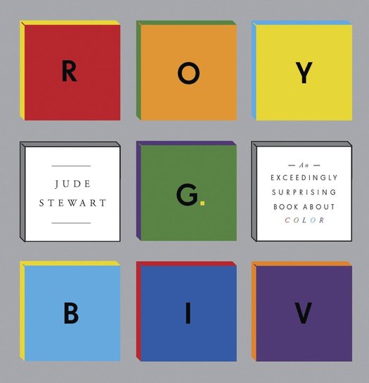
In my new book ROY G. BIV: An Exceedingly Surprising Book About Color, I take readers on an irresistible tour of color’s contradictory “faces”, meanings and moods. Color perception’s contingent nature falls in this category of surprise. Three indefatigably curious amateurs — Johann Wolfgang von Goethe, Josef Albers, and Joris-Karl Huysmans — paved the way for the more rigorous science of color perception that followed. This post offers a lightning tour of what surprises they reveal about color along the way.
Goethe
Trifles like writing the blockbuster myth Faust and schooling Darwin in plant morphology paled — in Goethe’s eyes, anyway — to publishing his baby, Theory of Colors (Farbenlehre), in 1810. It culminated over 30 years of Goethe’s increasingly systematic experiments with the factors influencing color perception.
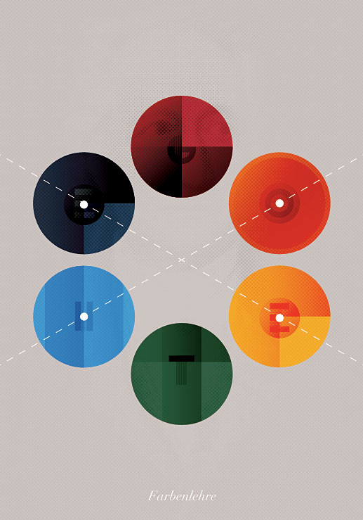
Book cover redesign of Goethe’s Farbenlehre by Daniel Kövesházi
Intended as a corrective to the science underpinning Newton’s Opticks (1704), Goethe imagined darkness not just as absence of light but as its own active force; the battle of Light vs. Dark supposedly threw off observable sparks of color. This wrongheaded conviction led the inventor of Weltliteratur and the Italian tour to spend weekends breathing on glass panes, prodding chocolate-froth bubbles, and flapping his arms in daylight, then jotting down how colors changed in each observation.

soap bubble by Ralph Hockens on Flickr
It’s not exaggerating to say the original Mister Wizard invented the field of color perception using stuff you can buy at Home Depot. Take the simplest-seeming of factors influencing color’s appearance, light sources. Goethe liked the blue shadows cast by candles and how yellow candlelight shifts blues towards looking green and reds toward looking orange. Like a bewigged Max Headroom, he loved how everything looked red after taking green spectacles off. He kept a supply of “confusedly-coiled” steel wire and scratched silver surfaces to learn more about catoptrical colors: how colorless light reveals many colors — mainly red and green — when reflected on an irregular surface.
The chilly nimbus of “snowy vapors”, iridescent fish dying under mountain-clear streams, brilliantly garbed servant-girls approaching at dusk — Goethe observed how all of these shifted his perception of color, in breathless combinations of found poetry and drily notated prose.
Huysmans
Goethe refracted his own Enlightenment-era values into his study of color perception. His tail-waggingly enthusiastic take on the subject was only suitable for publication as “science” before that field’s professionalization. Goethe was succeeded by more rigorous explorations in color perception by Michel Eugène Chevreul, Hermann von Helmholtz, and Albert Henry Munsell.
Even as science diverged into its own discipline in the late 1900s, humanists continued to dredge up surprises in color’s finicky nature. Take the 1884 novel À Rebours (Against Nature) by Joris-Karl Huysmans. This Decadent novel follows an exhausted duke who retreats from his excessive youth to contemplate finer points of aesthetics, especially the shifting nature of color. (À Rebours later became a darling of the 1960s countercultural revolution. Marianne Faithfull summed up its influence in her autobiography: “You would ask your date, ‘Do you know Genet? Have you read À Rebours?’ and if he said yes you’d fuck.”)
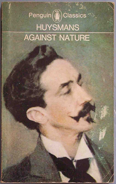
Penguin Classic edition of Against Nature by Joris-Karl Huysmans, via Flickr
In one episode, the Duc des Esseintes tackles a classic decorating quandary: What accessory will offset a brilliantly colored rug? At first he releases a live tortoise to crawl over it, but is unsatisfied with the resulting color-contrast:
“Alas! There was no doubt, the negro-head hue, the raw sienna tone of the shell dimmed the sheen of the carpet instead of bringing out the tints; the dominant gleams of silver now barely showed, clashing with the cold tones of scraped zinc along this hard, dull carapace …”
Any sensible Dubai oil-magnate knows the solution: dip the tortoise in gold, encrust its shell with gemstones, and drown the hell out of the rug’s colors by expensive contrast. Over several pages, our hero le Duc turns up his nose at emeralds and rubies (too like the red-and-green headlights on Parisian omnibuses) and amethysts (too beloved by fat butchers’ wives). Instead, le Duc nails the perfect combination with costlier jewels with weirder color-effects: ouvarovite, Ceylon’s cat’s eyes, cymophanes, sapphirines.
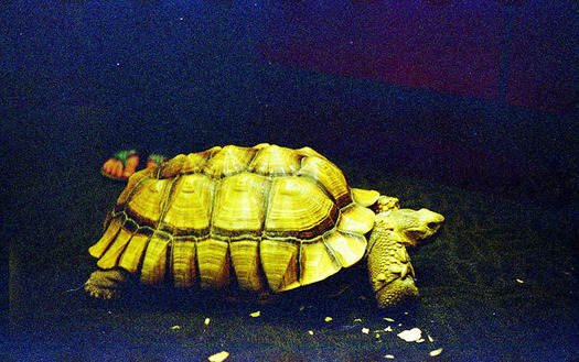
Tortoise by Travis Juntara on Flickr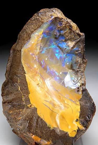
Opal from Quilpie, Queensland, Australia via MarinMineral.com
Elated with the effect for maybe ten seconds, le Duc leaves the tortoise struggling across the rug to celebrate over buttered toast and tea. He marvels at the spattered stars against the night sky; he mulls a tooth he once had extracted, he plays with his “mouth organ”, a complicated device mixing alcoholic confections in his mouth like musical tones on a piano. Pages into this twee-ing about, le Duc nudges the tortoise and abruptly realizes: the tortoise is dead. (Le Duc concludes, battily but poetically, that the tortoise was crushed not by the actual weight of his hood ornaments, but by the unaccustomed beauty of bearing this scintillating rainbow.)
What does le Duc’s tortoise teach us about color perception? Lots of things. Sapphires lose their flash under artificial light. Opals and hydrophanes only sparkle when wet. Royal in-breeding can make aesthetes downright squirrelly. But most critically: color isn’t lying to us, we’re lying to us. You can change any object’s color by playing around with the light, putting other colors next to it, or adding movement. But color perception is transformed most profoundly, at times, inside our skulls.
Albers
“Color deceives continually,” wrote painter and design professor Josef Albers, 150 years after Goethe and 80 years after Huysmans. Explaining this idea in his 1963 book Interaction of Color, Albers asked us to imagine 3 pots of water of different temperatures: hot, lukewarm and cold.
Plunge your hands first in the hot and cold, and you’ll feel 2 temperatures, one on each hand. Then stick both hands in the lukewarm pot, and you’ll again feel 2 temperatures, the opposite of what you felt before. Your left hand will feel cold after the hot water, and the right hand hot after cold water, but neither will feel the water’s true temperature: lukewarm.
Just as our sense of touch deceives, wrote Albers, “so optical illusions deceive. They lead us to ‘see’ and ‘read’ other colors than those with which we are confronted physically.”
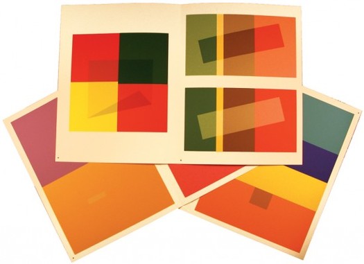
Spreads from Interaction of Color, now available in 50th anniversary edition (Josef Albers with Nicholas Fox Weber)
Armed with a sheaf of colored paper squares, Albers created a series of color studies that showed how colors change each other’s effects just by proximity. To cite just one example, it’s amazing how much the same color, at center below, morphs against the different-colored backgrounds. “The true color of the 2 central squares,” wrote Albers, “therefore becomes unrecognizable, as it loses its identity.” Like a credulous teenager, color bends under peer pressure.
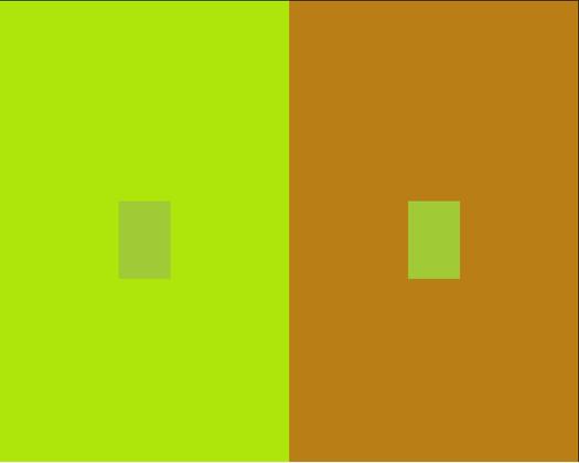
Is color a physical property, “stuff” like pigments or paint? Is it trembling in the light, vibrating in our eyes, or pinging like a champion pinball between our hopelessly separated brains? We’ve almost pinned down answers to all of these questions. As color perception evolved into true science, we’ve studied color-blindness, synesthesia, and other optical effects that influence how color looks to each of us. But intrepid fellows like Goethe, Huysmans and Albers got us all asking big questions about color in the first place.
Observed
View all
Observed
By Jude Stewart
Related Posts
Innovation
Ashleigh Axios|Essays
Innovation needs a darker imagination

Business
Kim Devall|Essays
The most disruptive thing a brand can do is be human

AI Observer
Lee Moreau|Critique
The Wizards of AI are sad and lonely men
Business
Louisa Eunice|Essays
The afterlife of souvenirs: what survives between culture and commerce?
Related Posts

Innovation
Ashleigh Axios|Essays
Innovation needs a darker imagination

Business
Kim Devall|Essays
The most disruptive thing a brand can do is be human

AI Observer
Lee Moreau|Critique
The Wizards of AI are sad and lonely men

Business
Louisa Eunice|Essays

 Jude Stewart writes about design and culture for Slate, The Believer, Fast Company and Print among others. Her first book,