September 29, 2016
The Typeface of Truth

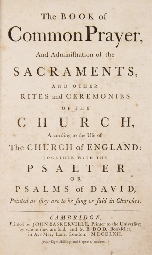
John Baskerville, The Book of Common Prayer, 1762.
I know in my heart that graphic design is important. Sometimes the fate of nations depend on it, sometimes it’s the missing link between a soft drink brand and Einstein’s Special Theory of Relativity, sometimes it just makes you happy. But I also know that the ingredients used by graphic designers — colors, shapes, typefaces — are fundamentally mysterious. What do they mean? How do they work? Why does one work better than another? What criteria should we use to choose?
This ambiguity can be maddening, especially to clients, who in desparation will invoke anecdotes and folk wisdom to help control an otherwise rudderless process. I’ve been told in meetings that triangles — to take one example — are the “most energetic” (or the “most aggressive”?) shape. I’ve been asked if it’s true that white means death in Japan. Or is it black? Or red? Or China?
To tell you the truth, I’ve always appreciated this ambiguity. Like other experienced designers, I appear to navigate this miasma of hearsay with confidence. For the truth is that in our field, to quote screenwriter William Goldman, “Nobody knows anything.” Black can be ominous or elegant. Triangles can be trendy or timeless. And typefaces? Hmm! Typefaces can be…anything you want them to be, right? There are many reasons to pick any one typefaces, all of them more or less arbitrary.
So imagine a client demands that text be set in “the most credible typeface.” I would probably hide a smile and say there’s no such thing.
But there is such a thing, says Errol Morris.
Several weeks ago, Morris, the Academy Award-winning documentary filmmaker and author, posted a simple quiz in his New York Times Opinionator blog. Ostensibly, the object of the quiz was to determine if the reader was an optimist or a pessimist. You read a short introduction about the likehood of an asteroid hitting the earth, and then an indented passage from a book by David Deutch, The Beginning of Infinity, in which he claims “we live in an era of unprecedented safety” and will likely be able to defend ourselves against such an impact. Morris then asked the reader to agree or disagree with the truth of that claim, and to indicate the degree of confidence the reader had in his or her conclusion. The result, supposedly, was to determine how many of us are optimists (finding Deutch’s statement to be true) versus how many are pessimists (finding the statement to be false).
But it was all a trick. Morris was actually testing something completely different: the effect of fonts on truth. “Or to be precise,” as he points out in his followup post today (part 1, part 2), “the effect on credulity. Are there certain fonts that compel a belief that the sentences they are written in are true?”
To find out, he had a colleague, Benjamin Merman, create a program that changed the font of the indented David Deutch passage each time the article was first opened. Each person taking the quiz would read the passage in one of six randomly assigned fonts: Baskerville, Computer Modern, Georgia, Helvetica, Comic Sans, or Trebuchet. So the test had nothing to do, really, with optimist or pessimism. Instead, it was meant to find out if setting the passage in one typeface or another would lead people to believe it more.
Now, if you’re like me, you already know what the least trustworthy typeface is, right? It’s got to be Comic Sans: goofy, unloved, mocked Comic Sans. And it turns out we’re right. According to Morris, people seem to be consciously aware of Comic Sans: it was in the news as recently as a few weeks ago, when it caused a minor dustup in the midst of the announcement of the discovery of the Higgs-Boson particle. This awareness seems to engender, in Morris’s words, “contempt and summary dismissal.” And good riddance, say I and countless other graphic designers.
But what about the other side of the equation? Is there a font that inclines us to believe that a sentence that’s set in it is true? After analyzing the research, Morris says the answer is yes. And that typeface is Baskerville.
To Morris’s surprise, the results of the test showed a clear difference between the performance of Baskerville and other fonts — not just Baskerville and Comic Sans (no contest); or Baskerville and Trebuchet or Helvetica (a clear serif versus sans distinction); but even Baskerville and Georgia (a lovely, and arguably even more legible serif by Matthew Carter). Compared to versions in the other typefaces, the passage set in Baskerville had both the highest rate of agreement and the lowest rate of disagreement. This led Morris to the inevitable conclusion: Baskerville is the typeface of truth.
John Baskerville loved typography, and it’s believed that he lost his fortune in pursuit of it, sinking all the money he had into designing and printing complete editions of the works of Virgil and Milton, not to mention the Bible. He was an avowed anti-religionist but had a deep and abiding faith in typography. “Having been an early admirer of the beauty of Letters,” he wrote in his introduction to Paradise Lost, “I became insensibly desirous of contributing to the perfection of them.” The typeface we today call Baskerville is based on the fonts he developed in the mid-eighteenth century at his foundry for his private presses. Ironically, a skeptic has created the typeface most likely to induce credulity.
“We have entered a new, unexpected landscape,” Errol Morris writes at the conclusion of his article. “Truth is not font dependent, but a font can subtly influence us to believe that a sentence is true. Could it swing an election? Induce us to buy a new dinette set? Change some of our most deeply held and cherished beliefs?”
Whether or not a typeface can do any or all of those things, I do agree the landscape has changed. Once upon a time, regular people didn’t even know the names of typefaces. Then, with the invention of the personal computer, people started learning. They had their opinions and they had their favorites. But until now, type was a still matter of taste. Going forward, if someone wants to tell the truth, he or she will know exactly what typeface to use. Of course, the truth is the truth no matter what typeface it’s in. How long before people realize that Baskerville is even more useful if you want to lie?
This essay was originally published in August, 2012
Observed
View all
Observed
By Michael Bierut
Related Posts
Innovation
Ashleigh Axios|Essays
Innovation needs a darker imagination

Business
Kim Devall|Essays
The most disruptive thing a brand can do is be human

AI Observer
Lee Moreau|Critique
The Wizards of AI are sad and lonely men
Business
Louisa Eunice|Essays
The afterlife of souvenirs: what survives between culture and commerce?
Related Posts

Innovation
Ashleigh Axios|Essays
Innovation needs a darker imagination

Business
Kim Devall|Essays
The most disruptive thing a brand can do is be human

AI Observer
Lee Moreau|Critique
The Wizards of AI are sad and lonely men

Business
Louisa Eunice|Essays
