June 12, 2013
The Whitney Identity: Responding to W(hat)?
Immediately after the release of the new visual identity for the Whitney Museum of American Art, social media rapidly reacted. “Great,” “bold,” “sweet,” “I’m really excited,” “I’m jealous” or simply “Love it!” were some of the initial glowing endorsements of the work designed by the Dutch design studio Experimental Jetset (EJ). However, what has been largely overlooked is EJ’s description and rationale for the project, which is a masterclass of ambiguity and ambivalence, one that builds upon gratuitous justifications, inconsequential buzzwords and the studio’s recurrently sought refuges.
In the essay “On the Uselessness of Design Criticism” in Idea magazine (2010), American designer Randy Nakamura alerts readers to the naiveté and misuse of out-of-context quotes by EJ. The Whitney project description was no exception, with Walter Benjamin’s “The Work of Art in the Age of Mechanical Reproduction” (1936) and Raymond Williams’ “Base and Superstructure in Marxist Cultural Theory” (1973) being vaguely invoked and loosely synthesized into just a few words — “to put it very briefly” — that serve as a quick prop to their argument.
Nakamura also points out the need for careful historical mapping when using quotations from other disciplines’ discourses and especially from very particular historical circumstances. He notes: “Experimental Jetset has at least the ambition to situate their work in a theoretical framework that reinstates some form of criticality to their practice. But they stumble when they choose to do so using frameworks that are solipsistic, obsolete and of questionable relevance.”
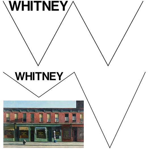
The most troubling aspect of the Whitney’s visual identity is its conceptual foundation, or the lack of it. This is reflected in its form. The so-called “responsive W,” a visual system based on the idea of a wavering zigzag that can assume different shapes, defines the Whitney’s logo and identity. The W, the designers explain, represents both the non-linearity of art history and the museum’s treatment of it. The logo apparently encapsulates the “heartbeat of New York, of the USA”; it is both “open and closed,” “in and out,” “Old World” and “New World,” “industrial” and “sublime.” With this degree of latitude, we might go on to suggest other equally valid (though so far unused) comparisons: Darth Vader and Luke Skywalker, up and down, yin and yang, yes and no. According to EJ, the shape “could also represent the ‘dérive’-like journey of the Whitney through Manhattan, moving from one location to the other. It could also symbolize the signature of the artist; or the waves of the nearby Hudson; or the waves produced by sound and vision.”
In short, it could mean anything. By trying to describe their work as simultaneously being something and its opposite, they place it in a particularly comfortable position: almost beyond criticism. This way, the Whitney can just as easily claim to be “Britney.” Or anything else … and its “anti.”
The ambiguity of the project’s description — and of the project itself — can likewise be seen in EJ’s citation of a diagrammatic “typology of lines” published in 1946 by the painter Ad Reinhardt. “It is exactly in this context,” they say, “that we would like to place the idea of the ‘responsive W’: the line as a graphic agent of systems (and of anti-systems)…” Deprived of substantial context, Reinhardt’s work becomes a prompt to build yet another dubious justification. Their use of sugarcoated, marketing-friendly buzzwords such as “industrial directness,” “low-fi/low-tech casualness,” and “openness,” along with an ultra-fast explanation of the etymology of the word “fresco” to justify the use of the word “freshness,” completes a bouquet of strange arguments.
In “Mad Dutch Disease” (2003), designer Michael Rock of 2×4 recalls the seminal discussion between Dutch designers Wim Crouwel and Jan van Toorn in the 1970s, while also labelling EJ’s output as an “ideology-free regurgitation of Crouwel’s work.” This debate serves as a reminder of two distinct ideological approaches to design and the public role of the museum. Where Crouwel argued that designers should not impose their own views on the content given to them, Van Toorn actively questioned the art museum’s authority as cultural producer, both theoretically and formally. The Dutch designers Metahaven have more recently noted in “Can Jokes Bring Down Governments?” (2013) that Crouwel and Van Toorn were both “tied to institutions that already advocated what the designer then amplified.” But this insight doesn’t diminish the importance of the designers’ individual ideologies; nor does it change Van Toorn’s commitment to the liberation of the audience and to independent research as a practitioner and academic. It does serve here, however, to highlight the shared responsibility of EJ and the Whitney, as commissioner, in this hugely visible public project.
Instead of critically addressing and confronting the context, EJ designed an identity that is the context. Yet despite serving a set of strict formal rules to the “excellent designers of the Whitney’s in-house design team” — who will have to apply them, like all rules, with little possibility for deviation — they still argue that a graphic identity “could (and should) never be a machine, in which one simply ‘inputs’ an image and a title, and out rolls an invitation.”
Undoubtedly, Experimental Jetset’s identity for the Whitney will continue to be retweeted, reblogged, re-liked, and eventually rebranded. When that happens, let’s hope that instead of a “responsive W” we get a reflective and critical institution with an identity that will also do just that: reflect and criticize. Until then, the Whitney Museum of American Art has the identity it sought, not the one it deserves.
Observed
View all
Observed
By Francisco Laranjo
Related Posts

Innovation
Ashleigh Axios|Essays
Innovation needs a darker imagination

Business
Kim Devall|Essays
The most disruptive thing a brand can do is be human

AI Observer
Lee Moreau|Critique
The Wizards of AI are sad and lonely men

Business
Louisa Eunice|Essays
The afterlife of souvenirs: what survives between culture and commerce?
Related Posts

Innovation
Ashleigh Axios|Essays
Innovation needs a darker imagination

Business
Kim Devall|Essays
The most disruptive thing a brand can do is be human

AI Observer
Lee Moreau|Critique
The Wizards of AI are sad and lonely men

Business
Louisa Eunice|Essays

 Francisco Laranjo is a graphic designer based in London, UK and a research student at the London College of Communication. He teaches at the University of Westminster and has been a guest lecturer at the Sandberg Institute (NL), Royal College of Art (UK) and ESAD (PT).