March 30, 2006
Variations on a Theme: New York‘s High Priorities
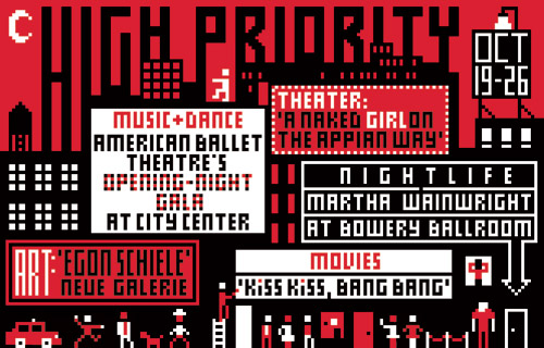
Illustration for New York, Christoph Niemann, 2005
Every week, the editors of New York magazine identify five upcoming “can’t miss” activities in the magazine’s back-of-the-book listings section. And every week, New York‘s design director, Luke Hayman, and art director, Chris Dixon, select a designer to create “High Priority,” a typographic illustration using these five selections.
The rules are simple. The illustration is 4.4 inches high by 6.875 inches wide; it has to include the five events, the dates of the week, and the words “High Priority;” and it can only use two colors, red and black. The designer gets the text late on Thursday, provides a sketch late on Friday, and the finished artwork by the end of the day on the following Monday. The result runs at the start of the listings section in the issue published the following week. This exercise, with its prescribed limitations and one-swing-and-you’re-out intensity, is as close as the graphic design world gets to an Olympic event.
Since Hayman and Dixon started “High Priority,” over 60 designers, from the legendary to the up-and-coming, have taken the challenge. The list is amazing: it includes Pierre Bernard, Laurie Rosenwald, Allen Hori, Neville Brody, Marion Deuchars, Fernando Gutiérrez, Barbara deWilde, Vince Frost, Julian Morey, Jonathan Hoefler, Ellen Lupton, Martin Venezky, Alexander Gelman, Bob Gill, Milton Glaser, Barbara Glauber, Chip Kidd and Todd St. John, to name just a few. And every week, the readers of New York get to see the same old problem solved a brand new way.
Observed
View all
Observed
By Michael Bierut

