
Felice C. Frankel, Felice C. Frankel, Angela H. DePace|Books
June 21, 2012
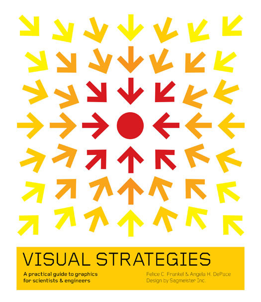
Visual Strategies
Visual Strategies, by Felice C. Frankel and Angela H. DePace (Yale 2012) is an essential guide to communicating scientific findings and concepts through graphics. The authors sat down with Stefan Sagmeister (whose studio designed the book) to discuss the importance of design in sharing scientific information effectively. The following is excerpted from Visual Strategies with permission of the publisher.
We were privileged to work with designer Stefan Sagmeister for this guide. In many ways, good design is the kernel that began our thinking for this project. In addition to seeing his design on these pages, we wanted to bring you his voice.
Felice Frankel and Angela DePace: The fact that you decided to design our book is pretty remarkable for us, Stefan. Is science something you were always interested in?
Stefan Sagmeister: No, not at all, in fact I had little interest in science when I was in school, received average grades, and took science education for the most part as a necessary evil. I only developed an interest after going to TED and hearing from all these amazing people talking about all these amazing developments.
FCF/AHD: We have always believed there has been a desperate need for talented graphic designers to participate in the process of communicating scientific data and concepts. Our readers might not immediately see the connection between your world and theirs. We wonder if you can help them think about it.
SKS: During the last decade scientific research has made fantastic progress, but this has often been poorly communicated. This is true for communications between various scientific fields, science communications within peer reviewed media, as well as how science is treated in mass media.
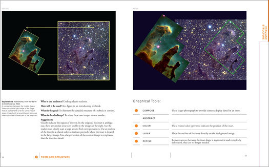
Visual Strategies, pages 32-33.

Before and after images showing a diagram of the Hubble telescope image and it’s related area in the sky. The challenge was to relate the two images, the “after” solution involved outlining the area shown and increasing the photo size, rather than relating the irregular shape to the sky image with simple arrows.
FCF/AHD: When you first saw some of the figures we were going to include, the “befores,” did you see a visual thread of some sort in terms of the mistakes most researchers make?
SKS: I was surprised to see a lot of very basic design mistakes. It seems many scientists creating complex visualizations are not aware of simple rules regarding color, form, or hierarchy. In numerous cases all it would take to fix this would be a design 101 course.
FCF/AHD: That would be a fantastic idea, but realistically, in our experience, most researchers wouldn’t give it the time. So, what would you think about the possibility of engaging more designers in the process? For example, do you think design schools might offer a specialized course for scientific graphics?
SKS: Yes, I am convinced there is a tremendous interest among design students, specifically at the master programs. Many are disillusioned with working for the commercial sector and would love the opportunity to sharpen their design skills dealing with content that engages their minds to the fullest.
FCF/AHD: Do you think the design community would embrace the idea of working on material with which they are not familiar? Do you think it would be important for designers to understand the material?
SKS: Yes and yes. Designers work with unfamiliar material all the time; learning about a new sector, business, or scientific process is a very integral part of the job (and I’d say one part that makes that job rather enjoyable). And yes, they had better understand the material; otherwise, innovative thinking or focused visualization will be impossible.
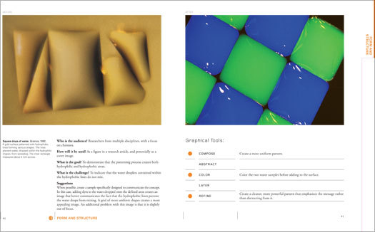
Visual Strategies, pages 40-41.

Before and after images showing suqare drops of water. The challenge was to indicate that the water droplets contained within
the hydrophobic lines do not mix. The solution created a more uniform pattern that could utilize two colors to emphasize the fact that the droplets don’t mix.
FCF/AHD: And specifically addressing Visual Strategies, if you remember our meeting on that hot NYC day on your office terrace, your request to place a subtle 5% yellow background behind all the images was a concern for the two of us. We were worried, as most scientists tend to be, that we were changing the data in a way – that we were augmenting the original content. However, you made the case that the design of the book warranted the change. We are sure our readers will have their own opinions about that matter. They will have the opportunity to discuss the issue with us on our online Visual Strategies forum. Can you clarify how a change like that benefits the design, and, more important, in general, what is your advice on design changes to a figure in science?
SKS: This is a wonderful question: whether a visualization should be more “objective” or “subjective” comes up in various ways on almost every single job. Are we communicating more effectively by placing more value on the overall form or are we better off sticking to the process in a literal way? Will more people understand if we use a sexy visual conceit or are we better off sticking to established modernism?
Does the colorization undermine or promote understanding? In the case of the cream backgrounds within this book, I myself don’t see a problem at all. They simply are a more orderly way of organizing the graphics on the page, a more sophisticated alternative to the black hairline.
FCF/AHD: Thanks so much, Stefan. The process of working with you has inspired us to think differently about creating scientific graphics. Let’s hope that more scientists and engineers will have the opportunity to closely collaborate with designers.
Observed
View all
Observed
Share on Social
By Felice C. Frankel, Felice C. Frankel & Angela H. DePace
 Felice C. Frankel is Senior Research Fellow in the Faculty of Arts and Sciences, Harvard University.
Related Posts
Design Impact
Ellen McGirt|Books
No mandates, only opportunities: IBM’s Phil Gilbert on rethinking change

Education
The Editors|Books
Your October reading list: The Design of Horror | The Horror of Design

Innovation
Vicki Tan|Books
How can I design at a time like this?

AI Observer
John Maeda|Books
Should we teach AI to reflect human values, emotions, and intentions?
Related Posts
Design Impact
Ellen McGirt|Books
No mandates, only opportunities: IBM’s Phil Gilbert on rethinking change
Education
The Editors|Books
Your October reading list: The Design of Horror | The Horror of Design
Innovation
Vicki Tan|Books
How can I design at a time like this?
AI Observer
John Maeda|Books