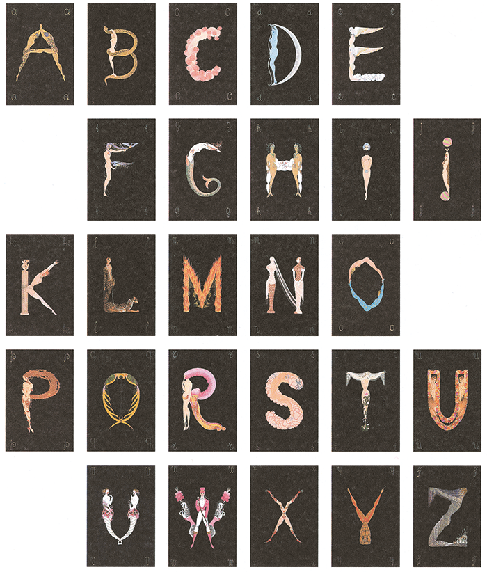
Erté alphabet, 1927
Typography is far more than type design and layout. It touches on key values of our society: the printed free word, and the democratic discourse. It is thanks to the power of typography that this discourse has assumed the form of a game of argument and counter-argument.
The new-media technology calls into question our accepted notion of typographic communication. Not since Gutenberg’s invention of moveable type in the fifteenth century has typographic communication undergone such a fundamental change as today. The typographic trade finds itself at a crossroads. Can typography still play a significant role when digitization and new media are shaking the foundations of the typographic craft? What direction will it take in its further development?
In
The Triumph of Typography twenty-one international experts in the fields of typography and communication share their expertise with fascinating analyses and examples. This book not only dwells on what moves and inspires today’s typographer, but also elaborates on new developments in the field of typography.
This and next week we offer some excerpts from this new publication. José Teunissen’s text is part of the book’s third section: “The Scope of Typography,” that shows actual typographic applications in various disciplines.
++++
Fashion is not obsessed with the body but with the “letter,” the inscription of signs on the body in a systematic space, wrote Roland Barthes in 1982. “The fashion body, like the Erté letter woman, demands to be read.” With this intriguing assertion Patrizia Calefato made clear in 2009 that fashion (and clothing, too) is essentially linked to communication. We use our appearance to convey who we (as individuals) want to be and to what social group we belong. On the whole, fashion has been functioning like this for a very long time, but over the past century and a half the communicative value of fashion has grown much more complex and versatile, with the emergence of graphic design in fashion playing a crucial role.
Graphic design made its entrance in the fashion world with the introduction of the label. When Charles Frederick Worth, the first couturier, opened a fashion house in 1858 and began making couture of his own design, the sewn-in label functioned as the artist’s signature. Fashion had entered the artistic domain. From that moment on, Worth established his own style, not only with the design of his clothing but also, and quite soon, with the typography on the label and the appearance of perfume and accessories. The first designer to create a coherent visual style (brand image, as we call it today) was Coco Chanel. She introduced a visual style in the 1920s, partly with her Chanel No 5 perfume (1921), which was very subtly repeated in the development of her clothing and accessory lines. By means of a recurring repertoire of contrasting piping, the double CC on the Chanel button, the string of pearls, the camellia, and the chain bag, she managed to develop a highly recognizable visual style over the course of the twentieth century that is still the point of reference for the collections that Karl Lagerfeld designs for Chanel today.

Chanel No. 5’s iconic packaging, part of a Total Look
What was both striking and innovative about Chanel when you compare her with contemporaries like Paul Poiret and Jeanne Lanvin was that she took garments from the world of sports and men’s fashion such as the jersey, the beret, the cardigan, and the suit and introduced them to women’s fashion, where she made them practical and functional. In doing so she created a new feminine identity during the 1920s that was mainly indicative of a social change. Classics like the Chanel suit and the petite robe noire (little black dress) were symbolic of emancipation: they could be worn to work as well as at home, so that women no longer had to change clothes five times a day. So while there was something very liberating about the Chanel look—some of the garments were symbolic of the new age—brand recognition was also increased by means of refined graphic additions, such as the piping and the buttons, which were featured on all the products. In this way Chanel, who worked on building up her empire until the early sixties, showed what a “fashion grid” or a Total Look might look like long before such a thing became commonplace.
Not until the 1980s, when the focus shifted from the garment to the building up of a brand, did many labels start following Chanel’s example. It was the small, conceptual, avant-garde, startup brands such as Comme des Garçons, Yohji Yamamoto, Paul Smith, and Martin Margiela that took the lead. They hired special art directors who were responsible for the invitations, lookbooks, flyers, packaging, advertisements, and shop furnishings. Not only did this result in a recognizable brand, but it also gave the brand’s image and philosophy broad visibility.

Invitation for the presentation of the 2006 Maison Martin Margiela spring/summer collection
In 1989, Alan Aboud and his company Aboud Sodano gave the Paul Smith brand a new image with a design that combined multicolored stripes with the name in handwritten letters on the label. The logo/label already existed in rudimentary form, but Aboud deliberately stylized it and employed it in brand communication. By placing the stripes and handwriting in a variety of forms on all its products, packaging, and invitations, Aboud vastly increased Paul Smith’s brand recognition. Paul Smith, whose clothing combines classical English tailoring with colorful influences from the Swinging Sixties (with a certain twist), does the same thing in his visual language. Smith often photographs his campaigns himself with a technical camera and then plays around with different technical processes. Developing the many variants of the multicolored stripes always begins with weaving and experimenting with colored yarns; computer manipulation is taboo. It all comes down to craftsmanship: that is the operating principle, which is then followed by creative experiments. And that’s just what the combination of multicolored stripes and handwritten logo conveys.
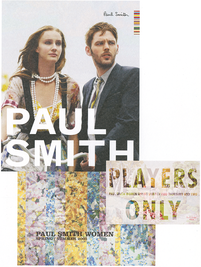
Paul Smith identity by Alan Aboud
During the 1990s, the classic French couture houses Dior, Givenchy, and Louis Vuitton (until then a brand of luxury bags) also began large-scale image renovations. They attracted young fashion designers to breathe new life into the ailing haute couture with spectacular, experimental collections. Alexander McQueen and John Galliano managed to put Givenchy and Dior back on the fashion map and to make them more appealing to a larger, younger public. Soon art directors were also taken on board and were told to “modernize” the brand’s visual image: their job was to change the image, which traditionally had been aimed at a small, older elite who could afford the product, and to make it widely accessible to a younger clientele. The Burberry brand of classical coats hired Christopher Bailey to rebrand the label without changing the product itself. By means of “advertorials” and campaigns, the brand acquired a whole new image.
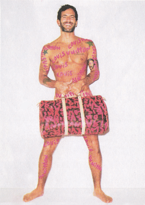
The Louis Vuitton brand of bags (1858) hired Marc Jacobs in 1997 to develop a matching clothing line, but it didn’t really catch on until the designer called in graffiti artist Stephen Sprouse in 2000 to rework the logo. Sprouse restyled the classic LV monogram by spraying a “Speedy” bag with graffiti. It became the beginning of a long experiment in which the classic logo was reinterpreted by a series of different artists into monograms that were recognizable as Louis Vuitton yet always seemed new. A combination of “heritage” (the brand is attractive because of its long history and high quality) and “modern visual language” (which artists introduce by means of graffiti and other visual treatments) have made Louis Vuitton one of the most popular brands of the twenty-first century.
 Marc Jacobs with a Louis Vuitton bag designed by Stephen Sprouse
Thus fashion today is increasingly choosing to communicate the brand instead of the products, and as a result fashion labels have become status symbols more than they ever were before. Rather than showing off the wealth of the buyer, labels mainly demonstrate that the wearer is a member and fan of the brand’s “community.”
For a few years now, fashion houses have used a new medium to communicate their brand: the fashion film. Photographers and graphic designers today regularly work on short films that are intended to promote new collections or concepts of a brand via the website and YouTube. With the development of broadband internet and the social media, the possibilities of visual marketing have expanded enormously. For maximum coverage among the young, on-line communication is essential. Well-known photographers such as Nick Knight and Inez van Lamsweerde and Vinoodh Matadin play an important role here, as do new names such as Zach Gold and Javier Bartala. We don’t yet know what innovations in the brand’s visual image the fashion film will lead to, but that is for the future to decide.
++++
The Triumph of Typography is edited by publisher Henk Hoeks and design critic Ewan Lentjes, and includes contributions from: Peter Bil’ak, Petr van Blokland, Hans Rudolf Bosshard, Paul van Capelleveen, Roger Chartier, Paul Dijstelberge, Yuri Engelhardt, Willem Frijhoff, Christof Gassner, Michael Giesecke, Britt Grootes, Gerard Hadders, Henk Hoeks, Ralf de Jong, Ewan Lentjes, Ellen Lupton, Lev Manovich, Jack Post, Rick Poynor, José Teunissen, Wouter Weijers. The book is designed by Patrick Coppens, and published by TERRA with ArtEZ Press. It can be purchased here.