


September 3, 2026
Brands cannot afford to speak in the same voice as countless others right now. Typeface designers can help.
How we, as designers, can break down the argument for investing in custom typefaces and the designers behind it
It has never made sense to me, why a brand wouldn’t opt for custom type. Working in branding agencies all over London for a lot of my career, I used to sit on the London Tube browsing the series of ads above commuters’ heads. All ads had the same formula: tiny logo in the corner, tick; stock photography, tick. But 50% of the communication — the heavy lifting on messaging — was done by the type. Yet it was always the same fonts, over and over. Often next to each other — I see you, Inter, Roboto, Helvetica.
Knowing how much thought always goes into the logo and imagery, it always stood out how little the type had been considered. Too often, there is a misconception among brand managers that a custom typeface is a nice-to-have rather than a necessity. People still think it can be too expensive, too cumbersome, too distracting to invest in or too hard to implement.
But in a world where global brands are starting to look more and more alike, as system fonts and widely available typefaces become the default, this misconception could be costly — because type is one of the most effective tools for recognition and expression.
For years, companies have moved toward type for efficiency, scalability and cost rather than distinction — and AI has only accelerated this shift toward genericness. Roboto alone now appears across hundreds of millions of websites, and Google Fonts publishes live analytics showing the enormous scale at which popular web fonts are served.
Brands cannot afford to speak in the same voice as countless others. The custom typefaces and the designers and agencies behind it are becoming an ever more essential investment for brands that don’t want to speak in the same voice as countless others. A unique typeface builds and amplifies a distinct brand DNA, while holding consistency across language and platforms. Ultimately, it’s about making a brand more commercially resilient — the most convincing argument of all.
Here’s how we, as designers, can break it down…
Rethinking the cost of streamlining
In some of our work with big FMCG clients, we manage to get rid of legacy fonts that can easily clog up operations — for Heinz, for example, the custom type replaced more than a dozen legacy fonts. Such streamlining ultimately saves money as organizations grow.
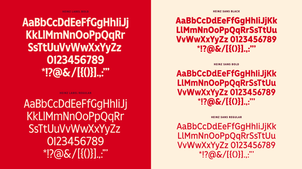
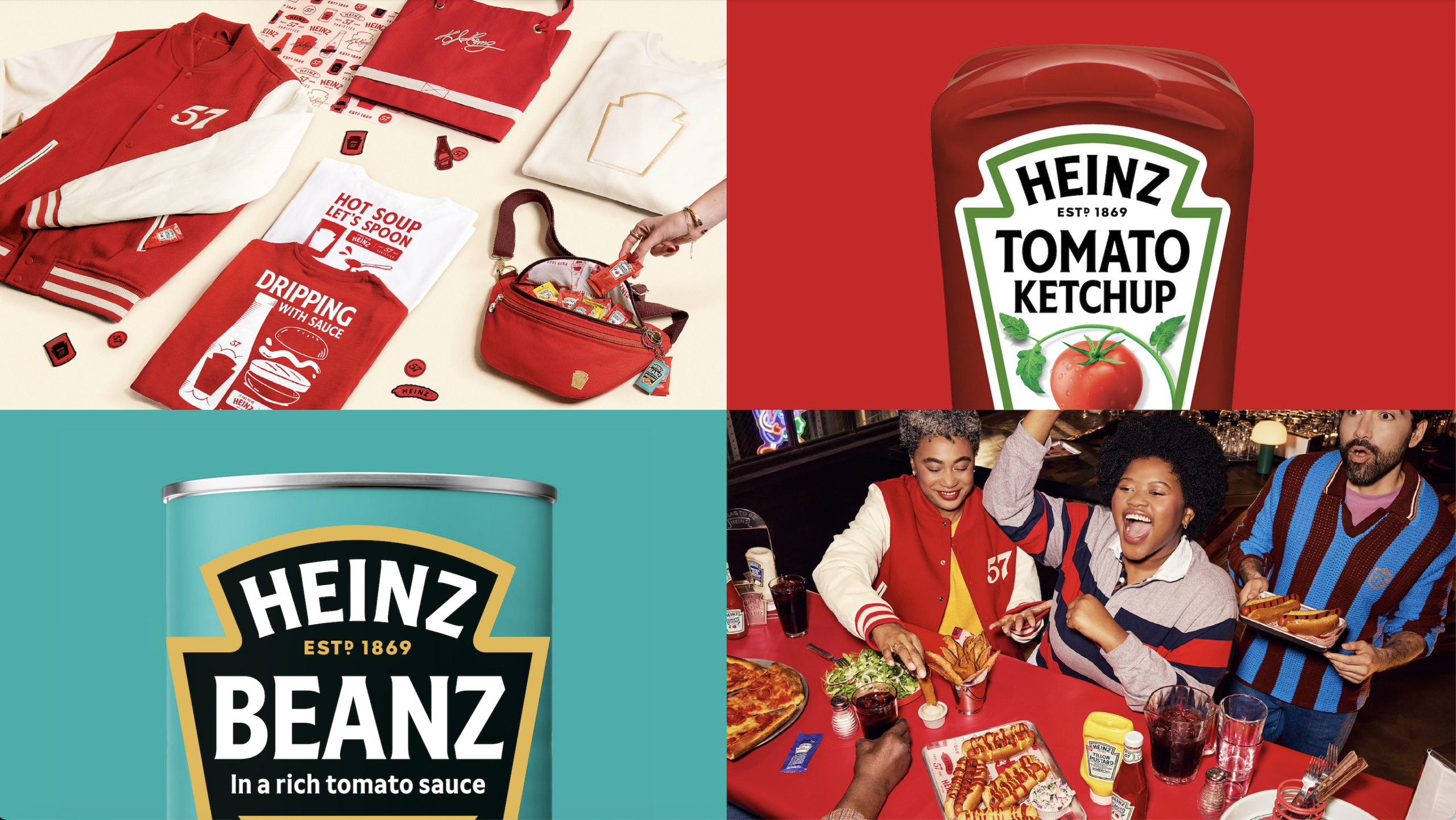
Cost is often overstated. In reality, size of investment depends on scope, licensing, and ambition. A brand could start with a headline typeface and pair it with an open source body font. Often the investment should be in the display typeface and is less necessary at text size. But then there’s the bigger picture too. Custom type can simplify the day-to-day work of design teams, reduce the mess of legacy licenses and prevent brands from juggling dozens of inconsistent fonts.
Readability with personality
Accessibility is another false trade-off when it comes to custom type. Legibility and personality are not mutually exclusive. A typeface can be clear and legible but still offer something expressive and ownable. Spotify Mix is very distinctive in its concept, combines elements from geometric, grotesque, and humanist typefaces in a typographic remix full of expression. At the same time, it’s super legible and user friendly.
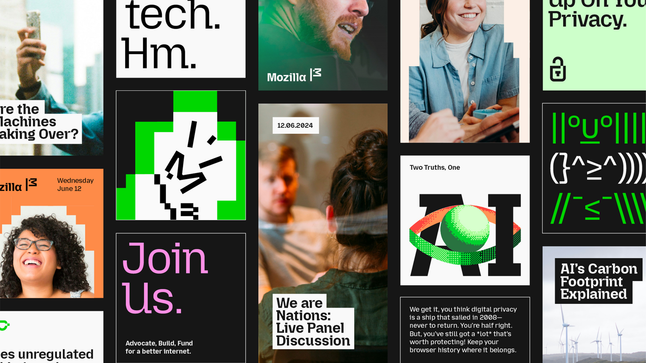
In our work for Mozilla, we also leaned into legibility principles — opening apertures, refining spacing, and introducing more clearly differentiated letterforms to remove common imposters and improve readability at smaller sizes. At the same time, we pushed the type family to remain as expressive as possible, capturing the spirit of the internet: open, distinctive, accessible and designed to connect communities worldwide.
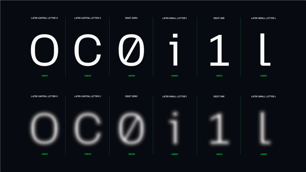
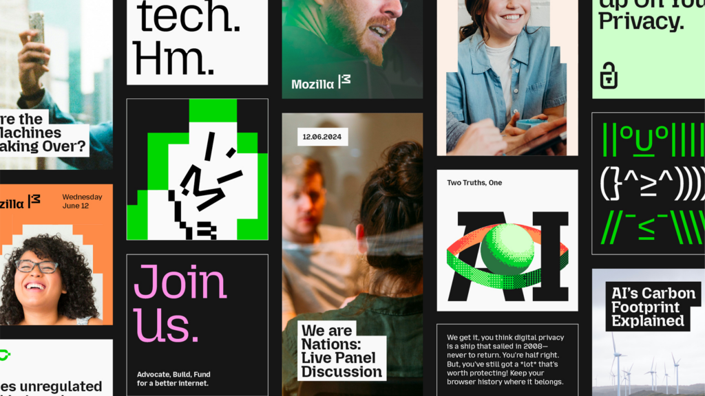
The type not only improved legibility (80% of users found it easier to read according to our accessibility partner Purple Tuesday than the then traditional text typefaces like Times New Roman); as part of the wider identity redesign, it also strengthened brand equity (with Mozilla seeing a 3-point increase in brand equity in the UK).
Scaling to global markets
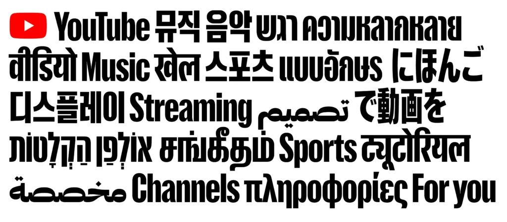
Too often, brands pick one retail typeface for Latin, then hunt for something vaguely compatible in Korean, Chinese, or Arabic script. Custom type allows a more deliberate approach: working with local experts to create the same voice across scripts without flattening cultural nuance. YouTube’s recent multi-script display system by Sharp Type is a strong example of this, built to support consistency and distinctiveness across a vast range of languages and touchpoints.
Making your investment work harder
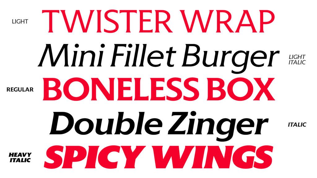
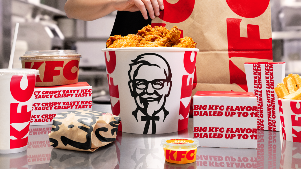
KFC has just revealed a large-scale rebrand that places its iconic bucket at the center of a new brand world. Working alongside JKR, we created a new word mark — and a custom type that sat in direct conversation with that mark, so every headline could carry more of the brand’s equity. Inspired by the brand’s famous red and white stripe motif, the type family amplifies the wider brand strategy and personality, giving the brand an ownable voice, no matter where it shows up.
Brands that continue to rely on the same shared typographic defaults may save effort in the short term, but they risk losing ownership of their voice. If we can convince more clients that custom type is about giving a brand a voice that can travel, scale, flex, and still be unmistakably ownable, everyone will win.
Observed
View all
Observed
Share on Social


By William Richardson
 William Richardson is Co-Founder and Managing Director at Studio DRAMA, the world’s first custom type foundry. He leads the studio’s creative vision. Building brands through distinctive typographic storytelling that challenges category conventions and amplifies identity at every scale.
Under his direction, Studio DRAMA has developed award-winning custom typefaces for global names such as Mozilla, Heinz and Vogue. Each project reflects his belief that typography isn’t just a design tool, but the most powerful visual expression of a brand’s voice.
Today, William’s focus is on pushing the future of typographic branding. Collaborating with agencies and brands worldwide to create work that’s as strategic as it is characterful.
Related Posts
Arts + Culture
John Ball|Commentary
The Smithsonian was ordered to flag “inaccurate information.” I designed a poster series that required complicated truths.

Business
Chris Mele|Commentary
Radical collaboration requires friction
Business
Helder Santo|Commentary
AI will offer you confidence and conviction. Don’t fall for it.

Business
Kate Watts|Commentary
The design-led business advantage: prioritizing the customer experience
Subscribe to The Observatory
Related Posts
Arts + Culture
John Ball|Commentary
The Smithsonian was ordered to flag “inaccurate information.” I designed a poster series that required complicated truths.
Business
Chris Mele|Commentary
Radical collaboration requires friction
Business
Helder Santo|Commentary
AI will offer you confidence and conviction. Don’t fall for it.
Business
Kate Watts|Commentary