


August 24, 2026
The Smithsonian was ordered to flag “inaccurate information.” I designed a poster series that required complicated truths.
As institutions face pressure to simplify the past, designers have a role to play: help people stay curious about difficult stories
In July, the Trump administration ordered signs to be hung outside Smithsonian museums warning visitors that exhibitions may contain “inaccurate information.” It has reignited a familiar question for me and many others: who gets to tell history, and how should institutions present it?
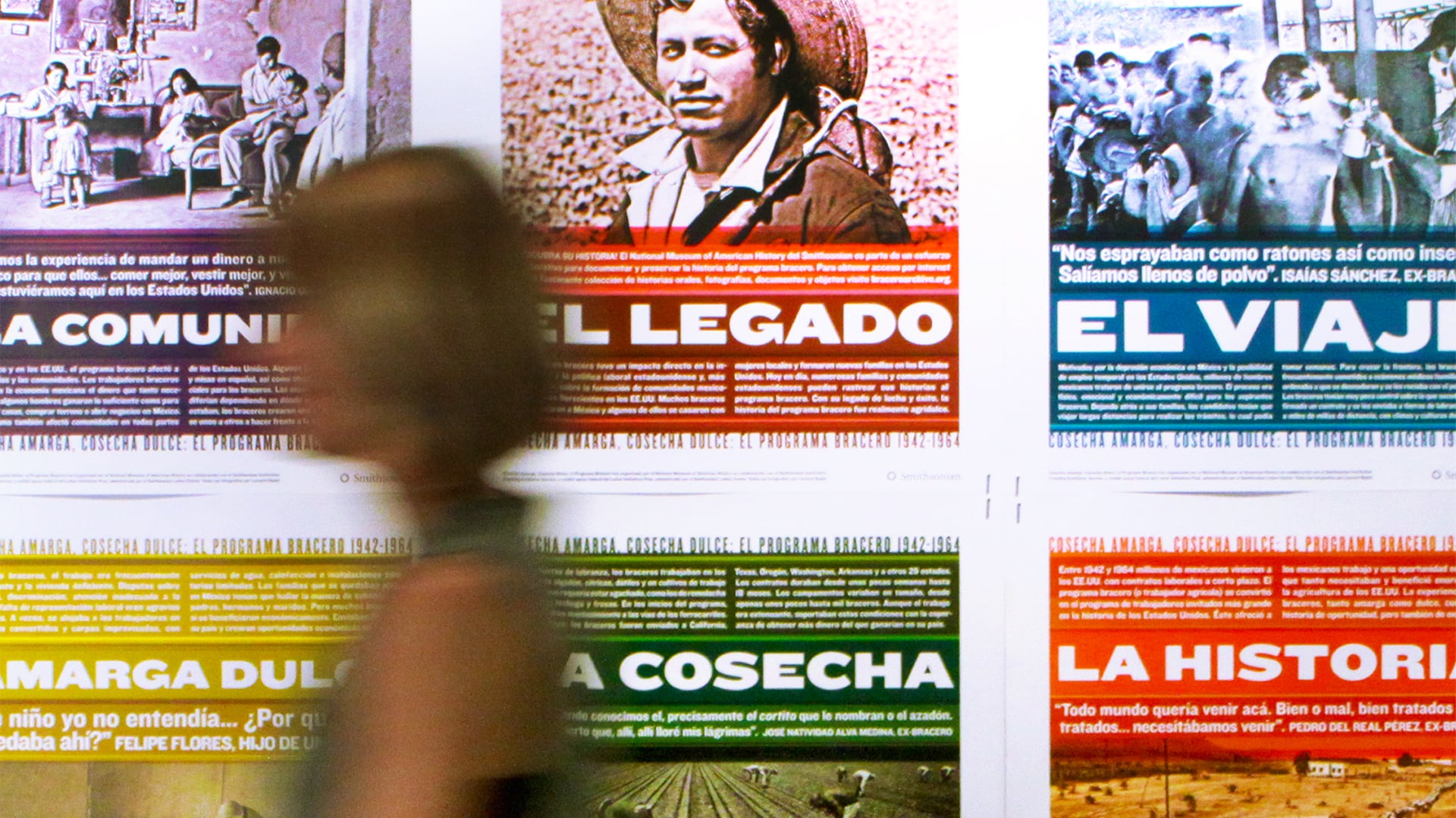
It also called to mind my own work with the Smithsonian. In 2012, MiresBall — where I’m currently a partner and creative director — worked with the Smithsonian on Bittersweet Harvest: The Bracero Program, 1942–1964, an exhibition about one of the most contentious subjects in America: immigration.
The Bracero Program was created during the Second World War to allow Mexican workers to travel legally to the United States to address labor shortages, particularly in agriculture and on the railroads. It eventually became the largest guest worker program in US history and helped shape many of the Mexican American communities that exist today.
But, as the title Bittersweet Harvest suggests, the story isn’t straightforward. On one hand, workers could earn wages and send money home, and some built new lives in the United States. On the other, many endured exploitation and degrading treatment, including being sprayed with pesticides on arrival for work on the farms.
The Smithsonian had already done the difficult work of researching and framing that history. Our role was to help viewers engage with the story by designing a national traveling poster series that would bring the exhibition into schools, libraries, museums, and community centers across the country.
When I saw the news of the “inaccurate information” signs, I was disappointed to see the Smithsonian’s credibility challenged. My experience of working with the institution revealed the thoughtful people and enormous amount of care that’s required to decide how to present complex stories.
It also reinforced something essential I’ve come to understand as a designer who works with contentious subjects: history is rarely monolithic, and our job is not to strip out that complexity.
Good design cannot make a difficult story neutral. What it can do is give the story the space it needs to ask readers to engage with complexity. For my team, achieving this required a series of decisions.
First, to honor the story, we had to rethink traditional design practices. Our first instinct was to let the photography dominate and make the text relatively unobtrusive. However, we realized much of this story lived in the words, so the copy needed to come into the foreground. The design had to serve the content, rather than asking the content to serve the design.
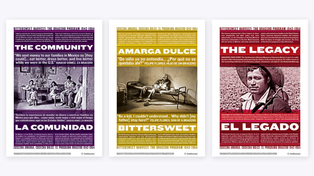
We also wanted the visual language to acknowledge the cultural context without reducing it to cliché. To do that, we took inspiration from traditional Mexican woven blankets, using text above and below the images, almost like fringe. It gave the posters a subtle connection to Mexican culture without relying on obvious visual shorthand.
It was important to us that the design of the exhibition communicated that one perspective was not more important than another. Because Bittersweet Harvest was inherently bilingual, we decided not to treat English as the default language and Spanish as the translation underneath it, as you often see on multilingual posters or leaflets. Across the series, three posters led in English and three in Spanish. Small design decisions communicate something about whose perspective is being valued.
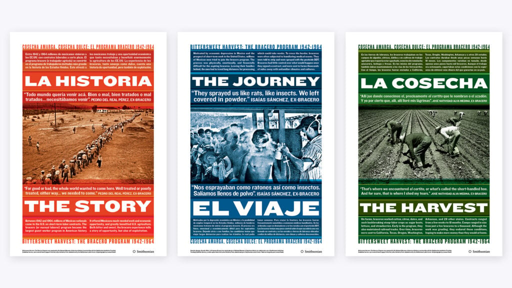
Equity does not always have to be announced. Sometimes it can be embedded in the structure of the design itself.
Our team leaned into the complexity of the story, allowing the opposing and uncomfortable elements to exist. We did not look for colors that represented the “good” parts of the Bracero Program and different colors for the “bad.” That would have imposed another layer of interpretation. Instead, we aimed to present the photography, testimony, and historical material as evenly as possible and allow people to encounter the contradictions for themselves.
That is an important distinction. When working on a contested subject, as designers, we needed to understand the material deeply enough to recognize when a visual choice was clarifying something and when it could have been quietly distorting it.
Looking back on an exhibition that showed from 2010 to 2017, Bittersweet Harvest feels almost like a foreshadowing of the debates we are having now. Immigration remains deeply polarizing, while disagreements over how American history should be presented have become increasingly political.
The answer is not to make those stories less complicated. It is to become better at presenting complexity.
As designers, we have many superpowers. Curiosity. A keen eye for the details. Taking in information and organizing it. Always questioning and looking for a better solution. These are the things we can lean into in pursuit of truth, whether for ourselves, our clients, or our society. Unfortunately, not everyone shares that same curiosity.
The “inaccurate information” signs are just another coded signal, reinforcing beliefs people already hold. I suspect the Smithsonian’s audience is culturally aware enough to see past them. But it’s telling that even a brand as trusted as the Smithsonian can get pulled into our polarization.
When public debate becomes louder and more polarized, one of design’s most valuable roles is not to tell people what to think, but to give difficult material the space it needs and help people understand what they are looking at.
Observed
View all
Observed
Share on Social


By John Ball
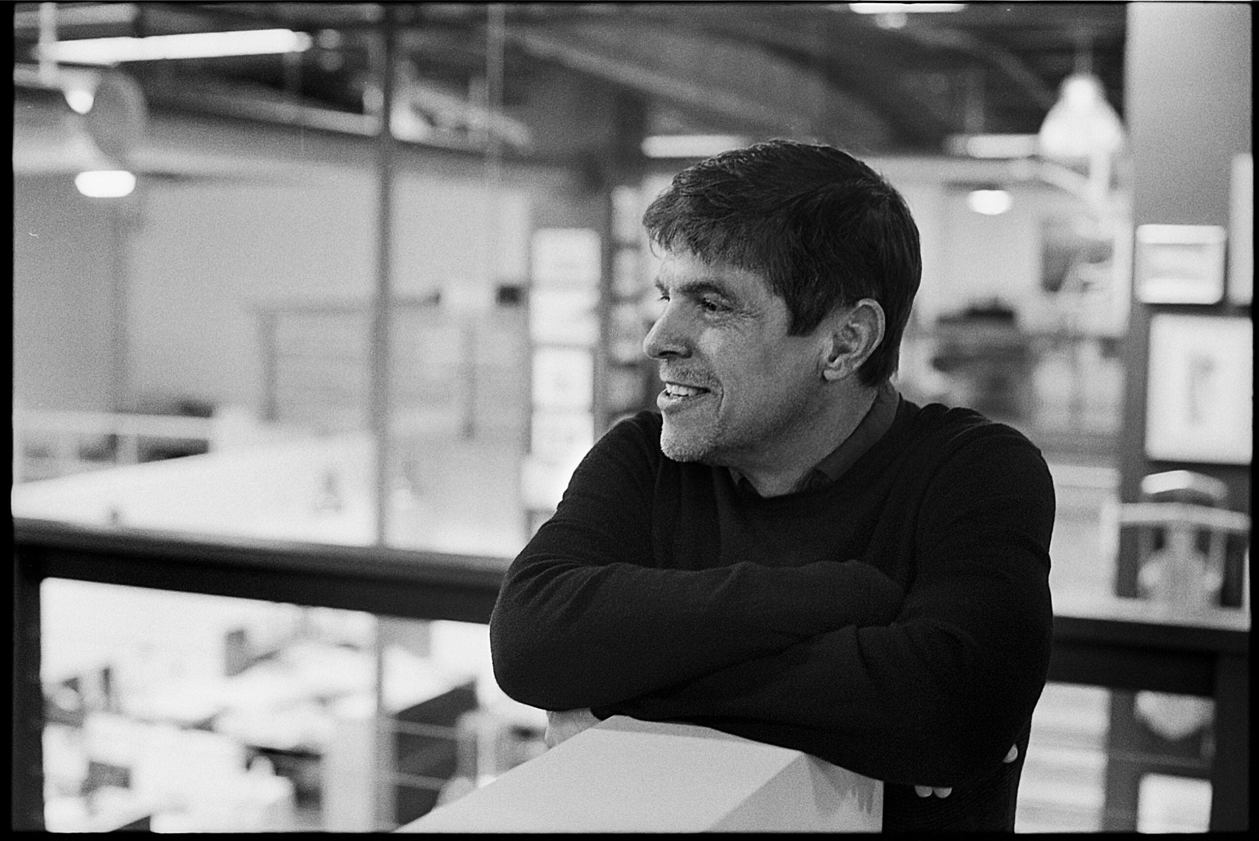 John Ball is the Principal/Creative Director of MiresBall. With over thirty-five years of design and business experience, John is known for the clarity and simplicity of his work. Combining strategic, practical thinking with meticulously executed creative, he’s built long-term relationships with global brands, including technology pioneer Intel and legendary audio icon Shure. Additionally, a passion for public good and the arts has led to collaborations with the Smithsonian, the American Association for the Advancement of Science, and the Institute of Contemporary Art, San Diego. John also served on the Lux Art Institute’s board of directors, creating the innovative arts organization’s brand identity and overseeing its award-winning communication program for fifteen years. His work has been recognized by organizations including Communication Arts, AIGA, Graphis, ReBrand, The American Association of Museums, and was selected for the 2005 California Design Biennial at the Pasadena Museum of Art.
Related Posts
Business
William Richardson|Commentary
Brands cannot afford to speak in the same voice as countless others right now. Typeface designers can help.
Business
Chris Mele|Commentary
Radical collaboration requires friction
Business
Helder Santo|Commentary
AI will offer you confidence and conviction. Don’t fall for it.

Business
Kate Watts|Commentary
The design-led business advantage: prioritizing the customer experience
Subscribe to The Observatory
Related Posts
Business
William Richardson|Commentary
Brands cannot afford to speak in the same voice as countless others right now. Typeface designers can help.
Business
Chris Mele|Commentary
Radical collaboration requires friction
Business
Helder Santo|Commentary
AI will offer you confidence and conviction. Don’t fall for it.
Business
Kate Watts|Commentary