


October 19, 2026
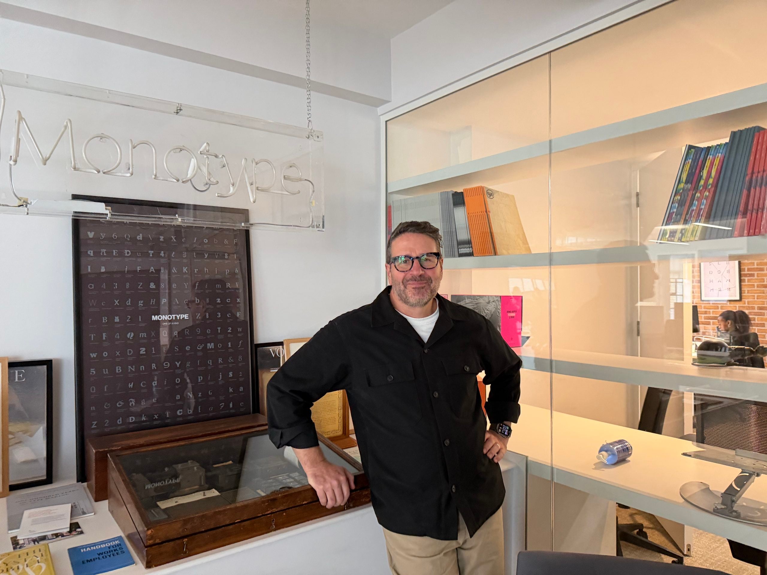
Typography is an accessibility, usability, and customer care issue, says Charles Nix
For pharmaceutical and wellness brands, partnering with the right designers is the first step to building trust
In Helvetica, the 3, 5, 6, and 9 share the same basic shape, so at small sizes they can be mistaken for one another. For a customer looking at the back of a medicine package who can’t tell if the dosage is 3 ounces or 9 ounces, this makes a real difference.
This is the kind of reality Charles Nix, senior executive creative director at Monotype, thinks through as part of Monotype’s latest partnership with Kenvue, a company made up of around 140 pharmaceutical and wellness brands, including Benadryl, Johnson’s, Neutrogena, and Tylenol. Nix has helped guide their typography toward a more cohesive, legible direction across brands.
For pharmaceutical brands, the technical stakes for typography are high. For a parent whose child has a fever and is trying to find the right dosage, or an older patient who has trouble reading the fine print on a medication package, legibility is essential to the trinity of usability, accessibility, and care. “Not just because it’s legally required,” Nix says, “but because it’s the best thing to do for the customer.”
It’s also a good business move. Typography also conveys ethos, building the kind of trust that keeps brands on the shelves. “It is the voice of the brand when you’re sleeping. When you’re not doing anything, it’s still out there, talking in the tone of voice, wearing the clothes, and communicating something on top of the words themselves,” he says.
From this perspective, good typographers should be prepared to do a psychological deep-dive into the Something of a brand. “You have to be curious, you have to be ready to listen, and ready to ask as many questions as you possibly can think of.”
The craft behind creating letterform, and the tools that allowed it, was foundational for Nix. “There was press type, metal type, even the printing press itself. I immediately wanted to make my own, to figure out how they made them so perfectly.”
Despite having a deep appreciation for what came before digital, he’s excited about what the age of AI could bring.
He sees why it’s causing angst, but ultimately, he says: “You are going to create because it’s part of who you are, and I’m going to create because it is part of who I am.” That impulse is the fast track to human-led innovation.
Design Observer sat down with Nix to talk about the importance of typography in pharmaceutical branding, his process for choosing custom type, typography as a craft, and his hot takes on AI.
This interview has been edited and condensed for length and clarity.
Tell me about working with Kenvue, which is made up of 140 pharmaceutical and wellness brands. What was your main goal?
Our job working with them is to make sure that the typography performs technically the way it should, and that it also aesthetically reflects the spirit of the brand. It’s that level of complexity that makes it interesting to me as a designer.
The question for a brand like Kenvue is: how many typefaces are actually being used within that global ecosystem? And the answer — at least two years ago — was really unsatisfying. Something close to “we don’t know.” So that’s where we began: trying to find out how much type is being used and where it’s being used, to count and classify and quantify.
Early on, for one particular Aveeno Baby product, we looked at the packaging and the sheer number of fonts being used within one package. That was an “aha” moment for Kenvue. We’ve managed to eliminate 14 fonts from the package. To a design eye, it actually looks a thousand times better.
What we’re doing is not necessarily a brand-by-brand refresh or restyle, but instead looking at the overall way that typography is being used across all 140-plus brands, and bringing them all up to a level of typographic expression that is commensurate with their standing in the world, or their overall ambitions to create a more unified brand ecosystem.
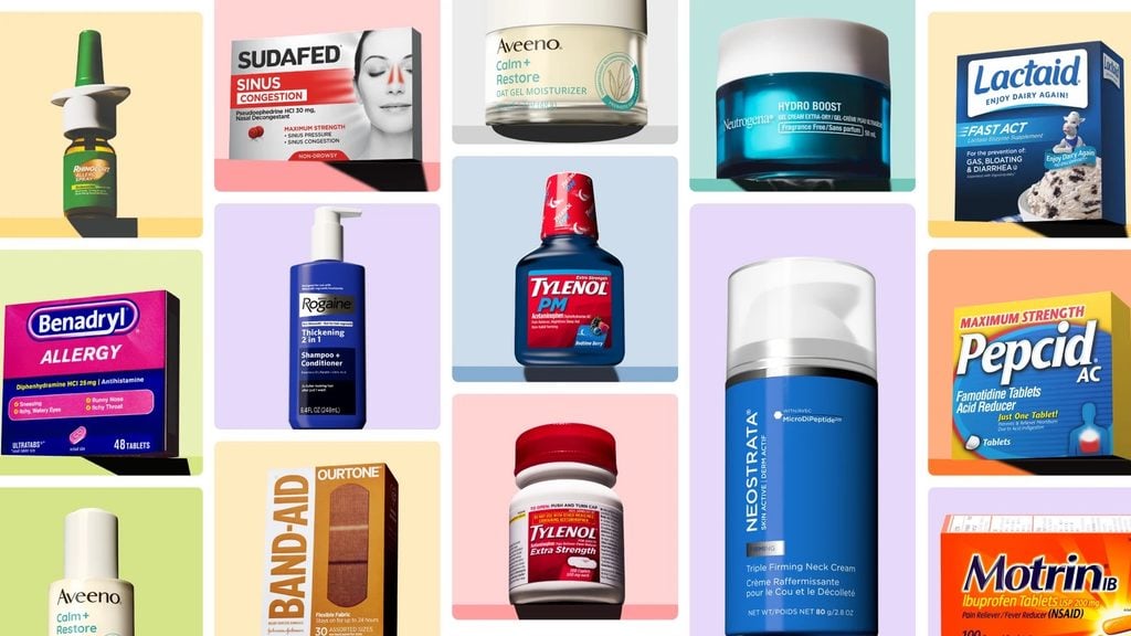
When a consumer is in a physical pharmacy looking for a product, why does typography matter?
There’s a functional and technical aspect of typography that’s really important.
In that environment, where somebody’s trying to figure out what the dosage is for their eight-year-old who’s got a fever at 8:00 at night, or they’re trying to find something within a pharmacy that will solve a problem — legibility is super important.
Fundamental, functional typography is super important — and then to what degree can you layer on top of that something that evokes whatever other aspects the product has? Is it about safety? Is it about science? Is it about comfort? What is the product trying to do on top of that fundamental functional aspect?

What are the risks to pharma brands if their typography misses the mark?
In our trends report a couple of years ago, we did this section on typography and aging. There’s a precipitous drop-off in the ability to differentiate or read small type after age 50. As one ages, one will find those back-of-pack micro-type things increasingly confounding. Finding a way to make that easier from the start is a big part of the long-term vision for Kenvue typography.
From the point of view of usability, accessibility, and care for the customer, I think it’s important to pay attention to those things and bring the best aspects of design to that equation — not just because it’s legally required, but because it’s the best thing to do for the customer.
And I would extend that to the rest of the really imperative typesetting that takes place on the back of a package: listings of ingredients, drug facts, directions for use. It’s easy to overlook but absolutely essential to the customer experience.
Why should businesses take typography seriously?
I would say typography is an essential aspect of communication for every brand and company in the world. It is the voice of the brand when you’re sleeping. When you’re not doing anything, it’s still out there, talking in the tone of voice, wearing the clothes, and communicating something on top of the words themselves. It’s song and performance. A great performer can take an ordinary song and make it amazing — in a way, that’s what typography can do for brand communications.
Ultimately, it comes down to this idea that every brand is an accumulation of communications with the customer, and every one of those communications is an accumulation of all of the details — how the customer is feeling at that point, what you’re trying to say to them, their ability to receive the message in that moment. You want every aspect of that interaction to have the best chance of success. Typography is so crucial to it that not paying attention to it really imperils the fundamental aspect of brand communication.
What’s the process for discovering what typeface is right for a brand?
One of the first questions you ask when you’re making a custom typeface, or even making a modification, or choosing a typeface, is almost like basic psychology. If I were trying to discover what typeface is best for you, I would ask, “How do you see yourself? How would you like to be seen? How do you think other people see you? How do you hope to evolve?”
You talk through that and listen closely to the answers, and ask further questions to continually frame and reframe the personality of the brand. And then, based on that, you begin making initial sketches of what the brand expression should look like, combining the feedback from the customer about what the brand wants to be, and one’s knowledge of typography.
You’re looking for just a few characters to show somebody and say, “When I hear you tell me who you are, this is what I see. Is it what you see?” And they say, “No, that’s not it at all.” And you say, “How about this?” And you give them maybe three, four, five, or 10 different versions of what could be possible typographic expressions of those ideas. Generally within that they find one that starts a conversation.
So you go from psychology to Rorschach test and then into the hard work of making sure that each of the individual aspects of those typefaces are doing their part to perform the act of expression.
Do you see typography as a craft?
Any two typographers — any seven, 20, 40, 400 typographers — could take the exact same letter and none of us would draw it the same way. But the end result to most people would be imperceptibly different.
You could learn how to do typefaces the same as me, but you’re never going to be able to do them the same as me, because there’s something about your view of the world that’s different than my view of the world.
So do I think it’s a craft? Definitely. In the same way that my grandfather’s work in cabinetry was a craft. There were things he knew technically about how to fit a corner that I could never have without studying for a long time. But there was an artistry in what he did too.
I think there’s a lot of public perception that typography is an article of commerce — something that has to exist, and therefore is not really craft-oriented, let alone a form of art. But I would say it straddles those two things. It is both art and science, both technical and craft-oriented, both artistic and scientific.
When did you first realize you were interested in typography?
My father was a printer, so I was around typography from when I was a little kid, I recognized it as a thing, and it spoke to me because — especially back then — it was sort of magical that it actually existed. I could see the connection between the people making the typography and the typography itself. Later, in college, that really blossomed. That made me very obsessive about typography and wanting to know as much as I could.
In an age where technology is threatening craft, is craft still important?
This is my hot take for our interview: to a degree, the craft probably isn’t important.
What we’re going to see with creative AI is the raising of the floor. There’s a lot of garbage design in the world, but a lot of it will go away because artificial intelligence and agentic design are going to raise the bottom level up. We already see it with templated platforms: 10 years ago, what passed for a PTA poster or a children’s fundraising flyer is very different than what you get on Canva today. That floor is only going to continue to rise.
The beautiful thing about the ceiling raising is that truly creative people are going to have to think even harder about what it means to be better than the rest, because that’s where differentiation comes from. You are going to create because it’s part of who you are, and I’m going to create because it is part of who I am. I will watch really carefully and participate periodically in the conversation about creativity and artificial intelligence. But I’m going to constantly be thinking about what it means to get outside of that, to get beyond it, to stay ahead of it — because that’s what we do. Our programming as humans is different than the programming of artificial intelligence.
I do see the terror of the mid-level designer — and even high-level design. It calls into question what we’ve been calling design for the past 30 or 40 or maybe 50 years. A lot of that has been design for production, which is sort of programmatic — behaving according to a script and not really doing the thing that brought us to this work to begin with, and the thing that moves the culture forward: to constantly look at what’s being done and to move outside of that.
This is a moment for all of us to reinvest in what it is that animates us as creatives, as designers, and to really push things forward. Be exciting, experiment, spend the time, make the mess, do the experiment, learn from it.
What do you think that looks like — or will look like very soon — in the typeface space?
The ordinariness of agentic design — being based only on things that it knows — leaves that white space for truly creative people to think of new typographic forms that exist way outside of what we currently consider normal. So it could push the field forward in a way that’s truly creative.
I’m excited about people looking at these tools and saying, “Yes, they can do what we did yesterday, and that will raise the floor — but what can they do that is completely uncharted, completely new?
Observed
View all
Observed
Share on Social


By Rachel Paese
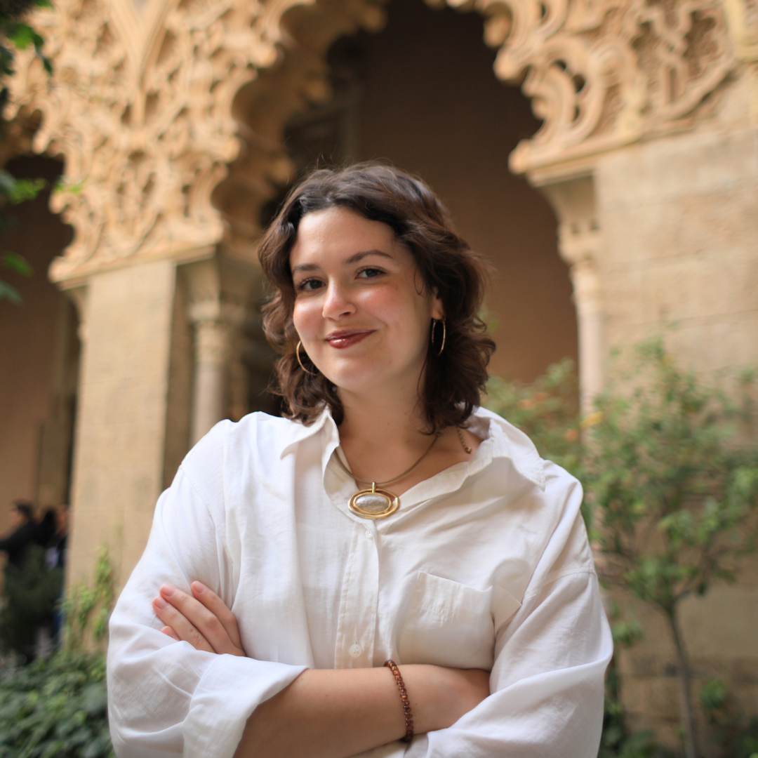 Rachel Paese is Design Observer’s Deputy Editor, and she loves giving curious people access to stories that change the way they see the world. It began with a major in English, and then evolved with a project that sharpened her editorial instincts the old-fashioned way: founding and leading her own multimedia magazine at the University of Kansas. After college, she carried that passion to education, helping students in Spain and Thailand think beyond their culture. Today, she brings that same spirit to Design Observer, working to connect readers with the people and ideas shaping a better future. Connect with her on LinkedIn, and ask her about her quest to sew her own wardrobe.
Related Posts
Design Juice
Rachel Paese|Design Juice
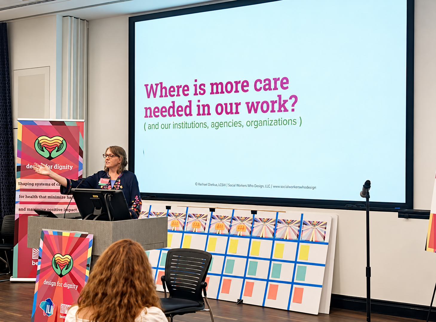
‘What if care were foundational to systems design?’ asks Rachael Dietkus
Design Juice
Rachel Paese|Design Juice
Sara Soskolne is a typeface designer who thinks of herself as a craftsperson
Design Juice
Rachel Paese|Design Juice
Ira Blossom created a games-only, print-only newspaper — and it’s sold at a newsstand in New York City
Design Juice
Rachel Paese|Design Juice
Katie Conry on building public programming for San Francisco’s most historically rich — and most misunderstood — communities
Subscribe to The Observatory
Related Posts
Design Juice
Rachel Paese|Design Juice
‘What if care were foundational to systems design?’ asks Rachael Dietkus
Design Juice
Rachel Paese|Design Juice
Sara Soskolne is a typeface designer who thinks of herself as a craftsperson
Design Juice
Rachel Paese|Design Juice
Ira Blossom created a games-only, print-only newspaper — and it’s sold at a newsstand in New York City
Design Juice
Rachel Paese|Design Juice