


Rachel Paese|Design Juice, Interviews
September 23, 2026
Sara Soskolne is a typeface designer who thinks of herself as a craftsperson
We’re surrounded by letters created by the human hand, and this “micro-nerdery” is what makes the viewer feel something
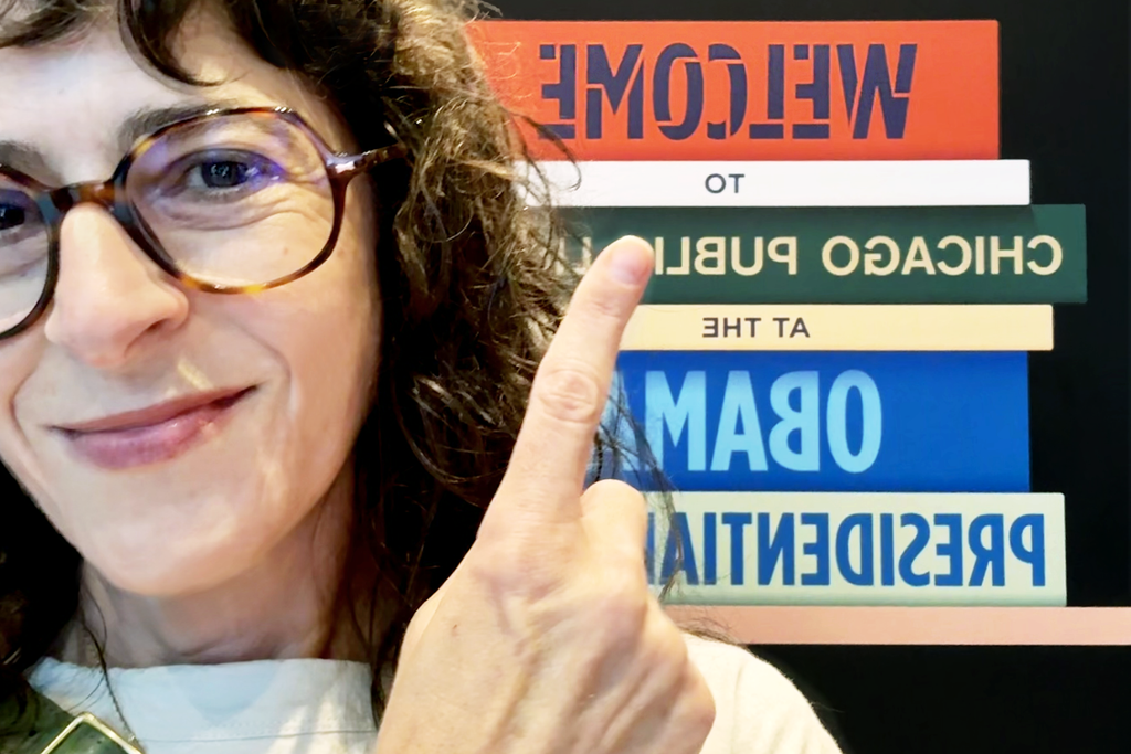
Sara Soskolne uses the word “micro-nerdery” to describe typeface design. “I think of myself as a craftsperson,” she says.
Soskolne is an Executive Creative Director at Monotype, and for much of the last two decades she has been waist-deep in the Gotham typeface — including many years working with its original designers, Tobias Frere-Jones and Jonathan Hoefler, as senior designer at Hoefler&Co.
After an iconic reputation solidified by Obama’s campaign, SNL, Netflix, and more, she recently led the development of Gotham Variable, expanding the font’s available iterations for designers. “When it’s a family as widely used and visible as Gotham, every decision that should seem tiny feels very conspicuous.”
“Micro-nerdery” is a nod to the precision that typeface design requires, but also a characteristic of the field that might surprise anyone unfamiliar: “I’ve always been a total generalist, so it’s bizarre that I’ve wound up in one of the most specialized vocations you could choose.”
She began her career wanting to think holistically. “I didn’t want to turn into the kind of typeface designer who only thinks about lettering and type and doesn’t think about how it would be used. That’s harder to do once you’re in it than I thought.”
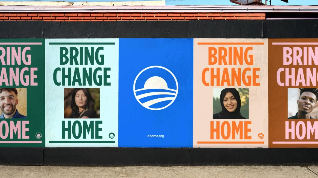
Working with the design team at Manual Creative, she explains how the bespoke type styles she created contributed to the bigger vision for the Obama Foundation. “These typefaces I spend all this time fussing over the details of wind up being used by great designers in a way that makes them about something so much bigger than just type.” Design choices can convey urgency, hope, and, in the case of the Foundation, have the power to “speak to a new generation and today’s concerns.”
“Some people describe fonts as being the clothes that words wear,” she says.
Soskolne wishes more people understood that we are all surrounded by human drawn micro-nerdery, every day. “You are interacting with letterforms that someone drew, someone designed, someone made decisions about, every minute of every day.”
At a time when AI threatens craft, Soskolne, like many others, has her worries — especially for up-and-coming designers.
However, some things remain the same. The human perspective is important, in typeface design as in everything else. “I’m interested in things humans make because I’m interested in what they have to say,” she says. “That’s something AI doesn’t have.”
This interview has been edited and condensed for length and clarity.
Can you tell me about your work with the Gotham font for the Obama Foundation?
The Obama Foundation was going through a brand refresh at the same time as planning the design program for the Obama Presidential Center. They were working with an agency called Manual Creative, and in the process, Manual made a couple of decisions that led to them reaching out to us, and then to me collaborating with them on a few custom styles of Gotham for the Presidential Center and the Foundation’s brand refresh.
When Manual Creative was trying to think about how to evolve the identity of the Obama Foundation — and updating it for today from that original voice of Gotham Bold, the voice of the Obama campaign in 2008. They wanted to add a second layer to it, another voice that was a little more urgent. That original voice is very open and hopeful, and I think that’s part of why people responded to it so much.
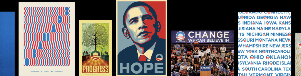
Seeing the words “hope” and “change” written in these plain-spoken, open forms of Gotham Bold feels very of its time, and we’re in a very different time now. They wanted the Obama Foundation’s identity to speak to a new generation and today’s concerns more, so they added Gotham Condensed Bold to the palette.
It’s a funny thing — the deeply nerdy, granular micro-details that we fuss over as typeface designers filter out into these larger cultural implications, so the decisions made by Gotham’s original designers 25 years ago about what its Condensed width should look like wind up becoming a voice that makes sense for the Obama Foundation to use to pull the brand into a new decade.
How do these fonts appear in the Presidential Center?
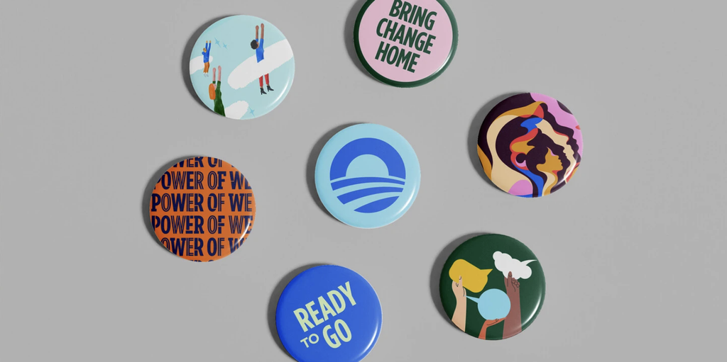
When these three new styles were originally envisioned, the idea was that the Slab Serif would mostly represent the programming track of civics and politics, the Inline would be used for things like sports and activity, and the Stencil would be used more for environment and sustainability-oriented programs — so each would represent a different programming focus of the Center. They are indeed being used that way, but they’ve also started using them all together in this lovely, eclectic way that really speaks to the idea of a multitude of voices. It’s such a nice metaphor. These typefaces I spend all this time fussing over the details of wind up being used by great designers in a way that makes them about something much bigger than just type.
You also worked with Gotham on the recently released Gotham Variable project. Can you tell me about that?
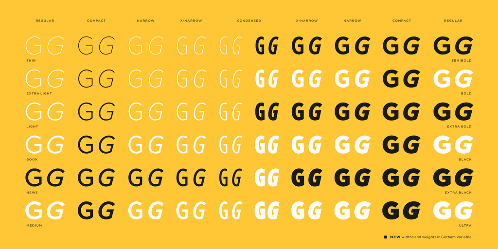
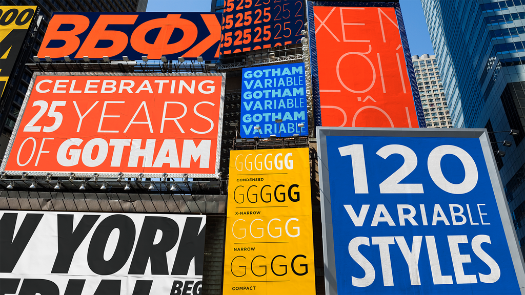
This year is the 25th anniversary of Gotham’s first appearance in print — on the cover and pages of GQ magazine in 2001. Technology evolves continuously, and Gotham’s character set has been updated, its range has been updated, but the actual technology of the font files themselves has been the same since Gotham first came out.
Variable fonts have been around for about a decade now, and their functionality is becoming more and more the norm of what people, particularly designers, expect from a workhorse family like Gotham. So it made sense — it was a perfect way to mark the 25th anniversary of Gotham’s origin moment, and the logical next step in its evolution, to update it for this new technology and ensure it stays current for everyone who loves using it.
I’m incredibly grateful for this beautiful design other people made that I’ve wound up, for better or worse, being responsible for stewarding into its next phase of life and that I get to keep working with, even though I’m probably ready to look at something else for a while.
What did it feel like to continue the legacy of such a famous typeface?
When it’s a family as widely used and visible as Gotham, every decision that should seem tiny feels very conspicuous.
We made the decision very early on that this wasn’t going to be a Gotham 2.0. We wanted to keep all the existing styles of Gotham exactly the same — for anyone already using it to be able to install this new version and not have anything move — so we essentially had to reverse-engineer variable technology onto this existing family. The challenge was adapting this existing very well-known and loved family for new technology and new requirements, while still having it feel like the original.
I also took some liberties. I’m not one of the original designers, but I have a very long relationship with Gotham and worked on the previous expansions of the family with those original designers for a long time, so I’m always deeply respectful of the DNA they created and cautious about the liberties I take with it. But I did add a few things I thought were necessary, and after all the years I’ve now spent with it I had to trust myself to be comfortable with those decisions.
Do you consider typeface design collaborative or solitary?
Well, it can be both, but most of the way I’ve done it has been very collaborative.
I got into it thinking it would be more solitary — the solo practitioner grappling with a set of letterforms. At H&Co it was always a minimum of two people, a designer and an editor — someone drawing the thing, someone else looking at it and providing feedback. Having worked that way for so long, that feels like a bit of a minimum to me now. With a project as big as Gotham Variable, I worked with a team — particularly three of us on the design expansions, and an amazing engineer who was my constant companion, figuring out how to make the technology behind all of this work.
It’s very collaborative, and I wouldn’t have it any other way. I think we make much better things in collaboration with other people than we can make by ourselves.
Was there a turning point when you realized letterforms would become a passion for you?
Even though I didn’t become a typeface designer until I was in my early thirties, I think I fell in love with letterforms because I was a big reader as a kid. The joy of being inside books made me want to be inside letters too, and made me respond to how letters change the tonality of text. There’s something about them being the visible form of language that’s very compelling — these weird abstract forms that also represent how we communicate with each other, the shape of language. I find that beautiful.
But the more directly connected experience was really when I started doing graphic design. I studied visual art and philosophy, not design at all, but fell into it to put myself through school in the early days of desktop publishing.
This was the first time I had access to a real library of type beyond the handful of system fonts on my little Macintosh SE. Just setting the same words in radically different styles — it’s extremely obvious in retrospect, but it blew me away how the apparent meaning of the exact same words changed depending on the typeface. That’s all it was.
As I progressed into a more sophisticated design practice, I started finding — because there were a lot fewer typefaces back then — that I could never quite find exactly the right thing for a particular project. I started thinking, I wish I could have this, but if it were just a little more like this. That editing or hybridization impulse, looking at something critically enough that you think, if I were making this, how would I make it different? It’s a slippery slope from there. But it was a gradual process.
Would you consider yourself more detail-oriented, or more of a generalist?
I’ve always been a total generalist, so it’s bizarre that I’ve wound up in one of the most specialized vocations you could choose.
Maybe that’s a weird dichotomy in my personality, but maybe it also helps me not stay in the weeds all the time, which is definitely my default setting these days while working on type. I remember thinking, when I got into it, that I didn’t want to turn into the kind of typeface designer who only thinks about lettering and type and doesn’t think about how it would be used. That’s harder to do once you’re in it than I thought. But I think it’s still really important.
When you think about the rise of AI and how it’s changing your field, what makes you nervous? What makes you hopeful?
Aside from the environmental implications, the ethical implications, the copyright implications — all of it — I really worry about AI turning us all into people who can’t think for ourselves. The paranoid part of me thinks that’s exactly what our sort of tech-bro overlords would like. So, to get really dark, that’s what worries me.
What gives me hope is that now, people have to think about design and type in more dimensions, especially with time, but also scale. Everything has to be much more adaptable, which is why we have to make variable versions of venerable families like Gotham. Today, designers have to use their brains in more sophisticated ways than when I was learning to be a designer — it necessitates more systematic, conceptual thinking.
I think of myself as a craftsperson, and the thing that graphic designers are doing when working with the things I make, is making decisions and judgments. That’s still what designers are going to need to do, even with different tools.
But what also scares me, to come back around: I feel like making stuff is how we learn, and if you aren’t directly engaging with the tedious aspects of what you do, I’m not sure you come to grips with them in the same way if some tool is doing them for you.
Everybody says experienced designers don’t have to worry, but it’s all the entry-level jobs going away — doing unglamorous but necessary work for smaller companies without huge budgets, or at a lower level in a big company — which are how you hone the judgment that lets you become a good designer. I don’t know where that comes from if people aren’t getting to do that kind of work.
What do you wish more people understood about type?
I think just the fact that we all interact with type constantly now, and that you’re surrounded by it.
There’s an amazing Canadian artist named Robin Collyer, who, back in the ’90s, had this practice of taking photographs and stripping all the text out of them. Photographs of an urban landscape, anything. He’d take all the text out, and they became these very unsettling images, because you’d think, what’s going on here? It would take a minute to dawn on you that the text was missing.
When I go on vacation, I have a tendency to go to places where there’s no typography so I can actually rest my eyes and my brain. People who enter my world have told me many times that after they get to know me, they start seeing type everywhere in a way they didn’t before — which may be both a blessing and a curse. I think it’s just having that awareness: every minute of every day now, you’re interacting with letterforms that someone drew, someone designed, someone made decisions about; for now, at least, there is a human creator behind every one of them.
Observed
View all
Observed
Share on Social


By Rachel Paese
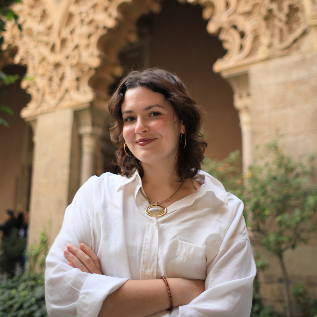 Rachel Paese is Design Observer’s Deputy Editor, and she loves giving curious people access to stories that change the way they see the world. It began with a major in English, and then evolved with a project that sharpened her editorial instincts the old-fashioned way: founding and leading her own multimedia magazine at the University of Kansas. After college, she carried that passion to education, helping students in Spain and Thailand think beyond their culture. Today, she brings that same spirit to Design Observer, working to connect readers with the people and ideas shaping a better future. Connect with her on LinkedIn, and ask her about her quest to sew her own wardrobe.
Related Posts
Design Juice
Rachel Paese|Design Juice
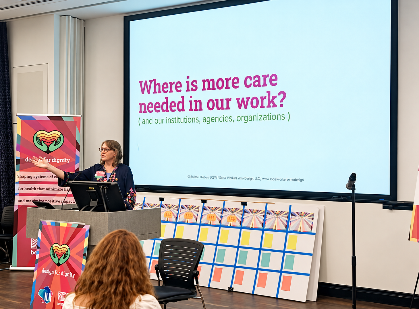
‘What if care were foundational to systems design?’ asks Rachael Dietkus
Arts + Culture
Alexis Haut|Interviews
The Kardashians will make you cringe, but first they’ll sell you shapewear
Design Juice
Rachel Paese|Design Juice
Ira Blossom created a games-only, print-only newspaper — and it’s sold at a newsstand in New York City
Design Juice
Rachel Paese|Design Juice
Katie Conry on building public programming for San Francisco’s most historically rich — and most misunderstood — communities
Subscribe to The Observatory
Related Posts
Design Juice
Rachel Paese|Design Juice
‘What if care were foundational to systems design?’ asks Rachael Dietkus
Arts + Culture
Alexis Haut|Interviews
The Kardashians will make you cringe, but first they’ll sell you shapewear
Design Juice
Rachel Paese|Design Juice
Ira Blossom created a games-only, print-only newspaper — and it’s sold at a newsstand in New York City
Design Juice
Rachel Paese|Design Juice