Wim Crouwel, Jan Van Toorn|Books
May 21, 2015
The Debate, Part 4
This week, Design Observer publishes four excerpts from The Debate, now available from Monacelli.
Today’s is the final installment. Read parts 1, 2, and 3.
++
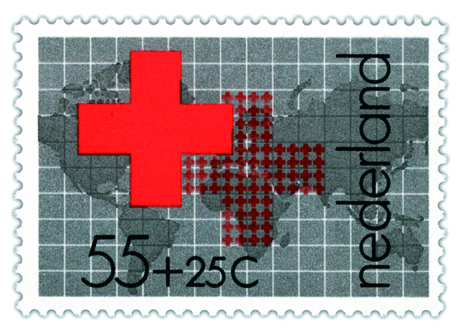
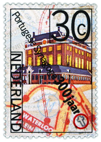
Wim Crouwel and Jan van Toorn both designed postal stamps as well. In the 1970s Van Toorn did a few assignments for the national postal service, PTT. In 1971 he designed a stamp for the Prince Bernhard Foundation, while in 1975 he created three stamps on topics related to Amsterdam (together with Paul Mijksenaar): two commemorating the capital’s seventh centennial and one on the Portuguese-Israeli community that had been in the Netherlands for three centuries. The original idea had been to design a sheet of one hundred stamps featuring images of Amsterdam residents from the last seven hundred years, with the overall color of the sheet changing from red to yellow.


Above: Jan Van Toorn, 1975
Unfortunately, this idea was not feasible for technical reasons. The stamps Van Toorn ultimately designed are structured as a collage, showing a map, a procession of Amsterdam residents, and an image of the Portuguese Synagogue. Although the design of these stamps was a collaborative effort, they still look like typical Jan van Toorn designs.


Above: Wim Crouwel, 1976

Jan Van Toorn, 1983

Wim Crouwel, 1978

Jan Van Toorn, 1991
Wim Crouwel, 1968
Observed
View all
Observed
By Wim Crouwel & Jan Van Toorn
Related Posts

Design Impact
Ellen McGirt|Books
No mandates, only opportunities: IBM’s Phil Gilbert on rethinking change

Education
The Editors|Books
Your October reading list: The Design of Horror | The Horror of Design

Innovation
Vicki Tan|Books
How can I design at a time like this?

AI Observer
John Maeda|Books
Should we teach AI to reflect human values, emotions, and intentions?
Recent Posts
Sam Furness got serious about investing in his curiosity. Now, he’s helping others do the same. Corporate crisis is design’s opportunity In a world that feels impossible to change, emerging designer Deborah Khodanovich is starting small Elixir Design founder Jennifer Jerde believes in the human touchRelated Posts

Design Impact
Ellen McGirt|Books
No mandates, only opportunities: IBM’s Phil Gilbert on rethinking change

Education
The Editors|Books
Your October reading list: The Design of Horror | The Horror of Design

Innovation
Vicki Tan|Books
How can I design at a time like this?

AI Observer
John Maeda|Books
