Wim Crouwel, Jan Van Toorn|Books
May 14, 2015
The Debate
Starting today, Design Observer publishes four excerpts from The Debate, now available from Monacelli.
++
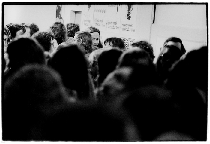
Over forty years ago, on a night in 1972 that was to take on mythic proportions, Dutch graphic designers Wim Crouwel and Jan van Toorn engaged in a public debate about their views and tenets. Titus Yocarini, then director of the professional organization of Dutch graphic designers (Grafisch Vormgevers Nederland, GVN), made an audio recording of that debate and the discussion that followed. Several years ago, this re cording was recovered by curator and graphic designer Dingenus van de Vrie, and this constituted the occasion for a publication in Dutch in 2008, now translated into English.
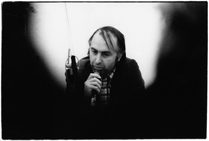
It is exciting to be able to witness the verbal battle between two grand masters of design when they were young, but the other reason for publishing it is that the arguments of both gentlemen have perfectly withstood the test of time. Wim Crouwel and Jan van Toorn can be seen as representatives of two opposed schools of graphic design: the rational approach versus the personal approach. They represent the classical antagonism between the engineer and the artist, the graphic designer as a service provider versus the designer who is more intent on personal expression. During those years, from the mid-1960s through the 1970s, social and political commitment were hot topics as well.
Crouwel and Van Toorn have, however, continued to regularly voice and otherwise express their respective positions with great consistency ever since. The debate on November 9, 1972, was perhaps the most exhilarating manifestation of their ongoing discussion.
The occasion for organizing a public discussion between Wim Crouwel and Jan van Toorn was an exhibition of the latter’s work, as part of a series about Amsterdam–based artists. It was held in Museum Fodor, which at the time served as an “annex” of the Stedelijk Museum located on the Keizersgracht in Amsterdam. Previously, the Fodor had shown posters from the Paris student revolt of May 1968, in an exhibition designed by Van Toorn, which a critic writing for progressive weekly De Groene Amster dammer had characterized as “messy.”
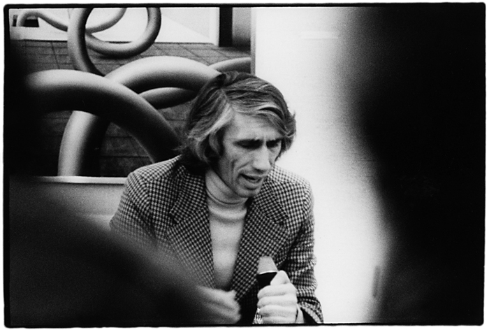
In the fall of 1972, Museum Fodor put on display posters, calendars, and catalogs by Van Toorn in a rather informal exhibition designed by George Sluizer. The show also exhibited anti-Vietnam war posters made by Van Toorn’s students. As a Stedelijk Museum publication, the catalog for this exhibition was designed by Wim Crouwel and his assistant Daphne Duyvelshoff. For the Fodor they developed a standard typography: a red cover with a pink dotted grid, showing the title “fodor” together with the issue number, 8, in a computer-like typeface. The remaining text on the cover—data on Van Toorn’s career and on the exhibition’s dates and location—was printed in a black typewriter font. Instead of pages, however, the catalog contained a loose, poster-sized foldout comprising photo compositions and a handwritten credo by Van Toorn (set in all lowercase letters): an object of graphic design should not be looked at on the wall of a museum because the object’s design thus takes on too much importance of its own. seen in relation to content, after all, design is already dominant as a formal exercise. bear in mind that printed matter is made to function in a specific situation, and there primarily its meaning is determined.
While preparing the “catalog” for the exhibition, it was decided that both designers would continue their conversations in a public debate.
Observed
View all
Observed
By Wim Crouwel & Jan Van Toorn
Related Posts

Sustainability
Delaney Rebernik|Books
Head in the boughs: ‘Designed Forests’ author Dan Handel on the interspecies influences that shape our thickety relationship with nature

Design Juice
L’Oreal Thompson Payton|Books
Less is liberation: Christine Platt talks Afrominimalism and designing a spacious life

The Observatory
Ellen McGirt|Books
Parable of the Redesigner
Books
Jennifer White-Johnson|Books
Amplifying Accessibility and Abolishing Ableism: Designing to Embolden Black Disability Visual Culture
Recent Posts
Minefields and maternity leave: why I fight a system that shuts out women and caregivers Candace Parker & Michael C. Bush on Purpose, Leadership and Meeting the MomentCourtney L. McCluney, PhD|Essays
Rest as reparations: reimagining how we invest in Black women entrepreneurs Food branding without borders: chai, culture, and the politics of packagingRelated Posts

Sustainability
Delaney Rebernik|Books
Head in the boughs: ‘Designed Forests’ author Dan Handel on the interspecies influences that shape our thickety relationship with nature

Design Juice
L’Oreal Thompson Payton|Books
Less is liberation: Christine Platt talks Afrominimalism and designing a spacious life

The Observatory
Ellen McGirt|Books
Parable of the Redesigner

Books
Jennifer White-Johnson|Books
