July 1, 2020
Typography Meets Sci-Fi

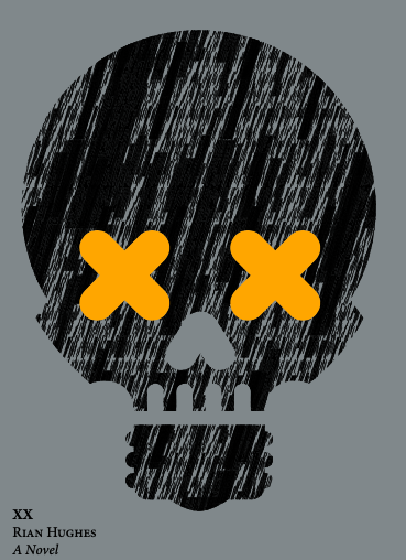
How can UK graphic design, illustrator, comics artist, author of a stack popular culture books, and now novelist, do it all? Just placing no less than thousands of original and derived fonts in his Device Fonts Foundry into the world is an act of unbridled will and religious devotion. But to have conceived, written, and designed a sci-fi extravaganza on the intricacies of AI where complex, nuanced typography is essential to the narrative structure and, in effect, has redefined the structure of the graphic and illustrated novel, is short of miraculous. Since I’m always attempting to learn how miracles occur, recently I asked Rian Hughes to simply tell me how he does it — without the benefit of artificial intelligence — how does he accomplish the feats of impossible creative power as easily as chewing gum.

Steven Heller: You have just published an incredible 720-plus page sci-fi novel, titled XX which is a hybrid of graphic, typographic, and conventional formats. You are so damn prolific, so this question may be more rhetorical than probing, but WHY a novel at this time in your career?
Rian Hughes: Well, it’s actually been a long gestation. In 2016, the Protein Gallery had an exhibition to celebrate 40 years of the Typo Circle. In a glass cabinet were spreads from Circular, the Typo Circle magazine. One was open at an interview I’d given back in 1996.
“There is, I think, room for some kind of ‘auteur’ design which its halfway between type, normal design and a ‘comic book’ narrative format”, said Hughes. “Such a hybrid will work in interesting ways — a kind of narrative design”.
So, after a mere twenty-five years, I’m finally getting this idea out.


SH: Will you describe the plot and how this intersects with your experiences and interests?
RH: The book is an intersection of several things that fascinate me: one, the expressive possibilities of type, their “tone of voice”, and how this might be leveraged for an extended narrative; two, a love of the ‘transformative’ hard science fiction typified by Arthur C Clarke, and his extrapolations about what might happen once the human species encounters alien life, and three, a need — which I’m sure all designers share — to create something in which the design is the “thing in itself”, the reason you pick the item up, rather than just a dressing for someone else’s idea or product.
The first point is obvious even to non-designers — readers will imbue the same text with different meanings, depending on which font the text is set in. Just this in itself presents interesting creative storytelling possibilities that the novel has only occasionally touched upon. And, as type designers, we are free to create new voices when we design new fonts, or even whole new alphabets.
However, without useful application, experimental font design can be an academic and sterile exercise. The issue here is that typographers only create the form, not the content. We design letters, but we don’t write the text these letters will carry.
We create tools, but we don’t put those tools to work.
The second point addresses communication, and how ideas are carried through a medium. Not being telepathic, humans need to speak, write or read in order to get an idea from one brain into another. Of course, it’s not just the obvious forms of communication that carry information — your body language, what you wear, your tone of voice, the social context, all of these can also communicate complex ideas.
Now imagine a mysterious signal from space has been received. It has structure. It has pattern. It looks like it might be the work of an extraterrestrial intelligence. How might we go about deciphering it? How might we step outside anthropomorphic ideas of what language is, where meaning resides, perhaps even what consciousness itself really is — in order to communicate?
The third point gets to the nub of authorship. I’m sure many designers want to become (say) poster or record sleeve designers because these kinds of clients present the most interesting creative possibilities. Designers are primarily interested in design, not commerce or marketing, the purposes design is usually leveraged for. This creates a mismatch. At one end of the spectrum, you might create a brochure for an accountancy firm, which I’m sure might be a beautiful, finely tuned piece of typography, but is still a brochure for an accountancy firm, and at the other end something in which the design is an integral part of the seductive “artistic” experience itself, for want of a better term. Setting aside discussions about what, exactly, “art” may be (as opposed, perhaps, to “craft”), there is always a tension between self-expression and commerce going on here.


Now, if you’re a musician, or a comic-book artist/writer, or a painter, you are not creating a fine bespoke suit for some other thing, but the thing in and of itself. You buy a comic for the comic itself, not some other thing that it is selling. You listen to a piece of music because you like the music, not some other thing the music is selling. You pick up a novel to read the novel, not some other thing the text is selling. But in graphic design, there is no genre, no object, in which graphic design is the whole and entire purpose of the exercise (unless you’re one of those graphic designers who pick things up purely for the design — but we’re weird).
Us designers already know this. We buy design books to ogle the beautiful work, not admire how many copies that book cover shifted, or how successful that launch for that new carpet cleaner was. That is not why we got into the business in the first place.
So we need to peel graphic design off the face of marketing and make it the thing in itself.
This is what I have tried to do with XX — create a form of narrative design, a “novel, graphic” (as the US blurb has it).


SH: I get the design motivation. From the science/sci-fi side, do you think there are other worlds out there and are they trying or have they succeeded in communicating with us?
RH: Though I find them fascinating, I don’t buy into Area 51 crashed saucer or channeled alien spirit theories — I’m actually pretty skeptical about these things — but the universe is an unfathomably huge place and we occupy a tiny backwater. To imagine that we’re the only intelligent creatures in that enormity is a bit arrogant. My guess is that the distances between stars, and thus habitable planets, is just too large, and an alien signal would have to be very powerful. Which is not to say it’s impossible — in our own solar system there may well be life under the crust of icy moons like Europa, whose seas are warmed not by the sun but by tidal deformation. Thirty years ago, no-one knew whether any star other than the Sun had planets, and now we have found over four thousand. When the James Webb Space Telescope comes online, we might be able to detect organics or technosignatures in the atmospheres of these exoplanets. I think the next decade or so is going to be very interesting.
SH: What were your challenges, solved or unsolved in making XX succeed in the ways you wanted?
RH: It went through several major restructurings. The story-within-a-story, Ascension, was moved back to the beginning of Book 2 because it was just one diversion too many to throw at readers early on. This, though, made much more sense — it now occupies the space in the novel between Dana’s meeting with the Man on the Moon and her recovery. I found the characters evolved from placeholders that were there to articulate the story into fully-rounded people — even the non-human ones — and it was interesting to go back and rewrite the earlier sections in the full knowledge of who they were. The more experimental pages all had to have a solid rationale, a reason for being there. I didn’t want the design elements to be some inessential add-on, a fairly standard story with a decorative icing of fancy typography — the two aspects had to intertwine seamlessly and convincingly. I also edited out around 350 pages, as I was determined to keep it under 1000 — I didn’t want to unduly test my reader’s patience or wallet. I went through over a dozen drafts, and even now could probably rewrite paragraphs of it.


SH: You’ve been nominated this year for two coveted Eisner awards, you’re publishing the novel, you’ve published a huge book of your typefaces, how do you decide what medium you’ll tackle next?
RH: I’m very excited about the Eisner nominations [for Logo a Gogo, Korero Press, in the categories of Best Comic Related Work and Publication Design]. This will probably be the only time I’ll ever be nominated. The catalogue of my typefaces, Typodiscography is a POD book, the idea being that it will be updated every year with the new releases.
I’m hoping that if XX does well, I’ll have the opportunity to create more ‘self-authored’ work. Next up is another ‘novel, graphic’ called The Black Locomotive, which has the benefit of being a lot shorter than XX. The elevator pitch is J. G. Ballard’s Crash or High Rise meets steam engines. Watch for it in 2021.
SH: I’ll be watching the heavens and the internet.

Observed
View all
Observed
By Steven Heller
Related Posts
Arts + Culture
Ellen McGirt|Interviews
The face, reconsidered
Design Impact
Alexis Haut|Education
‘Thoughts & Prayers’ & bulletproof desks: Jessica Dimmock and Zackary Canepari on filming the active shooter preparedness industry

Design Juice
Ellen McGirt|Interviews
Making ‘change’ the product: Phil Gilbert on transforming IBM from the inside out
Arts + Culture
Alexis Haut|Interviews
How production designer Grace Yun turned domestic spaces into horror in ‘Hereditary’ and heartache in ‘Past Lives’
Related Posts

Arts + Culture
Ellen McGirt|Interviews
The face, reconsidered

Design Impact
Alexis Haut|Education
‘Thoughts & Prayers’ & bulletproof desks: Jessica Dimmock and Zackary Canepari on filming the active shooter preparedness industry

Design Juice
Ellen McGirt|Interviews
Making ‘change’ the product: Phil Gilbert on transforming IBM from the inside out

Arts + Culture
Alexis Haut|Interviews

 Steven Heller is the co-chair (with Lita Talarico) of the School of Visual Arts MFA Design / Designer as Author + Entrepreneur program and the SVA Masters Workshop in Rome. He writes the Visuals column for the New York Times Book Review,