November 11, 2010
What Does H. P. Lovecraft Look Like?

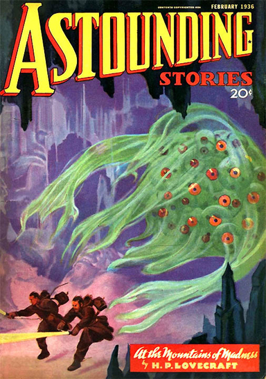
Picture credit: scifi.darkroastedblend.com
We live in a gilded age of adaptations: films, TV series, theatrical productions (often with added songs) and, most recently, graphic novels. People are much more likely now to have experienced an interpretation of the original than they are to have read the actual book. Literary classics don’t come much trickier to re-envision for a new generation than H. P. Lovecraft’s short novel At the Mountains of Madness.
Guillermo del Toro, director of Hellboy and Pan’s Labyrinth — populist or arthouse, take your pick — has been trying to film this horror/SF masterwork for several years and shooting starts in 2011. An irrepressible fan has already made him a trailer. In the meantime, Self Made Hero, a London publisher of graphic novels, has just launched its own interpretation, adapted and drawn by I. N. J. Culbard, a director of animation and comics artist.

For those who love his writing, Lovecraft occupies a satisfyingly uncertain position between high-class pulp fiction and the literary canon. Marginalized as a purveyor of ludicrously lurid horror — At the Mountains of Madness (1931) was first published in 1936 in Astounding Stories — he was honored only by practitioners and aficionados of the weird. Lately, though, his work has been reissued as modern classics and in definitive library editions with scholarly notes. The controversial French novelist Michel Houellebecq wrote a literary study, the Ballardian website pondered the links with Ballard, and a conference at Goldsmiths University in London considered Lovecraft in relation to theory.

Lovecraft has always posed a problem for anyone trying to turn the writer’s nightmares into visual imagery. The stories’ peculiar pleasure lies in the fully developed mythology that interconnects them, and in the morbidly refined vocabulary Lovecraft uses to evoke cosmic horrors too awful to describe, monstrous things from out of space and time too unfathomable to name, treading a fine line between an exquisitely apt descriptive style and embarrassingly purple prose. Lovecraft’s warped psychology and aberrant obsessions are best savored within the limitlessly accommodating theater of your own imagination. The risk with any attempt to make his spectral inventions literal and solid is that they will just look silly.
In At the Mountains of Madness, two explorers make discoveries in the Antarctic too unbearably alarming, they conclude, to be revealed to the world. It isn’t giving much away to say that there are hideous beings (Old Ones), some fabulously strange architecture, and hints of a devastating threat. Culbard does a perfectly capable job of breaking down the story into a fluently drawn, fast-moving narrative, but the Lovecraftian elements and tropes, the lunatic excesses piled on with absolute conviction and the stifling atmosphere of dread, elude him. In the original, an autopsy report furnishes a scientifically precise description of one of the creatures, down to the last sac-like swelling, breathing slit, and membraneous fin — an illustrator’s gift. Culbard’s Old One, which I won’t show here, looks like a plastic vegetable crossed with rubber bat wings.
Lovecraft describes the city as a “Cyclopean maze of squared, curved and angled blocks”… an “endless labyrinth of colossal, regular and geometrically eurhythmic stone masses which reared their crumbled and pitted crests above a glacial sheet”… an edifice composed of “geometrical forms for which an Euclid could scarcely find a name.” In the graphic novel, this composure-dissolving spectacle of an unimaginably advanced and unknown civilization crumbling into ruin in the frozen wastes becomes a decorous, Manhattanesque towerscape with a few minor cracks.


Despite the contradictions inherent in visualizing mysterious entities that depend on being unknowable for their mental frisson and disquieting ontological effect, there have been some convincing interpretations of Lovecraft from image-makers who feel an affinity with his writing. A paperback cover created by Ian Miller for a collection published in 1974 shows that one fruitful way to approach Lovecraft is to combine detailed drawing closely based on his descriptions with an otherworldly chaos of form and a febrile sensation of deep psychic malaise.

Picture credit: Mavmaramis at Flickr
A cover for At the Mountains of Madness (2005) by Electric Masada, American composer and saxophonist John Zorn’s group, has a similar current pulsing through its filaments, though the links to Lovecraft’s book are more tenuous here.

More recent visual communication also has its Lovecraft devotees. In the 1990s, the British illustrator and designer John Coulthart produced some brilliantly dark, scratchy, densely worked and oppressive interpretations gathered in his book The Haunter of the Dark (1999) — as in this image of R’lyeh from Lovecraft’s “The Call of Cthulhu.”

Coulthart also took a stab at illustrating At the Mountains of Madness before running out of juice with Lovecraft, but concedes that the only completed image looks more like one of Piranesi’s prison etchings. In the painting below, Coulthart’s disturbingly explicit monstrosity — Cthulhu — writhes with preternatural power while staying close to the conventions of highly finished realism usually favored in fantasy art.

Julian House, a designer at Intro in London, also cites Lovecraft’s weird invented world as an influence on his thinking and work for the Ghost Box music label he co-founded. In a series of monochromatic collages presented in two installments in Mark Fisher’s essay about Lovecraft (here and here), House takes visual interpretation of the writer in a less literal, more contemporary, and ultimately perhaps more viable and resonant direction.

Observed
View all
Observed
By Rick Poynor
Related Posts

Innovation
Ashleigh Axios|Essays
Innovation needs a darker imagination

Business
Kim Devall|Essays
The most disruptive thing a brand can do is be human

AI Observer
Lee Moreau|Critique
The Wizards of AI are sad and lonely men

Business
Louisa Eunice|Essays
The afterlife of souvenirs: what survives between culture and commerce?
Related Posts

Innovation
Ashleigh Axios|Essays
Innovation needs a darker imagination

Business
Kim Devall|Essays
The most disruptive thing a brand can do is be human

AI Observer
Lee Moreau|Critique
The Wizards of AI are sad and lonely men

Business
Louisa Eunice|Essays

 Rick Poynor is a writer, critic, lecturer and curator, specialising in design, media, photography and visual culture. He founded Eye, co-founded Design Observer, and contributes columns to Eye and Print. His latest book is Uncanny: Surrealism and Graphic Design.