.jpg)
Announcing the 2016 50 Books | 50 Covers selections.
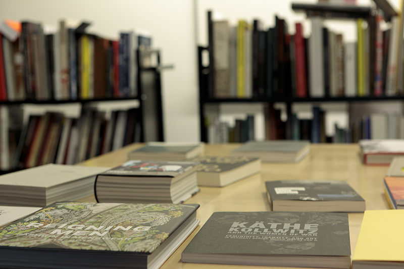
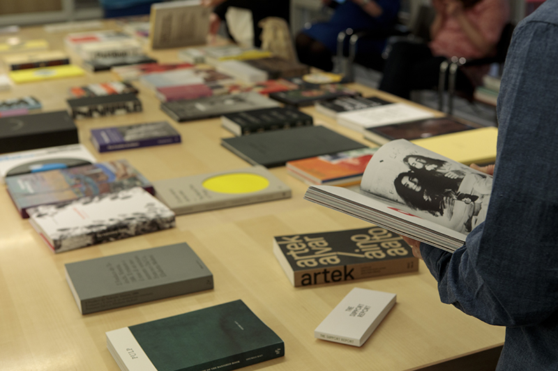
AIGA and Design Observer’s 50 Books | 50 Covers competition, which reviews and awards the best of book and cover designs published within the past year, has just concluded its 94th cycle. We’re pleased to announce this year’s winning cover and winning book selections, along with a few trends the judges couldn’t help but notice while digging deep into the stacks to pare nearly 700 submissions down to 100 final selections. Those selections become part of a nearly century-long tradition, a visual history of of book design available to the public in the AIGA Design Archives.
As popular as the ebook (supposedly) is these days, to our judges—Gail Anderson, designer and professor at the School of Visual Arts in New York City; Michael Carabetta, Creative Director of Chronicle Books; and Jessica Helfand, Co-Founder of this publication—the strongest trends from the hundreds of selections they reviewed were of the tactile variety.
Carabetta, who has previously juried the competition, noted after a full day of reviewing entries that the final books selected were excellent “not only in design—[but] in production; in paper, mixing coated and uncoated… People are getting into the real, physical qualities of the book.” He went on, “Maybe it’s because of the screen age we live in that they are appreciating the tactile quality.”
The book, in the mind of the bibliophile, has been threatened for some time now: due to the adoption of radio, or tv, or the direction that the current political wind is blowing. And book designers responded to these influences in the way designers know best—visually. In one particularly symbolic example, author Ray Bradbury ensured his 1953 book, Fahrenheit 451, would avoid the untimely demise experienced by those books of his plotline by binding the second edition in fireproof asbestos to prevent its burning.
With the adoption of ebooks, it seemed book lovers everywhere were not able to shake the fear that the humble object of their affection–a book created by the art of ink on paper (no battery required)–was similarly under fire. But the book has persisted in new forms, designed in even more inventive and delightful ways with each passing year. After reviewing one cover design, Anderson said, “This is one of those covers that I wish I’d done, but can now never attempt because the designer executed it perfectly.” If that’s not a high accolade, I’m not sure what is.
Indeed, trends among the winning books and covers leaned into the physical and tactile experiences a reader can’t enjoy from reading on an iPad—exposed binding; book covers that become posters; cloth outsides, that upon opening, reveal like a gift the book inside.
Stylistically, simplicity still reigned supreme among this “cross section” of book and cover design—among the submissions from more than 23 countries, clean typefaces, flat color, and pared down interiors (omission of title pages; tucked away copyright text) dominated. “It never ceases to amaze me how well type-only covers can carry a book cover or (fill in the blank),” said Carabatta of one cover design, with Helfand saying of another: “The type says it all.”
It seems there was no need among submissions for fire-retardant binding this year. But not to worry—there’s much more to catch your eye among the newly-anointed crop of best of book and cover designs. So how exactly does one judge a book by its cover? See for yourself.