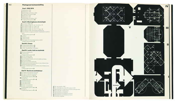
Wim Crouwel, Jan Van Toorn|Books
May 18, 2015
The Debate, Part 2
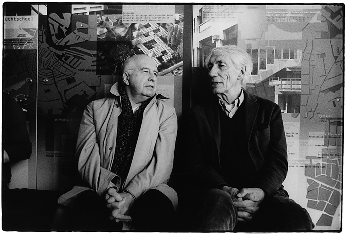
Jan Van Toorn and Wim Crouwel, 2007 | Photo: Pieter Boersma
This month, The Monacelli Press publishes the first English translation of a famous 1972 debate between Dutch graphic designers Wim Crouwel and Jan van Toorn, a public clash of subjectivity versus objectivity at Amsterdam’s Museum Fodor that helped set the stage for bold philosophical showdowns to come in design culture.
This week, Design Observer publishes four excerpts from The Debate. The first is here. Today, Grid v Intuition.
The Debate is now available from Monacelli.
++
Jan van Toorn
Grids are highly effective for conveying a message, but that is merely a starting point. You should not promote their use as the only way of design, or the only solution for arriving at great communication for the future.
Wim Crouwel
You say that I promote grids as the one true thing. I say that graphic design consists of a process of ordering for the benefit of the clarity and transparency of information. This needs to be founded on particular principles, because clarity and transparency on their own do not lead to quality information. There has to be an underlying principle as well.
My basic principles may have been characterized at times as subjective, but to me they are objective. When I depart from modular structures, then this is an underlying principle to me. These structures can be simple, but they can also be extremely complex. And I believe that design—not just graphic design, but also spatial design, architecture, and industrial design— benefits from a cellular approach, from a highly struc.tural approach.
Typography, for instance, is a preeminent example of such a process of ordering. Every form or shape in typography that wants to be more is one form too many. As a typographer you merely arrange information clearly so as to convey it in an easily readable way. That a clear arrangement may lead to incredible monotony is not at issue here; what matters is that you order things according to a specific point of view, from a basic principle. This is what determines form, and such form might well lead to a style as well.
In my view, typography does not have to be determined by tradition and history at all. It is time, I believe, that we throw overboard all those dos and don’ts that have kept typography in a straightjacket for so long. When as an alternative I advocate my structural approach, my cellular approach, which culminates in the use of grids for typography or spatial grids for architecture, I really have a different idea in mind.
Jan van Toorn
By traditional form I mean what you refer to as something determined by tradition. It does not so much pertain to style, but to our way of reading, the way of reading we have grown accustomed to. It does not just emerge out of the blue, but has a history. It is a case of historically determined human behavior. And you cannot simply act as if it doesn’t exist.
Working with grids, it seems to me, is a tremendous refinement of our tools, but it is not essential and only of interest to fellow professionals. We saw where systematic ordering ad absurdum leads us in the protests against the closing of the Hochschule in Ulm:* banners with perfectly clean typography. But in this way of protesting you do not see any identification with those you address, and this is a crucial problem for which a designer has to find a solution.
Wim Crouwel
Jan, I don’t believe in that at all. The lively concern of these people and their involvement—their angehauchtheit, as they call it in Germany—is equal to that of people who protest in more amateurish ways. Look at Paris ’68! The posters they made there are all obvious cases of amateurism; not a single one of them has any value. Not one of them is a good piece of design that really tries to convey an idea. It is all clumsy work that comes across as sweet, pleasant, full of feeling, but not as tough. Good designers could have conveyed the content much more strongly and this could have brought the movement more success.
Jan van Toorn
Why then did those designers fail to contribute? Because they are incapable of giving adequate answers. So all that remains is amateurism. The people in our profession have no answers.
Wim Crouwel
Jan, before the break let’s briefly return to the typography in the catalogs we make for museums. I have always taken the view that these catalogs should have a kind of magazine format, because they need to tell the museum’s story, rather than that of the artist. For this reason, they should be recognizable in their design as coming from an institution that takes a specific stance vis-à-vis contemporary art.
This has led to catalogs of which people said: “We can’t recognize the artist in it.” But the artist was present in the reproductions, and I have nothing to add to his story. The artist’s own story, when conveyed clearly and in a readable fashion by means of well-placed illustrations according to a certain principle, should be so powerful that he is always stronger than me. What I add to it is at most the specific objective of the museum involved.
In your catalogs for the Van Abbemuseum I recognize first and foremost the voice of Jan van Toorn, while that of the artist becomes perceptible only if I put in some more effort. As “pieces of art” these are great contributions to what is currently possible in free typography, but they are outright unreadable. I simply get stuck.
*By 1967 the Ulm School of Design was financially troubled and beset by faculty conflicts; some faculty members departed and the curriculum was scaled back. In 1968 the regional parliament in Bonn withdrew all funding to the school, forcing the institution’s closure amid student and faculty protests.
++


Above: Jan Van Toorn | cover and spread from Bouwen ’20–’40. De Nederlandse bijdrage aan het nieuwe bouwen | 1971


Above: Wim Crouwel | cover and spread from Het nieuwe bouwen | 1983

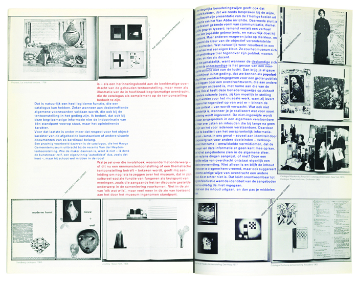
Above: Jan Van Toorn | cover and spread, Vormgeving in functie van museale overdracht | 1978
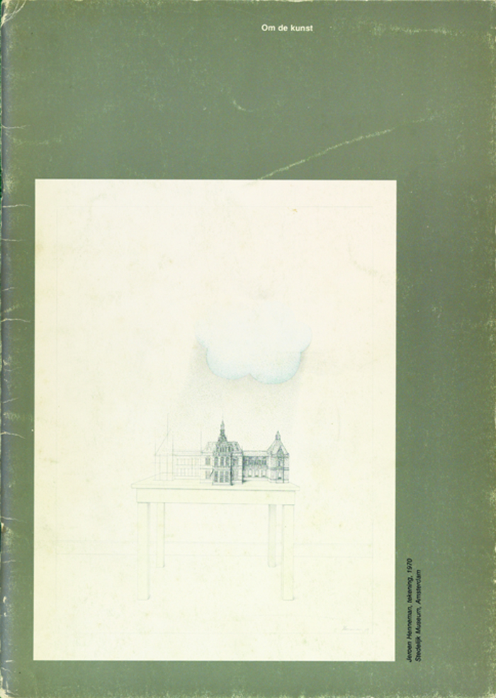
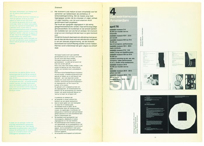
Above: Wim Crouwel | cover and spreads, Om de kunst | 1978
Observed
View all
Observed
By Wim Crouwel & Jan Van Toorn
Related Posts
Design Impact
Ellen McGirt|Books
No mandates, only opportunities: IBM’s Phil Gilbert on rethinking change
Education
The Editors|Books
Your October reading list: The Design of Horror | The Horror of Design
Innovation
Vicki Tan|Books
How can I design at a time like this?

AI Observer
John Maeda|Books
Should we teach AI to reflect human values, emotions, and intentions?
Recent Posts
Sam Furness got serious about investing in his curiosity. Now, he’s helping others do the same. Corporate crisis is design’s opportunity In a world that feels impossible to change, emerging designer Deborah Khodanovich is starting small Elixir Design founder Jennifer Jerde believes in the human touchRelated Posts

Design Impact
Ellen McGirt|Books
No mandates, only opportunities: IBM’s Phil Gilbert on rethinking change

Education
The Editors|Books
Your October reading list: The Design of Horror | The Horror of Design

Innovation
Vicki Tan|Books
How can I design at a time like this?

AI Observer
John Maeda|Books
